The misconception I kept running into, across project after project, was that accent walls and small spaces don’t belong together. That adding a bold wall treatment in a studio is asking for trouble, that it’ll close everything in, make the room feel cave-like, and undo all the other work you’ve done to make the space feel open.
I understand where that thinking comes from. Bad accent walls do shrink rooms. The wrong color on the wrong wall with the wrong scale pattern is a real problem, and I’ve walked into enough poorly executed attempts to know exactly what that looks like. But a well-considered accent wall in a studio doesn’t make the space smaller. It makes it feel more intentional. More designed. Like someone lived there and made actual choices, rather than leaving everything the same safe shade of builder beige because they were afraid to commit.
The difference between an accent wall that damages a studio and one that elevates it comes down to a few specific decisions, and none of them are especially complicated once you understand the logic behind them.
1. Which Wall You Choose Changes Everything
This is where most people go wrong. They pick the largest wall, or the wall they see first when they walk in, or the wall behind their sofa because that’s where accent walls go in the Instagram photos. And then they wonder why the room feels smaller after.
In a studio, the wall you accent needs to do a specific job. It should either create visual depth by pushing a wall away from you optically, or it should anchor a zone, giving the sleeping area or the living area a defined backdrop that separates it from the rest of the space. Neither of those things happens automatically just because you put color or texture on a surface.
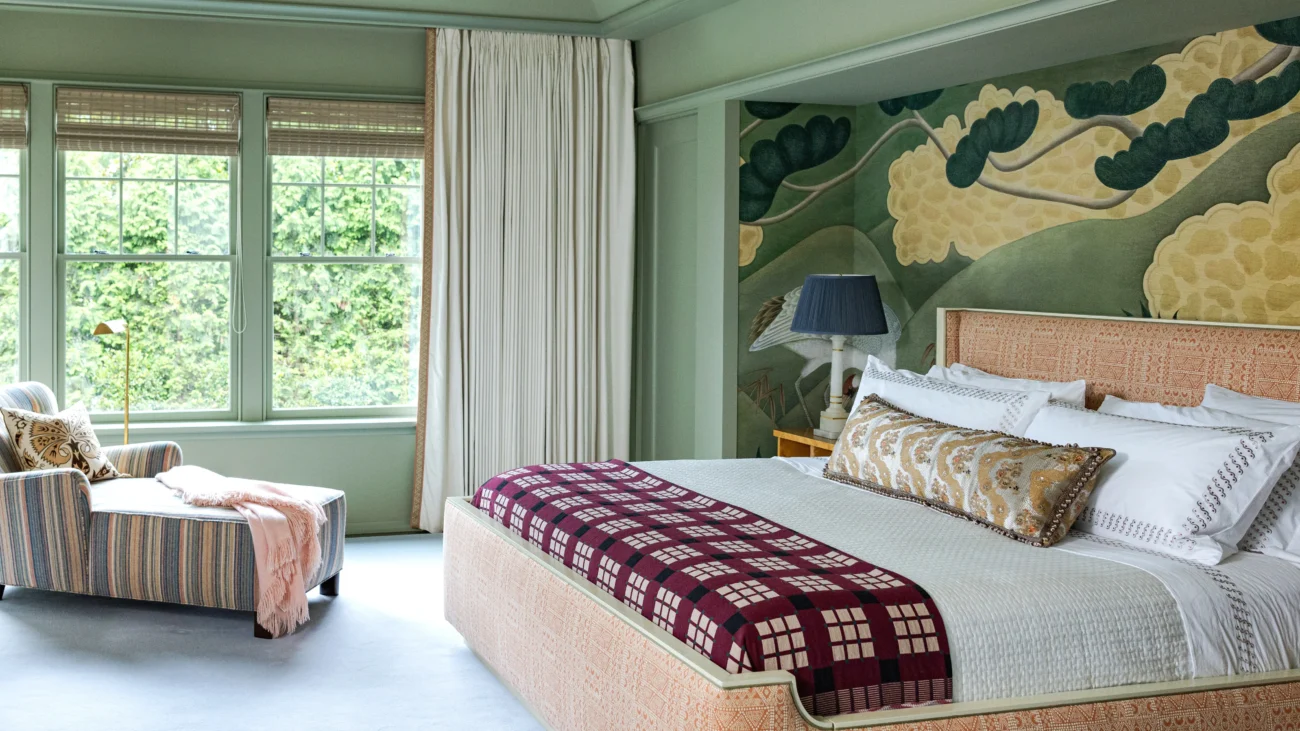
The wall that creates the most depth is typically the wall you see directly ahead when you enter the apartment. That’s your long-view wall. A darker color, a textural treatment, or a wallpaper with depth on that wall pulls the eye toward it and makes the room feel longer from front to back. This is the same principle used in restaurant design and theater set design, where the back wall is treated to extend perceived space. In a studio around 350 to 450 square feet, the effect is subtle but real.
The zone-defining wall is different. It’s the wall behind the bed, or the wall against which the sofa sits. The purpose here isn’t depth, it’s clarity. Giving the sleeping zone a distinct backdrop separates it visually from the eating or working area, which is the whole challenge of studio living: creating the feeling of distinct rooms without walls to separate them.
Both approaches work well. But mixing them on the same wall, trying to do both things at once, usually ends up doing neither.
2. Color Logic for a Small Room That Actually Holds Up
The conventional advice is always lighter colors for small spaces, and it’s not wrong, it’s just incomplete. The more accurate principle is: value contrast between surfaces creates boundaries, and boundaries define size. When all your walls are the same light color, the room reads as one continuous box. When one wall has noticeably different value (either darker or warmer or more saturated), it becomes a separate plane and the room reads as having dimensionality rather than just being a small box.
So the right accent wall color isn’t necessarily the darkest color you’d consider. It’s a color that reads as distinctly different from the other three walls, but stays in a family that feels cohesive with the rest of the room.
A terracotta or warm brick tone on the bed-facing wall in a studio with light warm-white walls, natural wood tones, and linen textiles reads as grounded and luxe, it doesn’t read as heavy. A dusty sage green on the long-view wall in a studio with pale grey and white reads as calm and spatial. A deep navy on a narrow feature wall behind a bench or entry console reads as dramatic but controlled, because the wall itself is narrow enough that the darkness is a punctuation mark rather than a weight.
The colors that actually do shrink studios are the wrong mid-tones: muddy greens, grayed-out purples, brownish-taupes that end up looking like the walls haven’t been painted recently. Saturated colors with clear identity work. Uncertain colors that try to be both neutral and interesting usually fail at both.
I should mention, because it comes up a lot: paint finish matters here too. A matte or eggshell finish absorbs light and reads softer. A satin or semi-gloss on an accent wall in a small space picks up every light source and can make the wall feel more dominant than intended. For accent walls in studios specifically, matte or eggshell is nearly always the better choice, the color does the work and the finish stays quiet.
3. Texture and Pattern Treatments That Work Without Visual Noise
Paint is the obvious starting point, but it’s not the only option and sometimes not the best one. Wallpaper, limewash, board and batten, fabric panels, and plaster finishes all create accent walls with more physical presence and character than flat paint alone. In a studio, the right textural treatment can read as a design choice that elevates the whole room. The wrong one reads as busy.
Limewash paint is worth talking about specifically because it’s been everywhere recently and it earns its popularity. It creates a soft, layered, slightly uneven finish that reads as organic and aged, it has genuine texture and depth without being pattern-heavy, and in small spaces it adds visual interest without visual noise. The color shifts subtly depending on where the light hits it, which means it holds the eye without demanding attention. For a bedroom zone accent wall in a studio, it’s one of the most studio-appropriate choices available.
Wallpaper is where people often make scale errors. A bold, large-scale pattern, the kind that looks incredible on a full wall in a larger room, compresses terribly in a small space. The repeat is too large for the wall area, the pattern gets cut off awkwardly at edges, and the overall effect feels jumbled rather than intentional. In studios, wallpaper works best in small-scale patterns, textural or geometric designs with a contained repeat, or single-panel statement treatments used as art rather than full wall coverage.
Board and batten, or any vertical paneling treatment, does something specific in a low-ceiling studio: it draws the eye upward and makes ceilings feel higher. But horizontal paneling or shiplap in a small room makes the walls feel like they’re converging. The direction of the lines matters. Vertical always wins for spatial effect in a tight space.
And on that note, this is a good moment to mention something Studio Apartment Setup covers well in its decor section: the relationship between wall treatments and furniture scale. An accent wall behind a low-profile platform bed reads very differently than the same wall behind a tall, heavy headboard. The treatment and the furniture in front of it form a composition, and you need to think about both together.
4. Renter-Friendly Approaches That Don’t Sacrifice the Look
Most studio apartments are rentals. And most rental leases prohibit permanent wall treatments, or at minimum require patching and repainting at move-out. That constraint rules out certain options and makes others more attractive.
Peel-and-stick wallpaper has improved meaningfully in the past several years. The earlier generations had problems with adhesion, with bubbling over time, and with removal damage that essentially voided the “renter-friendly” claim. Current-generation products from suppliers like Chasing Paper, Tempaper, and Walls Need Love hold well on clean, primed surfaces, remove cleanly in most cases, and have expanded in pattern quality to include designs that look genuinely high-end rather than obviously temporary. The caveat is preparation: the wall needs to be clean, smooth, and not freshly painted (fresh paint off-gasses in ways that affect adhesion). Follow the installation instructions precisely and the results are dependable.
Fabric wall panels are underused. A stretched canvas or a framed textile panel hung salon-style on a feature wall creates an accent wall effect without touching the wall surface at all. A collection of four to six linen or cotton panels in varying sizes, hung with picture hooks or removable adhesive strips, achieves a covered-wall effect that reads as intentional and designed. This is actually a good approach even for homeowners who want something easily changed, because the panels can rotate seasonally or when the mood shifts.
Removable paint is also worth knowing about. Chalk paint and certain water-based specialty paints do come off surfaces without permanent damage in some applications, though this is highly surface and application dependent and should be tested in an inconspicuous area before committing to a full wall. I’d treat this as a research-your-specific-situation option rather than a blanket recommendation.
For a checklist of what to assess before starting any accent wall project in a rental studio, here’s a plain-text reference to keep handy:
Before You Start: Accent Wall Assessment Checklist
[ ] Measured the wall: width, height, any obstructions (outlets, switches, vents)
[ ] Confirmed lease terms on wall treatments (read the specific clause, not the summary)
[ ] Identified which wall (depth wall vs. zone-anchor wall)
[ ] Chosen treatment type: paint / peel-and-stick / fabric panels / textural finish
[ ] Tested color/pattern sample on actual wall surface in actual lighting conditions
[ ] Checked adjacent furniture scale — does it work with the treatment height?
[ ] For peel-and-stick: confirmed wall is clean, smooth, and not freshly painted
[ ] Noted electrical outlet and light switch positions for pattern alignment
[ ] Planned removal process before starting installation
The testing step catches more problems than any other. A paint chip or wallpaper sample taped to the wall and observed across morning, afternoon, and evening light will show you things a phone screen never will. Colors shift significantly with natural light direction and artificial light temperature, and a color that looked right in the store or on a website can read completely differently on your specific north-facing wall under warm LED bulbs.
5. The Part Most Guides Skip: What Goes In Front of the Wall
An accent wall in a studio is never just about the wall. It’s about what the wall frames.
This is the part of the conversation I always have with clients that most online content glosses over. The treatment is a backdrop. It exists in relationship to the furniture and objects placed in front of it. A beautifully done limewash wall behind a cluttered nightstand and a bed with mismatched bedding doesn’t read as a designed space. A simple white wall with a single well-chosen piece of art and a bed with a clean linen duvet can read better.
The accent wall makes the strongest visual statement when the zone in front of it is edited. That doesn’t mean sparse or minimal, it means composed. The bed against the accent wall should have considered layering: two or three throw pillows rather than seven, a bedside table or wall-mounted sconce at the right height, and a clear sightline from the door to the wall so the eye travels there first when you enter the room.
For the living zone version, the sofa centered against the accent wall with a simple console table or shelf above it, a plant or two, and a controlled arrangement of framed prints creates a composition that makes the wall treatment worth doing. Letting the space in front of the accent wall become a dumping ground for unrelated items defeats the whole purpose.
Studio Apartment Setup has good material on keeping the visible surfaces in a studio organized, which ties directly into this. The design and the organization are the same problem in a small space.
And if you’re simultaneously figuring out how the accent wall fits into the broader layout decisions for your studio, the layout guides at Studio Apartment Setup walk through how to think about zones and visual anchors in a single room apartment, which is the right context for this decision.
FAQs
My studio has really low ceilings (about 7.5 feet). Will an accent wall make that worse? It depends entirely on the treatment. Vertical paneling or board and batten draws the eye upward and makes low ceilings feel higher, so it’s one of the better choices for a low-ceiling studio. Dark horizontal treatments or wide-stripe wallpaper patterns run parallel to the ceiling and reinforce the low feeling. Color alone on the wall doesn’t significantly affect ceiling height perception unless you’re also doing a contrasting ceiling color. Stick to vertical lines or texture without strong horizontal direction and the ceiling concern mostly resolves.
Can I do an accent wall in a studio that already has exposed brick on one wall? Yes, but carefully. Exposed brick is already doing the job of an accent wall, it has color, texture, and visual weight. Adding a second accent wall treatment in the same studio usually creates competition rather than complement. The better move is to work with the brick as the anchor and use paint color and furniture to build the rest of the room around it. If you do want to treat another wall, a very simple limewash in a tone that picks up the brick’s warm undertone reads as intentional. A contrasting bold color on the opposite wall tends to fracture the room.
How do I pick between doing the wall behind my bed versus the wall I see when I walk in? These serve different purposes. The wall you see when you enter creates your first impression of the whole space and should feel cohesive with the apartment’s overall palette. The wall behind the bed defines the sleeping zone and can be more personal and specific. If your studio is on the smaller end (under 400 square feet), I’d typically recommend the entry-view wall because it does the most perceptual work for the whole room. For larger studios with better defined zones, the bed wall gives you more creative latitude without affecting how the whole room reads.
What’s the most budget-friendly accent wall option that still looks considered? A single wall painted in a well-chosen color with eggshell finish, properly taped and cut in, costs between $40 and $80 in materials and a weekend afternoon. It’s the most accessible option and, done well, reads as designed. The mistake people make is rushing the prep: skipping the sanding, not priming over repairs, taping carelessly. The paint itself is inexpensive. The labor quality is what separates a professional-looking result from one that looks like a weekend project. Take the time on prep and the result speaks for itself.
I want to do wallpaper but I’m terrified of it looking tacky. What’s the safest pattern choice for a studio? Avoid anything large-scale, busy, or with a strong color contrast in the pattern repeat. The patterns that work consistently well in small spaces are tone-on-tone textures (a slightly textured pattern in two close values of the same color), small geometric repeats with soft edges, and botanical or abstract patterns with a contained, non-directional composition. If you can see the full pattern repeat on a piece of paper and it reads as calm and balanced, it’ll likely work on the wall. If it reads as chaotic at small scale, it’ll read as more chaotic at full wall scale.