A studio apartment can easily feel cramped or chaotic if space is not carefully structured. The challenge is not just fitting everything in—it is designing a layout where movement feels natural, storage disappears into design, and every zone supports calm living.
Minimal studio layouts are less about decoration and more about flow. When done correctly, even a small space can feel open, breathable, and intentionally designed.
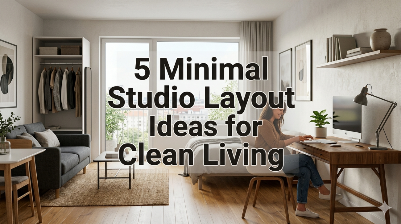
Below are five highly effective minimal studio layout ideas that transform tight spaces into clean, livable, and visually calm environments.
Idea 1: Zoned Layout Without Walls (Invisible Room Division)
Instead of physically separating space with walls or bulky partitions, this layout uses invisible zoning. Each function of the studio—sleeping, living, working, dining—exists in its own defined area without disrupting openness.
The key principle is psychological separation rather than physical separation.
For example:
- A rug defines the living area
- Lighting defines the workspace
- Furniture orientation defines boundaries
- Color tone shifts subtly between zones
Layout structure example:
| Zone | Defining Element | Furniture Type | Purpose |
|---|---|---|---|
| Sleeping zone | Soft rug + warm lighting | Bed + side table | Rest and recovery |
| Living zone | Larger rug + open seating | Sofa or floor seating | Relaxation/social |
| Work zone | Focus lighting | Desk + chair | Productivity |
| Dining zone | Compact table | 2-chair setup | Eating space |
| Entry zone | Mat or runner | Hooks/bench | Transition space |
Why this works:
The brain naturally accepts visual cues. When each zone has a different lighting tone or floor texture, the mind treats them as separate environments even without walls.
This creates a sense of order without reducing openness.
Idea 2: Floating Furniture Layout for Maximum Floor Clarity
One of the biggest mistakes in studio design is pushing all furniture against the walls. While this seems space-efficient, it often makes the room feel boxy and flat.
A floating furniture layout places key pieces slightly away from walls, creating breathing room and natural flow pathways.
Example configuration:
- Sofa floats in the center facing a focal point
- Bed placed with walking space on one or both sides
- Desk positioned near natural light but not stuck in corners
Floating layout benefits:
| Feature | Traditional Layout | Floating Layout |
|---|---|---|
| Visual space | Flat and tight | Open and layered |
| Movement flow | Restricted edges | Natural pathways |
| Room depth | Limited | Enhanced |
| Zoning clarity | Weak | Strong |
Why it feels cleaner:
Floating furniture creates invisible walking corridors. Instead of squeezing along walls, movement becomes fluid and intuitive.
It also improves light distribution, making the space feel larger than it actually is.
Idea 3: Hidden Storage Wall System (Vertical Clean Design)
In a minimal studio, clutter is not solved by removing items—it is solved by hiding them intelligently. A hidden storage wall system integrates storage into the architecture itself.
This means turning one entire wall into a structured storage unit with a clean, uniform face.
Typical features:
- Handleless cabinets
- Push-to-open panels
- Floor-to-ceiling storage
- Matching wall colors for concealment
Storage breakdown:
| Section | Purpose | Visibility |
|---|---|---|
| Lower cabinets | Daily essentials | Hidden |
| Middle cabinets | Frequently used items | Semi-hidden |
| Upper cabinets | Seasonal storage | Fully hidden |
| Built-in niche | Decorative minimal display | Visible but controlled |
Design effect:
When storage blends into the wall, the room feels uninterrupted. Instead of seeing “furniture,” the eye sees “surface continuity.”
This creates a hotel-like aesthetic where functionality exists without visual noise.
Idea 4: Diagonal Flow Layout for Perceived Spaciousness
Most studio layouts rely on straight lines—parallel furniture, square alignment, and grid-based placement. While efficient, this can make small spaces feel rigid.
A diagonal flow layout introduces angled movement paths that expand visual perception.
How it works:
- Sofa angled slightly instead of parallel to wall
- Rug placed diagonally in living zone
- Desk oriented toward corner light source
- Pathways created in diagonal lines instead of straight corridors
Flow comparison:
| Layout Type | Movement Feel | Space Perception |
|---|---|---|
| Grid layout | Controlled, rigid | Smaller |
| Diagonal layout | Natural, flowing | Larger |
| Mixed layout | Balanced | Moderate openness |
Why it feels bigger:
Diagonal lines trick the eye into perceiving more depth. The brain reads corners and angles as extended distance, even when the square footage remains unchanged.
This is especially effective in narrow studio apartments.
Idea 5: Multi-Functional Transformation Zones
In small studios, fixed furniture limits flexibility. A transformation-based layout uses adaptable zones that change function throughout the day.
Instead of assigning one purpose per area, the space shifts based on time and need.
Examples:
- Dining table becomes work desk
- Sofa converts into guest bed
- Foldable wall desk disappears after use
- Storage ottoman doubles as seating
Transformation chart:
| Furniture | Day Function | Night Function | Benefit |
|---|---|---|---|
| Foldable table | Workspace | Dining space | Dual use |
| Sofa bed | Seating | Sleeping | Space saving |
| Ottoman | Storage + seating | Extra table | Flexibility |
| Wall desk | Office | Hidden wall | Visual clarity |
Why this feels minimal:
True minimalism is not about having fewer things—it is about having fewer permanent demands on space. When furniture adapts, the room never feels overloaded.
This creates a dynamic living environment instead of a static one.
How These Layouts Work Together
Each of the five ideas can stand alone, but the strongest results come when combined.
Integrated system:
| Principle | Role in Layout | Impact |
|---|---|---|
| Invisible zoning | Defines space without walls | Openness |
| Floating furniture | Improves movement flow | Spacious feel |
| Hidden storage wall | Reduces visual clutter | Clean aesthetic |
| Diagonal flow | Expands perception | Larger appearance |
| Transformable zones | Adds flexibility | Functional efficiency |
When combined, these strategies turn even a small studio into a highly efficient and visually calm environment.
Bonus Insight: The Psychology of Clean Studio Layouts
A well-organized studio does more than improve appearance—it changes how the space feels emotionally.
Three key psychological effects:
- Reduced cognitive load (less visual distraction)
- Increased control perception (everything feels intentional)
- Enhanced relaxation response (open space signals safety)
This is why minimal layouts often feel “peaceful” even when no decorative elements are present.
FAQs
- What is the best layout for a very small studio apartment?
A zoned layout with floating furniture usually works best because it separates functions without reducing openness.
- How do I make my studio look bigger without renovating?
Use diagonal flow placement, light colors, and floating furniture to visually expand space.
- Is it okay to place furniture in the middle of a studio?
Yes. Floating furniture often improves flow and prevents the room from feeling boxed in.
- How do I hide clutter in a studio apartment?
Use vertical storage walls, under-bed storage, and multi-functional furniture to reduce visible items.
- What colors work best for minimal studio layouts?
Neutral tones like white, beige, soft gray, and muted earth colors help maintain visual calm and openness.
- Can one studio apartment support all these layout ideas together?
Yes. In fact, combining zoning, floating furniture, and hidden storage creates the most efficient and visually balanced setup.