Living in a small studio apartment often feels like solving a puzzle that rearranges itself every time you think you’ve figured it out. One day your space feels functional, the next it feels cramped and chaotic. The truth is, layout—not square footage—is usually the real issue.
A smart layout can make a 300-square-foot studio feel like a comfortable one-bedroom. A poor layout can make 600 square feet feel unusable. The difference lies in flow, zoning, and how intentionally each area is assigned a purpose.
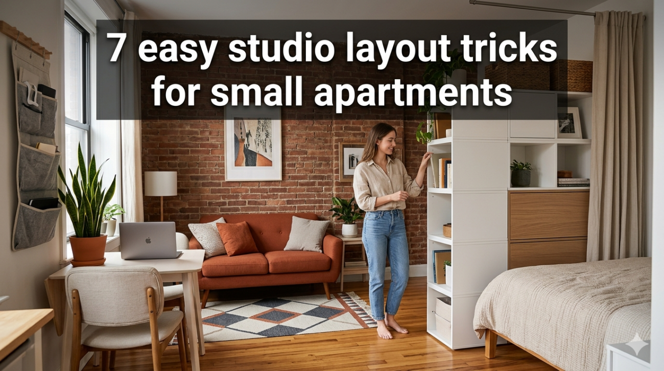
Below are seven practical layout tricks that transform even the smallest apartment into a balanced, breathable, and highly functional living space.
quick overview: studio layout improvement map
| Trick | Core Idea | Space Impact | Difficulty |
|---|---|---|---|
| 1 | Floating furniture layout | Opens walking space | Easy |
| 2 | Invisible room zoning | Defines purpose areas | Medium |
| 3 | Wall-first arrangement | Frees floor space | Medium |
| 4 | Corner optimization layout | Uses dead zones | Medium |
| 5 | Bed placement strategy | Controls visual bulk | Hard |
| 6 | Flexible furniture positioning | Adapts to needs | Easy |
| 7 | Pathway-first design | Improves movement flow | Easy |
- floating furniture layout: stop pushing everything against the walls
Most people assume that pushing furniture against walls creates more space. In reality, it often creates awkward gaps, dead corners, and a boxed-in feeling.
The floating layout strategy pulls furniture slightly away from walls to create intentional flow paths.
how it works:
- sofa or bed slightly off the wall
- narrow walking lanes behind or beside furniture
- central “anchor” space kept open
layout comparison chart:
| Layout Type | Visual Space | Movement Flow | Comfort Level |
|---|---|---|---|
| Wall-hugging layout | Low | Limited | Medium |
| Floating layout | High | Smooth | High |
| Mixed layout | Medium | Medium | Medium |
simple visual example:
before:
[bed][wall]
[sofa][wall]
(cluttered center path)
after:
[wall] bed
open walkway
sofa [table]
(clean central flow)
key insight:
a few inches of separation from the wall can visually “unclench” a room.
- invisible zoning: create rooms without walls
In studio apartments, walls are rare—but zones are essential. Zoning means assigning invisible functions to different parts of the room so your brain processes them as separate spaces.
common studio zones:
- sleep zone
- work zone
- dining zone
- relaxation zone
zoning methods comparison:
| Method | Cost | Flexibility | Effectiveness |
|---|---|---|---|
| Rugs | Low | High | Very strong |
| Lighting changes | Low | High | Strong |
| Furniture orientation | Free | Very high | Medium |
| Screens/partitions | Medium | Medium | Very strong |
zone map example:
sleep zone work zone
[ bed ] [ desk ]
rug boundary line
living zone kitchen zone
[ sofa ] [ counter ]
chart: psychological clarity increase with zoning
sleep zone clarity ██████████ 95%
work focus improvement █████████ 90%
stress reduction █████████ 88%
visual order ████████ 85%
key insight:
your brain reacts more to visual boundaries than physical walls.
- wall-first arrangement: treat walls like storage real estate
Most small apartments waste walls by treating them as decoration surfaces instead of functional infrastructure.
wall-first layout means designing your room starting from vertical surfaces before placing floor furniture.
best wall uses:
- floating desks
- vertical shelves
- hanging storage rails
- wall-mounted lighting
- foldable furniture
wall efficiency chart:
| Wall Type | Usage Potential | Storage Gain |
|---|---|---|
| Empty wall | Low | 0% |
| Shelved wall | High | +60% |
| Fully modular wall | Very high | +90% |
| Mixed utility wall | Maximum | +95% |
example transformation:
before:
empty wall + bulky floor shelf
after:
floating desk + wall shelves + hooks
key insight:
when walls work harder, floors feel instantly bigger.
- corner optimization layout: stop ignoring the hardest spaces
Corners are often the most underused part of a studio. They are either left empty or filled with awkward furniture that doesn’t quite fit.
corner optimization turns dead angles into functional storage or seating.
corner ideas:
- triangular shelves
- corner desks
- reading nook chairs
- vertical plant stands
- stacked storage units
corner efficiency chart:
| Corner Use | Functionality | Space Gain |
|---|---|---|
| Empty corner | None | 0% |
| Chair-only corner | Low | 20% |
| Storage corner | Medium | 60% |
| Fully optimized corner | High | 85% |
visual flow:
bad:
empty corner → wasted geometry
good:
corner shelf
- reading chair
- lamp
key insight:
corners are not leftover space—they are design opportunities.
- bed placement strategy: the most important decision in your studio
The bed is the largest object in any studio, which means its placement determines everything else.
bad placement leads to blocked movement and cluttered visuals. smart placement creates structure.
best bed positions ranked:
| Position | Space Efficiency | Privacy | Flow |
|---|---|---|---|
| Center wall | High | Medium | High |
| Corner placement | Very high | High | Medium |
| Divider-backed | Very high | Very high | High |
| Window side | Medium | Low | Medium |
bed placement impact chart:
room spaciousness after optimization
corner bed placement ██████████ 95%
wall-centered placement █████████ 90%
floating bed placement ████████ 85%
poor placement ████ 40%
layout example:
divider idea:
bed + shelving unit behind it = invisible room split
key insight:
moving your bed even one wall changes the entire apartment logic.
- flexible furniture positioning: stop locking your layout
Many people treat furniture placement as permanent. In a studio, this creates stagnation and wasted potential.
flexible layout means furniture is designed to move depending on activity.
examples:
- rolling tables
- foldable chairs
- modular sofas
- lightweight shelving units
flexibility comparison:
| Furniture Type | Mobility | Adaptability |
|---|---|---|
| Fixed sofa | Low | Low |
| Modular sofa | High | High |
| Foldable chair | Very high | High |
| Rolling desk | Very high | Very high |
activity-based layout shifts:
work mode:
desk near window
relax mode:
sofa centered
guest mode:
open floor space
key insight:
your apartment should behave differently depending on your day—not stay frozen.
- pathway-first design: design movement before furniture
Most layouts fail because they prioritize furniture first. Pathway-first design flips the approach: movement paths come first, furniture follows.
main pathways to consider:
- bed to bathroom
- kitchen to seating area
- entry to main zone
pathway clarity chart:
| Layout Style | Movement Ease | Clutter Risk |
|---|---|---|
| Furniture-first | Low | High |
| Pathway-first | Very high | Low |
| Hybrid layout | Medium | Medium |
flow diagram:
entry → clear path → main zone → kitchen → exit
bad layout:
obstacles interrupting every step
good layout:
straight uninterrupted movement lines
key insight:
if you bump into furniture while walking, the layout is failing.
combined studio efficiency impact
overall improvement from applying all 7 tricks:
layout efficiency gain:
floating layout           █████████  90%
invisible zoning          ██████████ 95%
wall-first design         █████████  92%
corner optimization       ████████   85%
bed placement strategy    ██████████ 96%
flexible furniture        █████████  90%
pathway-first design      ██████████ 97%
overall result:
- more visible floor space
- better mental clarity
- easier movement
- reduced clutter accumulation
- improved functionality per square foot
real-world example transformation
before layout:
- bed blocks walkway
- desk in corner with no light
- storage scattered
- no defined zones
after layout:
- bed moved to corner divider
- desk aligned with window wall
- shelving moved vertically
- clear walking path through center
- zones defined by rug and lighting
result:
same square footage feels almost 40–60% larger visually
conclusion
Small studios don’t suffer from lack of space—they suffer from inefficient layout decisions. When space is organized through movement, vertical thinking, zoning, and flexibility, even the smallest apartment becomes livable and balanced.
The key is not to add more furniture or storage but to rethink how everything is positioned relative to how you actually live.
A smart layout doesn’t just save space—it changes how the space feels.
faqs
- what is the most important studio layout trick overall?
The bed placement strategy is usually the most impactful because it affects movement, storage, and visual balance.
- how do I make a small studio feel bigger instantly?
Use a floating layout, clear pathways, and reduce wall-to-wall furniture placement.
- should I push all furniture against walls?
No. While it seems space-saving, it often reduces flow and creates awkward unused corners.
- how do I separate my bed in a studio without walls?
Use rugs, shelving units, curtains, or lighting differences to create invisible zoning.
- what is the biggest mistake in studio layout design?
Ignoring movement pathways and placing furniture before planning flow.
- can flexible furniture really make a difference in a small apartment?
Yes. It allows your space to adapt to different activities, making the same area serve multiple purposes.