There’s something deceptively simple about decorating a studio apartment. One open space, fewer walls, fewer decisions—at least that’s what it looks like at first glance. But anyone who has lived in or tried to style a studio knows the truth: it’s a delicate balancing act. Every choice carries more weight. A single bulky chair can throw off the entire flow. Poor lighting can shrink the room. Clutter becomes visible from every angle.
What makes studio decor particularly challenging is that the same space must serve multiple roles—bedroom, living room, workspace, sometimes even dining area. Without careful planning, these functions begin to collide rather than coexist.
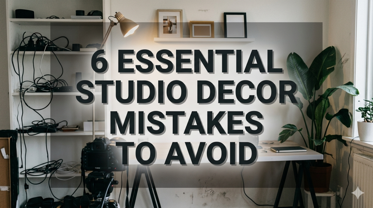
This article explores six essential studio decor mistakes that people often overlook, along with practical insights, real-life considerations, and structured guidance to help you avoid them. Along the way, you’ll find tables and visual-style breakdowns to make the ideas easier to apply.
mistake 1: ignoring zoning and treating the studio as one single space
One of the most common missteps is designing a studio as if it were just one large room without purpose divisions. This often leads to visual chaos, lack of privacy, and an overall feeling of discomfort.
Why zoning matters
Even without walls, your brain needs cues. When everything blends together—bed next to kitchen, desk beside wardrobe—the space feels disorganized. Zoning creates psychological separation, helping you relax, focus, or sleep more effectively.
Common signs of poor zoning:
- Bed visible from every angle
- No clear path for movement
- Work area blending into relaxation space
- Furniture pushed randomly against walls
Simple zoning techniques
You don’t need construction work to define zones. Small adjustments can dramatically improve layout clarity.
table: zoning methods and their effectiveness
| zoning method | cost level | space usage | visual impact | flexibility |
|---|---|---|---|---|
| area rugs | low | none | high | high |
| open shelving | medium | moderate | high | medium |
| curtains/dividers | low | low | medium | high |
| lighting separation | low | none | medium | high |
| furniture placement | none | optimized | high | medium |
Practical example
Instead of placing your bed directly facing the entrance, shift it to a corner and use a slim bookshelf or curtain to partially block the view. Add a rug under your “living area” and suddenly the room feels like two spaces instead of one.
mistake 2: choosing oversized furniture that overwhelms the room
Many people fall into the trap of buying furniture based on comfort or aesthetics without considering scale. A plush sofa might look beautiful in a showroom, but in a studio, it can dominate the entire layout.
The scale problem
Large furniture reduces walking space, blocks natural light, and makes the room feel smaller than it actually is. It also limits flexibility—you can’t easily rearrange things when everything is bulky.
table: ideal furniture proportions for studio spaces
| item type | recommended size guideline | common mistake |
|---|---|---|
| sofa | 2-seater or compact loveseat | full 3-seater sectional |
| bed | queen max (or storage bed) | king-size bed |
| coffee table | narrow or nesting tables | large rectangular heavy table |
| desk | wall-mounted or slim profile | executive desk |
| wardrobe | vertical, tall storage | wide horizontal units |
Smart alternatives
- Use multi-functional furniture (sofa beds, storage ottomans)
- Opt for furniture with exposed legs to create visual lightness
- Choose foldable or extendable pieces
Visual balance tip
Even if you prefer comfort, balance one larger piece with several lighter elements. For example, pair a loveseat with a slim side table instead of a bulky coffee table.
mistake 3: neglecting vertical space
When floor space is limited, vertical space becomes your greatest asset. Ignoring it leads to cluttered surfaces and wasted potential.
Why vertical design matters
Studios often have decent wall height. By not using it, you’re compressing everything into the lower half of the room, making it feel cramped.
Common vertical design misses:
- Bare walls with no storage or decor
- Overloaded floor shelves instead of wall-mounted ones
- Curtains hung too low, making ceilings appear shorter
chart: impact of vertical usage on perceived space
| vertical usage level | perceived room size | clutter level | storage efficiency |
|---|---|---|---|
| low | small | high | poor |
| moderate | balanced | medium | average |
| high | spacious | low | excellent |
How to use vertical space effectively
- Install floating shelves above eye level
- Use tall bookcases instead of wide ones
- Hang curtains close to the ceiling
- Add hooks or pegboards for functional storage
A subtle trick
Align vertical elements—like shelves and wall art—in a consistent line. This creates a structured, intentional look instead of scattered clutter.
mistake 4: poor lighting choices that flatten the space
Lighting is often treated as an afterthought, but in a studio, it’s one of the most powerful tools you have.
The single-light mistake
Relying on one overhead light creates harsh shadows and makes the space feel flat and uninviting. It also fails to support different activities like reading, working, or relaxing.
types of lighting you need
table: lighting layers and their roles
| lighting type | purpose | placement example |
|---|---|---|
| ambient | overall illumination | ceiling light |
| task | focused activity lighting | desk lamp, reading lamp |
| accent | mood and highlighting | LED strips, wall lights |
Layering strategy
- Combine warm and neutral light sources
- Use floor lamps in corners to soften edges
- Add under-shelf lighting for depth
Lighting zones
Match lighting to activity:
- Bright light near desk/workspace
- Soft warm light near bed
- Medium lighting in living area
mistake 5: overdecorating and creating visual clutter
In a small space, every decorative item competes for attention. Too many elements can overwhelm the room and make it feel chaotic.
The clutter illusion
Even if the room is physically clean, excessive decor can make it appear messy. This is especially true in studios where everything is visible at once.
Signs of overdecorating:
- Too many wall frames with no consistent theme
- Multiple color schemes clashing
- Decorative items covering every surface
table: balanced vs cluttered decor approach
| element | balanced approach | cluttered approach |
|---|---|---|
| wall art | 2–3 cohesive pieces | many unrelated frames |
| color palette | 2–3 main colors | 5+ competing colors |
| surfaces | selective decoration | fully covered |
| textiles | coordinated textures | random patterns |
Minimal doesn’t mean empty
The goal is not to remove personality but to curate it. Choose items that serve a purpose or tell a story.
A useful rule
For every new decorative item you add, consider removing one. This keeps the visual balance intact.
mistake 6: ignoring storage planning from the beginning
Storage is not something you fix later—it should be part of the initial design. Without proper storage, clutter builds up quickly.
The hidden problem
Many studios look great at first but become messy over time because there’s no designated place for everyday items.
chart: storage planning impact over time
| storage planning level | initial appearance | long-term organization |
|---|---|---|
| none | good | poor |
| partial | good | inconsistent |
| well-planned | excellent | sustainable |
Smart storage solutions
- Under-bed storage drawers
- Storage benches or ottomans
- Wall-mounted cabinets
- Hidden compartments in furniture
table: storage types and best uses
| storage type | best for | advantage |
|---|---|---|
| under-bed | seasonal items | hidden, space-saving |
| vertical shelves | books, decor | maximizes height |
| baskets/boxes | small loose items | easy organization |
| multi-use items | combined storage + seating | efficiency |
Planning ahead
Before buying furniture, ask:
- Where will daily-use items go?
- How often will I access them?
- Can this piece serve two purposes?
bringing it all together
Avoiding these six mistakes doesn’t require a huge budget or professional design skills. It’s about awareness and intentional choices. A studio can feel spacious, functional, and visually appealing when each element supports the others.
quick summary table
| mistake | core issue | quick fix |
|---|---|---|
| no zoning | lack of structure | use rugs, shelves, layout shifts |
| oversized furniture | poor scale | choose compact, multi-use items |
| ignoring vertical space | wasted potential | add shelves, tall storage |
| poor lighting | flat atmosphere | layer lighting types |
| overdecorating | visual clutter | simplify and curate |
| no storage planning | long-term mess | integrate storage early |
faqs
- how do i make my studio look bigger without renovation?
Focus on light colors, mirrors, vertical storage, and multi-functional furniture. Proper zoning and decluttering also create the illusion of more space. - what is the best bed placement in a studio apartment?
Place the bed in a corner or partially shielded area to create separation from living and working zones. Avoid placing it directly in the center. - how many colors should i use in a studio decor scheme?
Ideally, stick to 2–3 main colors with a few subtle accents. Too many colors can make the space feel chaotic. - is it better to have open or closed storage in a studio?
A mix of both works best. Open storage is great for frequently used or decorative items, while closed storage hides clutter. - how can i decorate without making the space feel crowded?
Choose fewer but meaningful decor pieces, maintain a consistent theme, and leave some empty space to let the room breathe. - what type of lighting is best for small studio apartments?
Layered lighting is ideal—combine ambient, task, and accent lighting to create depth and functionality.
In the end, a well-decorated studio is not about filling space—it’s about shaping it. Every choice should contribute to clarity, comfort, and purpose. Avoid these common mistakes, and your studio will not only look better but feel better to live in.