There’s a quiet satisfaction in walking into a space that feels refined, intentional, and expensive—only to know you achieved it without draining your wallet. Studio apartments, by their very nature, demand efficiency. Every object carries visual weight, and every design decision either elevates or diminishes the entire atmosphere. The good news is that creating a premium look isn’t about how much you spend; it’s about how thoughtfully you spend it.
What follows isn’t a list of trendy items or quick-fix hacks. Instead, it’s a deeper exploration of six budget-conscious decor ideas that consistently produce a high-end aesthetic when executed carefully. Along the way, you’ll find tables, comparisons, and structured insights that help you apply these ideas with clarity rather than guesswork.
- Strategic lighting that mimics luxury environments
Lighting is often the first thing people notice subconsciously. Expensive spaces rarely rely on a single harsh overhead bulb. Instead, they layer light in ways that create depth, warmth, and visual interest.
In a studio, this becomes even more important because lighting helps define zones—sleeping, relaxing, working—without physical walls.
A premium lighting setup typically includes three layers:
- Ambient lighting (overall brightness)
- Task lighting (focused areas like desks)
- Accent lighting (decorative glow)
You don’t need designer fixtures to achieve this. A mix of floor lamps, table lamps, and warm LED strips can replicate the effect convincingly.
Lighting impact comparison table:
| Lighting Type | Budget Option Example | Cost Range (USD) | Visual Impact Level | Placement Tip |
|---|---|---|---|---|
| Floor Lamp | Minimal metal lamp | 15–40 | High | Corner behind sofa or bed |
| Table Lamp | Ceramic or matte finish | 10–25 | Medium | Nightstand or desk |
| LED Strip Lights | Warm white strips | 5–15 | High | Behind TV, shelves, or headboard |
| Clip Light | Adjustable reading light | 8–20 | Medium | Workstation or bed edge |
A useful rule: aim for at least three light sources in a studio, even if it’s small. Warm tones (2700K–3000K) instantly make a space feel more expensive than cool white lighting.
- Neutral color palette with intentional contrast
Luxury interiors rarely overwhelm with color. Instead, they rely on restrained palettes—whites, beiges, greys, and muted tones—paired with deliberate contrast.
In a studio, a neutral base does two important things:
- It makes the space feel larger
- It allows small accents to stand out
This doesn’t mean everything should be plain. The trick is layering subtle variations within the same palette.
Example palette structure:
| Element | Suggested Color Range | Purpose |
|---|---|---|
| Walls | Off-white / warm white | Expands visual space |
| Sofa or Bed | Beige / soft grey | Anchors the room |
| Curtains | Light neutral tones | Maintains openness |
| Accent Pieces | Black / dark brown | Adds contrast and definition |
| Decorative Items | Gold / brass touches | Introduces a premium feel |
Even a small studio can look curated if the color scheme feels intentional. One mistake to avoid is mixing too many unrelated colors—it tends to create visual clutter, which instantly reduces the perceived value of a space.
- Multipurpose furniture that looks intentional, not improvised
Budget decor often fails not because of price, but because things look temporary or mismatched. Premium spaces, on the other hand, feel cohesive—even when they’re practical.
Multipurpose furniture is essential in studios, but it needs to look deliberate.
Instead of:
- Random storage bins
- Foldable plastic tables
- Visible clutter solutions
Aim for:
- Storage ottomans
- Sofa beds with clean lines
- Nesting tables
- Shelving units that double as room dividers
Furniture efficiency chart:
| Furniture Type | Function Count | Budget Range (USD) | Premium Effect Score | Best Use Case |
|---|---|---|---|---|
| Storage Ottoman | 2–3 | 20–50 | High | Seating + hidden storage |
| Sofa Bed | 2 | 80–200 | High | Living + sleeping |
| Nesting Tables | 2 | 25–60 | Medium | Flexible surface area |
| Open Shelving | 2–3 | 30–90 | High | Storage + visual divider |
A useful mindset shift: choose fewer pieces, but make each one count. Overfilling a studio with furniture makes even expensive items look cheap.
- Textures that add depth without adding clutter
Texture is one of the most overlooked elements in budget decor. When done right, it creates richness without requiring expensive materials.
Think of texture as the difference between a flat image and a layered one.
Ways to introduce texture affordably:
- Throw blankets with visible weave
- Cushions in mixed fabrics (linen, velvet-style, cotton)
- Rugs with subtle patterns
- Curtains with a soft drape
Texture layering guide:
| Layer Type | Example Material | Budget Tip | Visual Benefit |
|---|---|---|---|
| Soft Layer | Throw blanket | Choose neutral but textured fabric | Adds warmth |
| Mid Layer | Cushions | Mix 2–3 fabric styles | Creates depth |
| Ground Layer | Rug | Look for low-cost patterned rugs | Defines the space |
| Vertical Layer | Curtains | Full-length even in small studios | Adds height illusion |
A studio without texture feels unfinished, even if everything is technically “nice.” Texture bridges that gap.
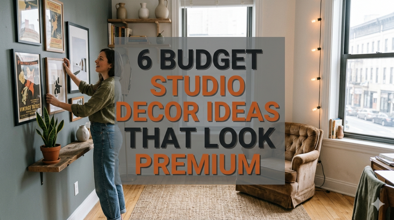
- Wall styling that avoids the “empty or overcrowded” problem
Walls are often either ignored or overloaded. Premium spaces strike a balance—intentional, but not excessive.
Budget-friendly wall decor ideas:
- A single large framed print instead of many small ones
- DIY gallery walls with consistent frames
- Floating shelves with minimal styling
- Mirrors to expand space visually
Wall decor comparison:
| Approach | Cost Level | Effort Level | Premium Feel | Risk Level |
|---|---|---|---|---|
| Large Statement Art | Medium | Low | High | Low |
| Gallery Wall | Low | Medium | High | Medium |
| Floating Shelves | Low | Medium | Medium | Low |
| Mirror Placement | Low | Low | High | Very Low |
A mirror placed opposite a window can double the perceived light in a studio, which instantly elevates the space.
One caution: avoid filling every wall. Empty space is part of the design—it signals confidence and restraint.
- Decluttering as a design strategy, not a chore
No amount of decor can compensate for clutter. In fact, clutter is one of the fastest ways to make a space feel cheap.
High-end interiors are not necessarily filled with expensive items—they are edited carefully.
A practical decluttering framework:
| Category | Keep Criteria | Remove Criteria |
|---|---|---|
| Daily Use Items | Used at least 3–4 times a week | Rarely used or duplicated |
| Decor Items | Matches color palette and theme | Random or mismatched |
| Furniture | Serves at least one clear function | Redundant or oversized |
| Storage | Hidden or aesthetically pleasing | Visible clutter containers |
Decluttering doesn’t mean minimalism for its own sake. It means making room for the elements that actually contribute to the look and feel you want.
A short practical checklist for premium transformation
Before finishing your setup, run through this quick evaluation:
| Question | Yes/No |
|---|---|
| Do you have at least three light sources? | |
| Does your color palette stay within 3–4 main tones? | |
| Does each furniture piece serve a clear purpose? | |
| Have you added at least two types of texture? | |
| Are your walls styled but not overcrowded? | |
| Is visible clutter minimized or hidden? |
If most answers are “yes,” your studio is likely already leaning toward a premium aesthetic.
Closing thoughts
A premium-looking studio isn’t built through one dramatic purchase. It’s the result of dozens of small, thoughtful decisions—how light falls across a surface, how colors interact, how space is used, and how restraint is practiced.
Budget limitations often force better creativity. When you can’t rely on expensive items, you begin to notice composition, balance, and proportion more carefully. Ironically, that’s exactly what defines high-end design.
The goal isn’t to imitate luxury—it’s to understand why certain spaces feel refined, and then recreate those principles using accessible tools.
FAQs
- Can a very small studio still look premium?
Yes. In fact, smaller spaces often look more polished when designed well because every element is visible and intentional. Focus on lighting, color consistency, and clutter control. - What is the biggest mistake in budget studio decor?
Trying to include too many elements at once. Overcrowding reduces visual clarity and makes even good items look cheap. - Are DIY decor items a good idea for a premium look?
They can be, but only if they look clean and intentional. Poorly finished DIY projects tend to stand out in a negative way. - How much should I realistically spend to upgrade a studio?
A noticeable upgrade can often be achieved within 100–300 USD if you focus on lighting, textiles, and small furniture adjustments. - Do plants help make a studio look more expensive?
Yes, even a few well-placed plants can add life and contrast. Just avoid overcrowding or using too many mismatched pots. - Is it better to buy everything at once or gradually?
Gradually. Buying everything at once often leads to mismatched decisions. Building your space step by step allows for better cohesion.