There’s something oddly personal about a studio apartment. It’s not just a living space—it’s your bedroom, your workspace, your dining area, and sometimes even your escape from everything else. When I first moved into mine, I underestimated how much design decisions would shape my daily mood, productivity, and even sleep quality.
At first glance, it was just a plain room with white walls, a small window, and barely enough space to stretch without bumping into something. But over time, I made seven intentional decor changes. None of them were outrageously expensive or overly complex. Yet together, they transformed the space in ways I didn’t expect.
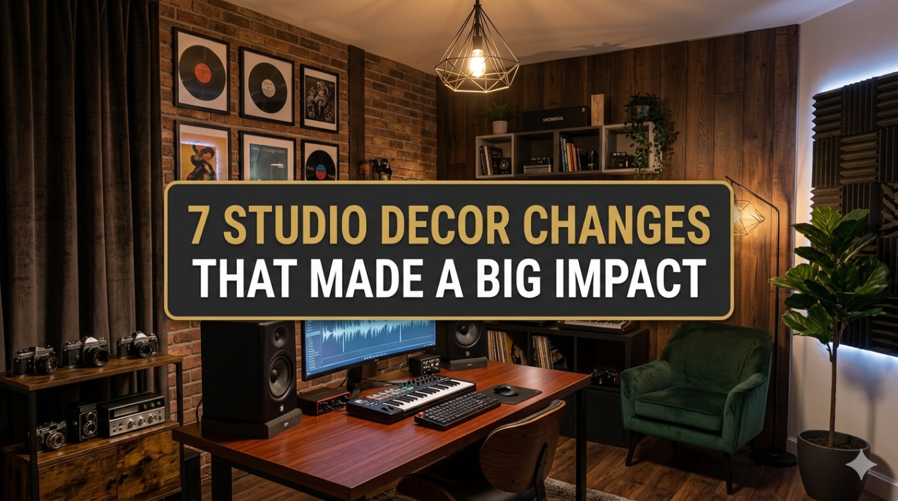
This is a detailed breakdown of those changes, how I implemented them, and why they worked so well.
change 1: redefining the layout instead of adding more furniture
The first instinct when a studio feels incomplete is to buy more furniture. I almost made that mistake. What I actually needed was to rethink how the existing space was being used.
Initially, my bed was pushed against the wall, my desk was awkwardly placed near the door, and there was no clear separation between “zones.” Everything blended into one undefined area.
I started by sketching a simple layout. Then I shifted things around:
- Moved the bed slightly away from the wall to create breathing room
- Rotated the desk to face the window instead of the wall
- Positioned a small rug to visually define the sleeping area
The result wasn’t just aesthetic—it changed how I used the space.
layout impact comparison table:
| element | before change | after change | impact level |
|---|---|---|---|
| bed placement | tight against wall | slightly centered | high |
| desk orientation | facing wall | facing window | high |
| zoning | none | defined by rug/spacing | very high |
| walking space | cluttered | more open pathways | medium |
The key insight here was that space planning matters more than square footage.
change 2: upgrading lighting from functional to layered
Lighting was originally just a single overhead bulb. It did the job, but it made everything feel flat and slightly harsh.
I introduced three types of lighting:
- ambient lighting (warm ceiling light)
- task lighting (desk lamp)
- accent lighting (floor lamp + LED strip behind the bed)
This layering added depth to the room. More importantly, it allowed me to control the mood depending on the time of day.
lighting effect chart:
| lighting type | purpose | emotional effect |
|---|---|---|
| ambient | general visibility | neutral / balanced |
| task | focused work | alert / productive |
| accent | aesthetics | calm / cozy |
One unexpected benefit was better sleep. Warmer lighting in the evening reduced the harshness that used to keep me mentally “on.”
change 3: using textiles to soften the environment
Before, everything felt hard—wood, metal, plain walls. It lacked warmth.
I added:
- a medium-sized rug
- thicker curtains
- textured cushions
- a soft throw blanket
These elements didn’t just make the studio look better—they changed how it felt physically.
texture layering breakdown:
| item | material type | effect on space |
|---|---|---|
| rug | woven fabric | anchors area + warmth |
| curtains | heavy cotton | sound dampening + softness |
| cushions | mixed | visual comfort |
| throw blanket | fleece | tactile coziness |
The room became quieter, warmer, and more inviting. It stopped feeling temporary.
change 4: introducing vertical storage instead of horizontal clutter
Floor space is precious in a studio. I realized I was wasting vertical space entirely.
So I added:
- wall-mounted shelves
- a tall bookshelf instead of a wide one
- hooks for everyday items
This simple shift reduced clutter dramatically.
space efficiency comparison:
| storage type | floor usage | storage capacity | visual impact |
|---|---|---|---|
| horizontal units | high | medium | bulky |
| vertical units | low | high | streamlined |
The room felt taller and cleaner almost instantly. Less stuff on the floor made everything easier to navigate.
change 5: creating a focal point instead of scattered decor
At one point, I had random decor items everywhere—small frames, plants, objects—but nothing stood out.
So I decided to create one focal point: a wall above the bed.
I arranged:
- three framed prints
- a small wall light
- a trailing plant
Instead of decorating every corner, I concentrated visual interest in one place.
focal point strategy chart:
| approach | result |
|---|---|
| scattered decor | cluttered, unfocused |
| single focal point | intentional, cohesive |
This made the studio feel designed rather than decorated.
change 6: adding greenery for life and contrast
Plants were something I delayed adding, assuming they’d be high maintenance. That turned out to be wrong.
I started small:
- one snake plant
- one pothos
- a tiny desk succulent
Benefits were immediate:
- improved air freshness (perceived)
- added color contrast
- softened hard edges
plant impact overview:
| plant type | maintenance level | visual impact | placement |
|---|---|---|---|
| snake plant | low | strong | corner |
| pothos | low | cascading | shelf |
| succulent | very low | subtle | desk |
The space felt alive in a way that furniture alone couldn’t achieve.
change 7: limiting color palette for cohesion
Initially, I had no clear color direction. Items were added randomly—different tones, mismatched finishes.
I simplified everything to a palette:
- base: white and beige
- accents: muted green and black
- textures: natural wood
color cohesion table:
| category | chosen tones | effect |
|---|---|---|
| base | white / beige | openness, light |
| accents | green / black | contrast, depth |
| materials | wood | warmth, natural feel |
Once I committed to this palette, everything started to look intentional—even older items.
combined impact analysis
When I look at all seven changes together, the biggest transformation wasn’t visual alone. It was behavioral.
combined improvement chart:
| aspect | before | after |
|---|---|---|
| comfort level | moderate | high |
| productivity | inconsistent | stable |
| visual clarity | cluttered | cohesive |
| mood | neutral | calm / positive |
| usability | limited | efficient |
The studio didn’t just look better—it worked better.
lessons learned from the process
- small changes compound over time
- layout matters more than decoration
- lighting can completely alter perception
- cohesion beats variety in small spaces
- functionality and aesthetics should align
Perhaps the most important takeaway was that design isn’t about filling space—it’s about shaping experience.
faq section
- how do i start improving my studio without spending much money
Start with layout and decluttering. Rearranging furniture and removing unnecessary items can create immediate improvement without any cost. - what is the most important decor change in a small studio
Layout and lighting tend to have the biggest impact. They influence both how the space looks and how it feels to live in. - how many colors should i use in a studio apartment
Limiting to 2–4 main tones usually works best. Too many colors can make a small space feel chaotic. - are plants necessary for a good interior
Not necessary, but highly beneficial. Even one or two plants can add life, contrast, and a sense of calm. - how can i make my studio feel bigger
Use vertical storage, keep floor space clear, and maintain a consistent color palette. Mirrors and lighting also help. - how do i avoid clutter while decorating
Focus on fewer, more meaningful items. Create focal points instead of spreading decor everywhere.
In the end, these seven changes weren’t about following trends. They were about paying attention to how the space responded—and adjusting accordingly. That’s what made the impact feel real and lasting.