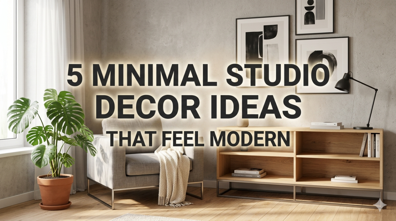
Living in a studio apartment often means balancing style with function in a very limited space. The challenge is not just to make it look good, but to ensure it feels open, breathable, and practical. Minimalist decor is one of the most effective ways to achieve that balance. It focuses on clarity, simplicity, and intentional design choices that avoid clutter while still reflecting personality.
This article explores five minimal studio decor ideas that feel modern, practical, and visually appealing, along with structured tables, comparisons, and actionable insights you can actually apply.
- Neutral foundation with layered textures
A modern minimalist studio always starts with a strong neutral base. But “neutral” doesn’t mean boring. It means controlled color harmony that allows textures to do the visual storytelling.
Instead of filling the room with color, you build depth through materials like linen, wood, stone, cotton, and matte finishes.
Common neutral base combinations:
| Base Color | Supporting Texture | Resulting Mood |
|---|---|---|
| Warm white | Oak wood + linen | Calm and cozy |
| Soft beige | Wool + rattan | Natural and earthy |
| Light gray | Concrete + metal | Modern and urban |
| Off-white | Cotton + glass | Airy and clean |
Why this works in a studio:
- Makes small spaces feel bigger
- Reduces visual noise
- Allows flexibility in accents later
- Creates a timeless foundation
Practical tip:
If your studio feels flat, don’t add more color—add texture contrast instead. A woven rug, a knitted throw, or matte ceramic decor can completely change the feel without cluttering the space.
- Multi-functional furniture with clean lines
In a studio apartment, every piece of furniture should justify its existence. Minimal modern decor strongly relies on furniture that serves more than one purpose.
The goal is simple: reduce items, increase function.
Examples of smart multi-functional furniture:
| Furniture Type | Function 1 | Function 2 | Benefit |
|---|---|---|---|
| Sofa bed | Seating | Sleeping | Saves bedroom space |
| Storage ottoman | Seating | Storage | Reduces clutter |
| Foldable dining table | Dining | Workspace | Flexibility |
| Wall-mounted desk | Work area | Fold-away surface | Frees floor space |
Design principles to follow:
- Prefer straight or slightly curved edges
- Avoid bulky or ornate frames
- Stick to 1–2 materials per piece
- Choose light visual weight furniture (legs instead of solid bases)
Impact on studio layout:
A well-planned multi-functional setup can reduce furniture count by 30–40% while improving usability.
- Vertical space optimization (walls are your second floor)
One of the most overlooked aspects of studio living is vertical space. Most people focus only on floor layout, but walls can dramatically increase storage and design impact without crowding the room.
Key vertical design strategies:
- Floating shelves instead of floor cabinets
- Wall-mounted lighting instead of lamps
- Hanging plants instead of floor pots
- Pegboards for flexible organization
Vertical usage comparison:
| Storage Method | Floor Space Used | Storage Capacity | Visual Impact |
|---|---|---|---|
| Floor shelves | High | Medium | Heavy |
| Floating shelves | None | Medium | Light |
| Wall cabinets | Low | High | Moderate |
| Pegboards | None | Flexible | Modern |
Why vertical design feels modern:
- Creates visual height
- Keeps floor area open
- Adds architectural interest
- Encourages organized living
A simple rule:
If it touches the floor and doesn’t need to, move it to the wall.
- Minimal color accents (controlled personality)
Minimal does not mean colorless. The modern approach is to keep 80–90% of the space neutral and use 10–20% for intentional accents.
These accents should feel curated, not scattered.
Popular minimal accent directions:
| Accent Style | Colors Used | Best For |
|---|---|---|
| Earth tones | Olive, clay, sand | Warm interiors |
| Monochrome | Black, gray, white | Modern urban studios |
| Muted pastels | Dusty pink, sage | Soft aesthetic |
| Metallic accents | Brass, matte black | Industrial modern |
Where to apply accents:
- Cushions and throws
- Small wall art
- Lamps or fixtures
- Rugs or runners
What to avoid:
- Too many accent colors at once
- Large bold furniture in bright tones
- Random decorative objects with no theme
Design insight:
Consistency beats variety in minimal spaces. One strong accent theme is more powerful than multiple scattered ideas.
- Invisible storage and visual decluttering systems
A modern minimal studio is not just about looking clean—it is about being structured in a way that hides chaos naturally.
Invisible storage means everything has a place, but nothing looks “stored.”
Storage hierarchy:
| Storage Type | Visibility | Use Case |
|---|---|---|
| Closed cabinets | Invisible | Daily clutter |
| Drawer systems | Hidden | Personal items |
| Baskets/boxes | Semi-visible | Quick access items |
| Open shelves | Visible | Decorative essentials |
Decluttering strategy:
- Keep surfaces at 70% empty minimum
- Limit countertop items to essentials only
- Use matching storage containers
- Rotate decor instead of adding more
Psychological impact:
Clean visual environments reduce cognitive load and make small spaces feel significantly larger.
Bonus comparison: Minimal vs cluttered studio impact
| Feature | Minimal Studio | Cluttered Studio |
|---|---|---|
| Perceived space | Larger | Smaller |
| Cleaning time | Low | High |
| Stress level | Lower | Higher |
| Visual focus | Clear | Distracted |
| Design longevity | Timeless | Trend-dependent |
Design flow summary table
Here’s how a modern minimal studio evolves step-by-step:
| Stage | Focus | Result |
|---|---|---|
| 1 | Neutral base | Visual calmness |
| 2 | Functional furniture | Space efficiency |
| 3 | Vertical design | Expanded storage |
| 4 | Accent control | Personality |
| 5 | Hidden storage | Clean finish |
Practical layout example (small studio)
| Zone | Furniture | Purpose |
|---|---|---|
| Sleeping area | Sofa bed + wall shelf | Rest |
| Work area | Foldable desk | Productivity |
| Dining area | Compact table | Eating/work |
| Storage zone | Vertical shelves | Organization |
This type of layout ensures no wasted corners and maintains open movement paths.
Common mistakes in minimal studio decor
- Buying too many “small decor items” thinking they don’t count as clutter
- Using oversized furniture that overwhelms space
- Mixing too many materials without a visual system
- Ignoring lighting layers (ambient, task, accent)
- Filling every empty corner instead of leaving breathing space
Final insight
Minimal studio decor is not about emptiness. It is about intentional living—where every object has a reason to exist, and every design choice supports clarity and function. When done properly, minimalism doesn’t reduce comfort; it increases it by removing unnecessary visual and physical noise.
FAQs
- Is minimal decor suitable for very small studio apartments?
Yes, it works especially well because it reduces clutter and makes the space feel larger and more open. - What colors work best for a modern minimal studio?
Neutrals like white, beige, gray, and soft earth tones work best, often paired with one accent color. - How do I decorate a studio without making it feel empty?
Use texture layering, lighting variation, and a few intentional accent pieces instead of filling space with items. - What type of furniture is best for minimal studio design?
Multi-functional furniture like sofa beds, foldable tables, and storage ottomans are ideal. - How can I make a studio feel modern without spending too much?
Focus on decluttering, rearranging layout, using vertical storage, and updating textiles like rugs and cushions. - What is the biggest mistake in minimal studio decor?
Over-decorating with small items instead of focusing on structure, storage, and spatial balance.