A studio room is never just “a room.” It’s a workspace, a storage unit, a creative corner, and often a living space all at once. That mix is exactly why layout matters more than decoration. I learned this the hard way—no matter how clean I made things, the space still felt tight, chaotic, and mentally draining.
The real shift happened when I stopped thinking about “decorating” and started thinking about “restructuring flow.” These six layout changes didn’t just improve how my studio looked—they completely changed how I moved, worked, and thought inside it.
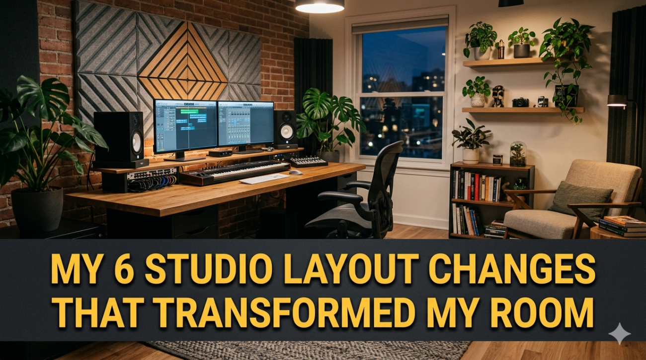
- Repositioning the work zone to natural light
The first major change was moving my main work desk directly into natural light instead of keeping it against a wall for symmetry or tradition.
Before, my desk was placed in a corner. It looked neat, but it created a subtle sense of isolation and fatigue, especially during long hours.
After repositioning it near the window, everything changed—energy, focus, even how long I could comfortably work.
Layout comparison:
| Factor | Old Layout (Corner Desk) | New Layout (Window-Facing Desk) |
|---|---|---|
| Light exposure | Artificial only | Natural + artificial |
| Eye strain | High | Reduced |
| Mood | Flat | Energized |
| Productivity duration | 2–3 hours | 4–6 hours |
| Space feeling | Closed | Open |
Why this works:
Natural light influences circadian rhythm and reduces visual fatigue. But beyond science, there’s also psychological openness. Facing light makes the room feel less boxed in, even if the square footage hasn’t changed.
The key lesson here wasn’t just placement—it was alignment with natural energy flow instead of forcing artificial structure.
- Creating a dedicated “movement corridor”
One of the most underrated layout mistakes in small studios is blocking natural walking paths with furniture.
I used to place storage boxes, a chair, or even decor items wherever they fit. That made the room feel functional in theory, but restrictive in practice.
The solution was to create a clear “movement corridor”—a direct path from entrance to main zones.
Before vs After Flow Map:
Before:
Entrance → obstacle (chair) → desk → storage → tight turn → bed
After:
Entrance → clear path → desk zone → storage zone → rest zone
Space efficiency chart:
| Movement Factor | Before Change | After Change |
|---|---|---|
| Walking ease | Interrupted | Smooth |
| Visual clutter | High | Minimal |
| Accident risk | Moderate | Low |
| Cleaning speed | Slow | Fast |
Why this matters:
Your brain interprets physical obstruction as mental friction. Even small obstacles add subconscious stress. Once the corridor was cleared, the entire studio felt larger—even though nothing was removed.
- Splitting the room into functional micro-zones
Instead of treating the studio as one continuous space, I divided it into micro-zones based on activity type.
This wasn’t about walls or dividers—it was about invisible structure.
Zones I created:
- Focus zone (work/desk)
- Creative zone (drawing/brainstorming)
- Storage zone (rare-use items)
- Relax zone (reading/rest)
- Utility zone (charging/tools)
Zone function table:
| Zone | Purpose | Key Items | Time Spent |
|---|---|---|---|
| Focus | Deep work | Laptop, notebook | High |
| Creative | Idea generation | Sketchpads, markers | Medium |
| Storage | Long-term items | Boxes, files | Low |
| Relax | Mental reset | Chair, lamp | Medium |
| Utility | Support tasks | Chargers, tools | Low |
Why it transformed the room:
Instead of everything competing for attention, each activity now had a “home.” This reduced mental switching fatigue and made transitions smoother.
It also stopped the habit of spreading items across the entire room.
- Moving storage vertically instead of horizontally
At one point, my studio looked organized—but still felt crowded. The problem wasn’t clutter. It was footprint saturation.
Every surface was used:
- Floor storage
- Desk storage
- Side table storage
So I changed direction entirely and moved storage upward.
Vertical conversion breakdown:
| Storage Type | Old Position | New Position |
|---|---|---|
| Books | Desk stack | Wall shelves |
| Supplies | Floor boxes | Hanging organizers |
| Files | Drawer pile | Vertical rack |
| Decor items | Flat surfaces | Wall-mounted display |
Space impact chart:
| Metric | Before | After |
|---|---|---|
| Floor space usage | 85% | 40% |
| Surface clutter | High | Low |
| Visual openness | Low | High |
| Cleaning effort | High | Medium |
Why it works:
Horizontal storage competes with usable space. Vertical storage frees breathing room without reducing capacity.
This shift made the studio feel like it “expanded” without any physical renovation.
- Rotating furniture instead of replacing it
I used to think improving layout meant buying new furniture. That was expensive and unnecessary.
Instead, I started rotating and reorienting what I already had.
Examples:
- Turning desk perpendicular instead of facing wall
- Rotating bed away from main entrance view
- Angling chair toward natural light
- Moving shelf behind door instead of beside desk
Rotation impact table:
| Change Type | Effort | Visual Impact | Functional Impact |
|---|---|---|---|
| Desk rotation | Low | High | High |
| Bed reposition | Medium | High | Medium |
| Shelf movement | Low | Medium | High |
| Chair angle change | Very low | Medium | Medium |
Why this is powerful:
Furniture orientation controls perception more than furniture quantity. A rotated room feels new even if nothing is added or removed.
This was one of the highest-impact, lowest-cost changes I made.
- Creating “visual silence zones”
Even when a studio is organized, too many visible objects can overload the brain.
So I created intentional empty zones—areas that contain nothing but space.
These became visual reset points for the eyes.
Types of visual silence zones:
- Empty wall section
- Clear desk corner
- Blank shelf space
- Minimal floor patch near entry
Visual density comparison:
| Area Type | Before | After |
|---|---|---|
| Wall usage | Fully filled | 30–50% empty |
| Desk surface | Crowded | Half-clear |
| Shelves | Packed | Balanced |
| Floor corners | Used for storage | Kept empty |
Why this matters psychologically:
The brain doesn’t just process objects—it processes density. Too much visual input creates fatigue even if everything is technically “organized.”
Empty space acts like a pause button for attention.
Combined transformation overview
When all six changes worked together, the studio stopped behaving like a cluttered room and started functioning like a system.
System comparison:
| Category | Before Changes | After Changes |
|---|---|---|
| Navigation | Confusing | Intuitive |
| Energy level | Inconsistent | Stable |
| Productivity | Interrupted | Flow-based |
| Cleaning time | High | Low |
| Visual experience | Dense | Balanced |
Flow improvement diagram:
Old system:
Clutter → distraction → delay → stress → more clutter
New system:
Structure → clarity → smooth flow → maintenance → stability
Key insights from the transformation
- Layout matters more than decoration
- Space feels larger when flow is improved, not when items are removed
- Furniture orientation can change emotional response
- Empty space is not wasted space—it is functional breathing room
- Vertical thinking unlocks hidden capacity in small rooms
FAQs
- What is the most impactful change from all six?
The most impactful change is creating a movement corridor. It immediately improves flow and makes the entire space feel more usable.
- Do I need to buy new furniture to improve my layout?
No. Most improvements come from repositioning existing furniture rather than replacing it.
- How do I know where to place zones in a small studio?
Start with your most frequent activity (usually work or sleep), then build other zones around natural movement paths.
- Can vertical storage work in very small rooms?
Yes, and it actually works better in small rooms because it frees up limited floor space.
- Why do empty spaces matter in a room design?
Empty spaces reduce visual overload and give the brain resting points, improving focus and comfort.
- How long does it take to fully implement these layout changes?
Most people can complete the layout restructuring in a few hours, but optimizing flow may take a few days of adjustment.