

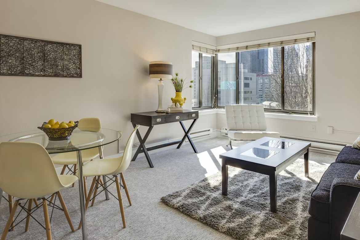
Scrolling through Pinterest at midnight while sitting in my cramped studio apartment, surrounded by mismatched furniture and a color scheme I’d describe as “accidental beige” — that was my wake-up call.
I’d lived in my studio for almost eight months before I realized I hadn’t actually decorated it. I’d just moved stuff in and called it a day. The place was functional, sure. But it felt like a storage unit that I also happened to sleep in.
So I started paying attention. I followed small-space interior accounts, watched way too many apartment tours on YouTube, and eventually started experimenting on my own walls, shelves, and corners. What I noticed over time was that there were clear patterns — specific trends that kept showing up in the best-looking small apartments, over and over again.
These aren’t passing fads. They’re smart, practical design choices that happen to look really good. Here are the eight that are genuinely taking over right now.
1. Japandi — The Aesthetic That Makes Small Spaces Breathe
If you haven’t heard this word yet, you will soon. Japandi is the lovechild of Japanese minimalism and Scandinavian coziness (hygge, if you want the buzzword). It’s warm but clean. Simple but intentional. And it works incredibly well in studios.
The core idea is: fewer things, better things, neutral palette, natural materials.
When I started leaning into this aesthetic — swapping out my chunky dark furniture for a low-profile platform bed, adding a jute rug, and pulling in some light wood tones — my apartment instantly felt twice the size. Not because anything changed structurally, but because the visual noise dropped dramatically.
How to get the look without overspending:
- Stick to a palette of warm whites, soft greys, and earthy browns
- Swap loud throw pillows for simple linen ones
- Add one or two natural elements: a wooden bowl, a woven basket, a small clay pot
- Remove anything decorative that doesn’t actually bring you calm
The restraint is the point. Resist the urge to fill every surface.
2. Arched Everything — Doorways, Mirrors, Shelves, You Name It
This one caught me off guard because I didn’t expect a shape to make such a difference.
Arched mirrors, arched shelving units, arched cabinet inserts — they’re everywhere right now, and there’s a reason. Curved lines soften a space. In a studio where you’ve got a lot of hard corners and straight edges (walls, furniture, windows, doors), one arched mirror can completely change the energy of a room.
I picked up an arched full-length mirror from a small home goods shop for around $60. Leaned it against the wall near my window. It bounced light around the room, made the ceiling look taller, and honestly just looked cool in a way that’s hard to explain until you see it.
Arched shelving units are the functional version of this trend. They give you storage while also acting as a visual focal point — which is exactly what a studio needs, since you don’t have multiple rooms to draw the eye.
Where arched pieces work best in a studio:
- Leaning mirror near a window for light reflection
- Arched bookshelf in a corner as a room divider
- Small arched wall shelf above a desk or nightstand
3. Maximalist Gallery Walls Done Right
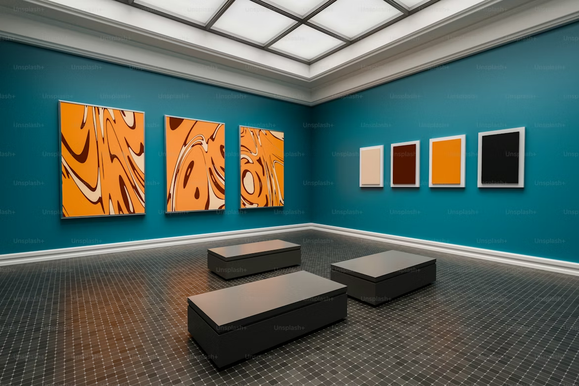
Wait — maximalism? In a small space?
Hear me out. The old rule was “keep small rooms minimal or they’ll feel cluttered.” And there’s truth in that. But a well-executed gallery wall actually does something clever: it gives the eye a designated place to go, which paradoxically makes the rest of the room feel more spacious and intentional.
The key word is executed. A random scatter of frames in different sizes, finishes, and themes looks chaotic. A gallery wall with a consistent frame color (all black, all natural wood, all white), thoughtful spacing, and a cohesive theme looks like design.
I did mine with all black frames, a mix of vintage botanical prints I found on Etsy for about $3–$5 each, and a couple of personal photos. Total cost: under $80 including the frames. It became the most-commented-on part of my apartment when friends visited.
Steps to build a gallery wall that works:
- Pick one frame color and stick to it
- Choose a theme (travel photos, botanicals, abstract art, black-and-white portraits — pick one)
- Lay it out on the floor first to find your arrangement
- Use paper templates taped to the wall before hammering anything
- Keep spacing consistent — 2–3 inches between frames is the sweet spot
For renters worried about nail holes, Command strips work for lighter frames. For heavier ones, look into the adhesive picture-hanging strips from 3M — they’re genuinely strong and remove cleanly.
4. Biophilic Design — Plants as Actual Decor Strategy
I used to think having plants was just a personality trait. Turns out it’s a full-on interior design philosophy called biophilic design, and small apartment designers are going deep on it.
The idea is simple: bringing natural elements indoors — plants, natural light, wood, stone — makes a space feel more alive and less box-like. In a studio where you’re surrounded by walls and manufactured surfaces all day, even a few plants can genuinely shift the mood.
But here’s the part most people skip: placement matters as much as the plants themselves.
A cluster of plants in one corner creates a visual “zone” — suddenly that corner has a purpose and identity. A trailing pothos on a high shelf draws the eye upward, which makes ceilings feel taller. A single statement plant (like a fiddle leaf fig or a monstera) acts as a natural focal point that competes with furniture in the best way.
If you’re not a natural plant parent (I am not, historically), start with:
- Pothos — basically unkillable, trails beautifully
- Snake plant — thrives on neglect, looks architectural
- ZZ plant — tolerates low light and infrequent watering
For wall-mounted planters or hanging options that don’t require drilling, check out 5 Wall Shelving Space Hacks for a Quick Studio Apartment — some of those shelving ideas double perfectly as plant display solutions.
5. Curtains Hung High and Wide — The Illusion Trick Designers Swear By
This is one of those things that sounds too simple to be true, but the difference is genuinely dramatic.
Most people hang curtains just above the window frame, at the exact width of the window. Interior designers hang them at ceiling height (or as close as possible) and extend the rod 8–12 inches beyond the window frame on each side.
The result? Your window looks enormous. Your ceiling looks taller. Your entire room feels bigger — without changing a single thing structurally.
I did this in my studio and it looked like a renovation. The window I’d always thought of as small suddenly looked like a proper feature. And because the curtains frame the natural light rather than covering it, the room felt brighter too.
Quick guide to the high-and-wide curtain trick:
- Mount the rod 4–6 inches below the ceiling (or right at crown molding if you have it)
- Extend the rod 10–12 inches past the window frame on each side
- Choose curtains long enough to touch or slightly pool on the floor
- Go with light, airy fabrics for maximum effect (linen, cotton voile)
Budget tip: IKEA’s LENDA curtains are a go-to for this. They’re cheap, they come in long lengths, and they look way more expensive than they are.
6. Multi-Tonal Neutral Palettes — Beyond “Just Paint It White”
For a long time, the advice for small spaces was paint everything white. And yes, white makes spaces feel bigger. But pure white can also feel cold, clinical, and frankly a little sad in a tiny apartment.
The trend that’s taken over now is layered neutrals — using two to four tones from the same neutral family to create depth and warmth without introducing visual clutter.
Think: warm greige walls, off-white trim, a sand-toned sofa, and a camel throw. Everything is technically neutral, but the room has dimension. It feels designed rather than defaulted.
| Color Combination | Mood It Creates |
|---|---|
| Warm white + greige + camel | Cozy, earthy, Scandi-warm |
| Cool white + soft grey + slate blue | Clean, calm, modern |
| Cream + terracotta + rust | Boho-warm, textured, Mediterranean |
| Off-white + sage + warm wood | Natural, airy, Japandi-adjacent |
The key is staying within the same temperature family — either warm or cool — and letting texture (linen, jute, velvet) do the work of creating contrast.
For renters who can’t repaint, this approach works just as well through textiles, furniture choices, and accessories. You don’t need to touch the walls.
7. Functional Furniture That Looks Like Decor
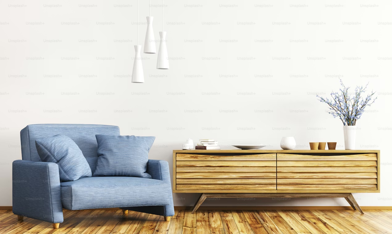
This one has quietly become a defining feature of well-designed studio apartments, and once you see it you can’t unsee it.
The best studios don’t look like they’re trying to hide their functional pieces. They feature them. A beautiful wooden ladder leaning against the wall is the towel rack. A rattan trunk at the foot of the bed is the storage solution. A sleek bar cart isn’t just for drinks — it holds books, plants, and a candle.
The shift is from hiding functionality to celebrating it. And it works especially well in studios where you genuinely can’t afford to have furniture that only does one thing.
Some of my favorite dual-purpose decor pieces right now:
- Ottomans with storage — seating, footrest, and hidden compartment
- Floating shelves with integrated lighting — display and task lighting in one
- Decorative baskets and bins — they look intentional while holding the chaos
- A bench at the entryway — seating for putting on shoes, storage underneath, visual separator for the “entry zone”
If you want to go deeper on how functional furniture transforms a studio layout, 8 Mighty Studio Apartment Hacks for Open Floor Plans has some really solid ideas for making every piece count.
8. Warm Ambient Lighting — The Fastest Decor Upgrade in Existence
I’ve saved this one for last because it’s the easiest, most affordable, and most immediately impactful trend on this whole list.
Overhead lighting — that one flat ceiling fixture that came with your apartment — is the enemy of cozy. It flattens everything, makes the room feel like a waiting room, and washes out all the nice textures and colors you’ve worked to build.
The trend right now is layered warm lighting: multiple light sources at different heights, all on the warmer end of the spectrum (think candlelight, not fluorescent).
The layered lighting formula for a studio:
- One floor lamp in a corner for ambient fill
- Desk or bedside lamp for task lighting
- LED strip lights under shelves or behind furniture for depth
- A few Edison bulb string lights or a small table lamp for warmth
Switch any existing bulbs to warm white (2700K). It costs $8–$12 and transforms the entire atmosphere of your space after 6pm.
The difference between a studio that feels like a home and one that feels like a dorm room is often just the lighting. No exaggeration.
For more ways to combine smart decor and storage thinking without spending much, 12 Proven Studio Apartment Space Hacks Using Dollar Store Finds is worth a look — you’d be surprised how many lighting and decor hacks involve items under $5.
Mistakes I Made (So You Don’t Have To)
Trying to do all of these at once is the fastest way to end up with a chaotic, half-finished space and an empty bank account. Trust me — I tried.
Pick one trend and implement it fully before moving to the next. A single well-executed change (like redoing your lighting or hanging curtains correctly) does more for a space than six half-baked attempts.
Also: don’t buy trending pieces just because they’re trending. That arched mirror is gorgeous, but if it doesn’t fit your space or color palette, it’ll look out of place and you’ll resent it. Always ask: does this work for my space specifically?
And finally — photos lie. What looks amazing in a staged Instagram apartment photo doesn’t always translate to a real lived-in studio. Before buying any statement piece, measure your space, check the scale, and visualize it in context.
How These Trends Stack Up
| Trend | Effort Level | Budget Impact | Visual Impact |
|---|---|---|---|
| Japandi Aesthetic | Medium | Low–Medium | Very High |
| Arched Pieces | Low | Medium | High |
| Gallery Wall | Medium | Low | High |
| Biophilic / Plants | Low | Very Low | Medium–High |
| High-Wide Curtains | Low | Low | Very High |
| Layered Neutrals | Medium | Low | High |
| Functional Furniture | Medium | Medium | High |
| Warm Ambient Lighting | Low | Very Low | Very High |
The trends with the highest visual impact and lowest cost — curtains, lighting, plants — are the ones to start with. Get those right first and everything else builds naturally on top.
The best thing about all eight of these trends is that they’re not about spending more — they’re about being more intentional. A $15 warm-white bulb swap, a well-placed plant, curtains hung at ceiling height. None of that is expensive. All of it changes how your space feels to live in every single day.
That’s the whole game with a studio: making a space that genuinely feels like home, not just a place you store your stuff between commitments.