

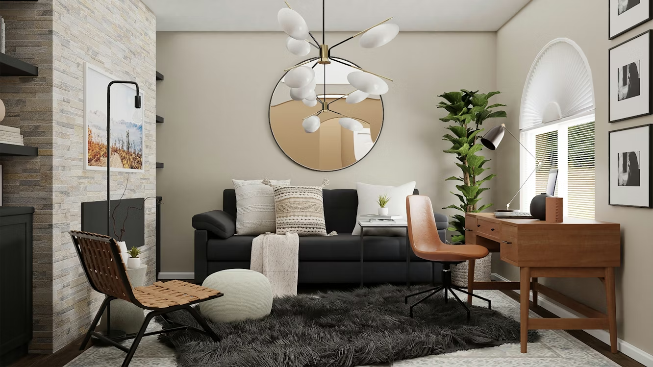
My first studio apartment was 320 square feet. I know because I measured it approximately forty times trying to convince myself it was bigger than it felt.
It wasn’t.
The ceilings were low, the walls were a dingy off-white, and the previous tenant had left behind some truly tragic dark curtains that made the whole place feel like a submarine. I’d come home after work and genuinely feel my shoulders tense up the moment I walked in. It felt small in a way that went beyond just the square footage — it felt heavy.
Then I started making changes. Not expensive ones, at first. Small visual tweaks based on things I’d read and half-remembered from design rabbit holes. And the shift was honestly kind of shocking. Same 320 square feet. Completely different feel.
Here’s what actually worked — no fluff, no “hang a large mirror” advice that tells you nothing useful.
1. Ditch the Dark Curtains and Go Floor-to-Ceiling
This was my single biggest win, and it cost me about $35.
Dark curtains were doing two things wrong at once — they were absorbing light and visually cutting the room off at window height. The moment I swapped them for sheer white linen-style curtains hung as high as possible (nearly at the ceiling), the whole room exhaled.
Here’s the thing most people miss: it’s not just about the curtain color. It’s about where you hang the rod.
Most people hang curtain rods right above the window frame, which is “correct” in a technical sense but visually shrinks your wall height. Hang the rod 4 to 6 inches below the ceiling instead, and let the curtains fall all the way to the floor. Your eye follows the fabric from ceiling to floor, and the room reads as taller than it actually is.
Step-by-step:
- Find your ceiling height and subtract about 4–6 inches for rod placement
- Measure down to the floor — that’s your curtain length
- Choose curtains in white, cream, soft grey, or any light neutral
- If you want privacy without blocking light, layer sheer panels over light-filtering blinds
I used curtains from IKEA’s LENDA line — they’re not fancy but they hang beautifully and the off-white color reflects light rather than eating it. Total cost including the rod and brackets was under $40.
| Curtain Approach | Visual Effect |
|---|---|
| Dark curtains, rod above window | Room feels shorter, heavier, darker |
| Light curtains, rod at ceiling height | Room reads taller, airier, more open |
| Sheer curtains + high rod + floor length | Maximum light + height illusion |
2. Use Paint to Fake Architectural Features

This one sounds intimidating if you’ve never done it, but it’s genuinely one of the highest-impact, lowest-cost tricks in a studio.
Painting your ceiling the same color as your walls (or one shade lighter) removes the hard visual “lid” that makes a room feel boxed in. Most apartments have stark white ceilings against colored or neutral walls, which draws your eye to exactly where the ceiling starts — i.e., exactly how low it is.
When the wall color flows into the ceiling, that boundary blurs and the room feels more like a continuous envelope than a box.
I painted my walls and ceiling in a soft warm white (Sherwin-Williams “Alabaster” is a popular pick — I used a similar dupe from a local hardware store for half the price). The difference was immediate.
Another trick: an accent wall in a lighter shade.
Don’t go dark for your accent wall in a small studio. I know every design magazine shows moody dark feature walls, and they look great in large rooms. In a tiny studio, a dark accent wall just closes things in. Instead, pick the wall your eye lands on first when you walk in — usually the wall directly across from the door — and paint it one shade lighter than the other walls. It creates depth without darkness.
If you’re also rethinking your layout alongside your decor, this pairs well with 6 Essential Studio Layout Mistakes to Avoid — because paint tricks work best when the furniture arrangement isn’t fighting against them.
3. The Mirror Strategy (But Actually Useful This Time)
“Hang a big mirror” is advice you’ve heard a hundred times. What you haven’t heard is where and how to hang it so it actually does something meaningful.
A mirror on a random wall just gives you a place to check your outfit. A strategically placed mirror doubles perceived space.
What actually works:
Place a large mirror on the wall that faces your primary light source — usually the window wall or the wall perpendicular to it. When light hits a mirror directly, it bounces back into the room and creates a genuine sense of depth. You’re essentially creating a visual “second room” that your brain partially registers as real space.
The mirror should be as large as you can reasonably fit — at least 24 inches wide. A leaner-style mirror (the tall ones you lean against the wall rather than mounting) works great because you can reposition it easily and they tend to be cheaper than wall-mounted options.
I picked up a 65-inch leaner mirror from Wayfair during a sale for around $55. Placed it opposite my window. My studio suddenly looked like it had a second room behind it.
What doesn’t work:
- Small decorative mirrors grouped together (cute but doesn’t create space illusion)
- Mirrors on walls with no natural light hitting them
- Mirrors placed so high they only reflect the ceiling
Rough guide to mirror placement:
| Mirror Position | Light Source Interaction | Space Effect |
|---|---|---|
| Opposite a window | Direct light reflection | Strong depth illusion |
| Adjacent to a window | Partial light catch | Moderate effect |
| On interior wall with no windows nearby | Minimal light | Mostly decorative |
| Above furniture only (partial height) | Reflects upper half of room | Minimal spatial impact |
4. Low-Profile Furniture Is Not a Compromise — It’s a Strategy
When I first moved in, I had a hand-me-down bed frame with a tall headboard. It was a perfectly nice bed frame. But in my studio, it felt like a wall had appeared in the middle of the room.
Tall furniture in a small space does one specific visual thing: it fragments the room into chunks. Your eye keeps hitting vertical stops — the tall headboard, the high bookshelf, the big wardrobe — and the room feels like a series of blocked zones rather than one open space.
Switching to low-profile furniture was a game changer.
A platform bed with no headboard (or a short, upholstered one) lets the eye travel past the sleeping area instead of stopping at it. Low media consoles keep the walls open above them. Armless seating options take up visual weight without adding bulk.
The general principle: keep most of your furniture below your eye line when you’re seated, which is roughly 36–42 inches from the floor. Leave the upper portion of your walls as open as possible.
One exception: vertical storage. A slim, tall bookshelf in a corner actually draws the eye up and makes ceilings feel higher — as long as it’s in a corner and not in the middle of a wall. The key is keeping it narrow (12–14 inches deep max) so it doesn’t project into the room.
If you want to go deeper on creating that “open” look while still having enough storage, 9 Secret Studio Apartment Space Hacks for Vertical Storage has some genuinely clever ideas that work in tight spaces.
5. One Rug to Define, Not Divide
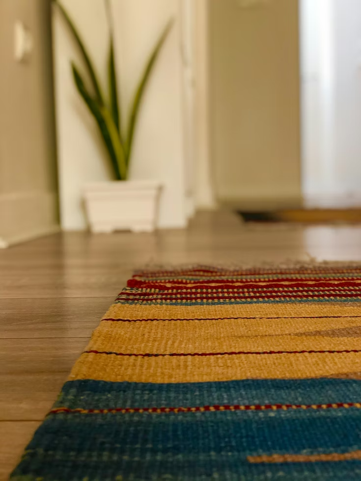
Rugs in studios are tricky. Get them wrong and your space looks chopped up into weird little zones. Get them right and your whole layout feels intentional and cohesive.
The most common mistake I see: rugs that are too small. A tiny rug under just the coffee table, floating in the middle of the room, does nothing good. It just looks like a mat that got lost.
The rule I follow now: the rug should be large enough that at least the front two legs of every piece of furniture in that zone sit on it. For a studio living area, that usually means a 5×8 or 8×10 rug.
Color and pattern matter too:
Light-colored rugs with low-contrast patterns (think soft geometric, tonal texture, faint stripes) keep the floor plane open and unified. A dark or busy rug breaks up the floor visually, making the room feel more segmented.
If your studio is mostly neutral, one rug in a warm ivory or soft sage can anchor the whole space while keeping it feeling light. I use a jute-blend rug — it’s textural without being visually heavy, it’s durable, and it works with basically any color scheme.
Pro tip: Lay a non-slip rug pad underneath. It keeps the rug from shifting (which immediately makes a space look disheveled) and adds a tiny amount of cushion underfoot.
6. Lighting Layers Change Everything
Most studio apartments come with one overhead light. One. Usually a ceiling fixture that casts the most unflattering, flat, institutional light you’ve ever experienced.
That single overhead light is actively making your space feel smaller and less inviting. When the whole room is lit uniformly from above, there are no shadows, no depth, no variation — and the eye reads “small box” instead of “layered space.”
The fix is lighting layers, and it doesn’t have to be expensive.
The three layers:
- Ambient — your general overhead light (what you already have)
- Task — directed light for specific areas (desk lamp, reading lamp, under-cabinet lights)
- Accent — warm, soft light that creates mood (floor lamp, LED strip lights, candles)
I added two floor lamps and a small table lamp to my studio. Total cost: around $70 across all three, mixing a HomeGoods find and a basic IKEA lamp. I also stuck some warm LED strip lights (Govee makes affordable ones you can find online) along the back of my bookshelf and under my kitchen cabinets.
The result: at night, my studio looks warm, layered, and genuinely cozy. The overhead light barely gets used anymore.
Quick lighting upgrade chart:
| Lighting Type | Cost Range | Impact on Feel |
|---|---|---|
| Swap overhead bulb to warm white (2700K) | $5–$10 | Immediate warmth, low effort |
| Add one floor lamp | $25–$60 | Creates visual depth and zones |
| LED strip lights (warm) | $15–$30 | Adds dimension and ambiance |
| Table lamp on a surface | $20–$50 | Grounds a zone, adds intimacy |
Don’t underestimate the bulb temperature thing. Daylight bulbs (5000–6500K) are great for task lighting but make living spaces feel clinical. Warm white (2700–3000K) is what you want in 90% of your fixtures.
7. Vertical Lines — and Why They’re Your Best Friend
This is the most underused trick in small space decorating, and once you notice it, you’ll see it everywhere.
Vertical lines — whether in wallpaper, curtains, artwork arrangement, shelving, or even striped cushions — pull the eye upward and make walls read as taller than they are. It’s the same reason vertical stripes on clothing make people look taller. It works on rooms too.
Here are a few ways to introduce vertical lines without it looking deliberate or overdone:
Tall, narrow artwork. Instead of one wide horizontal piece, try two narrow vertical prints side by side. The eye travels up the height of each piece and reads the wall as taller.
Vertical shiplap wallpaper or peel-and-stick panels. Even on a single accent wall, vertical lines add significant perceived height. You can find peel-and-stick options that don’t damage rental walls — brands like RoomMates or NuWallpaper have decent options under $50 for a small wall.
Tall plants. A snake plant or a fiddle-leaf fig (if you’ve got decent light) does double duty — it adds vertical height naturally and brings life into the room. I have a 5-foot snake plant in the corner of my studio that people always comment on. It cost me $22 from a local nursery two years ago.
Floating shelves in a vertical column. Instead of one long horizontal shelf, consider three shorter shelves stacked vertically in a column on one wall. The vertical arrangement guides the eye upward and makes use of wall height you’d otherwise ignore.
If you want to build out a more complete approach to how decor, layout, and organization all work together, 12 Ultimate Studio Apartment Space Hacks for Modern Design covers a lot of ground in one place and has some ideas that complement what’s here really nicely.
The Mistakes That Undo All Your Hard Work
Even with all the right moves, a few habits can quietly shrink your space back down.
Overcrowding surfaces. Every flat surface that’s packed with stuff adds visual noise that makes a room feel cluttered and tight. Keep counters, shelves, and tables at roughly 60–70% capacity. Leave breathing room.
Too many competing patterns. One strong pattern in a room is interesting. Three competing patterns is chaos. In a small studio, keep patterns to one or two max, and let the rest be solids.
Ignoring the entryway. The first two feet of your studio set the tone for how the whole space feels. A cluttered entry (shoes everywhere, bags piled up, no designated spot for anything) makes the entire apartment feel smaller. A simple hook rack and a small tray for keys and shoes costs under $20 and makes an outsized difference.
Never editing your stuff. This isn’t a decorating tip — it’s a reality check. No visual trick overcomes genuine clutter. Regular editing (once a month, pulling out things you don’t use or need) keeps the space from working against you.
Putting It All Together
The cool thing about all seven of these tricks is that none of them require renovation, none of them require a big budget, and they all compound. Each one individually does something. Combined, they can transform a tight, heavy-feeling studio into a space that genuinely feels open and intentional.
Start with the curtains and the lighting — they’re the fastest wins. Then work through the mirror placement and furniture scale. The paint and vertical line details can come last once you’ve nailed the bigger moves.
Your space doesn’t have to feel small just because it is small. That distinction matters more than you’d think.