Living in a studio apartment can feel like solving a puzzle that changes every day. The walls are fixed, but the way you use the space is not. One day it feels cozy, the next it feels cramped, and often the difference has nothing to do with square footage—but with layout decisions.
Most studio layout problems don’t come from lack of space. They come from how that space is arranged. A poorly planned layout can make even a 500-square-foot studio feel tight and chaotic, while a well-designed one can feel open and breathable.
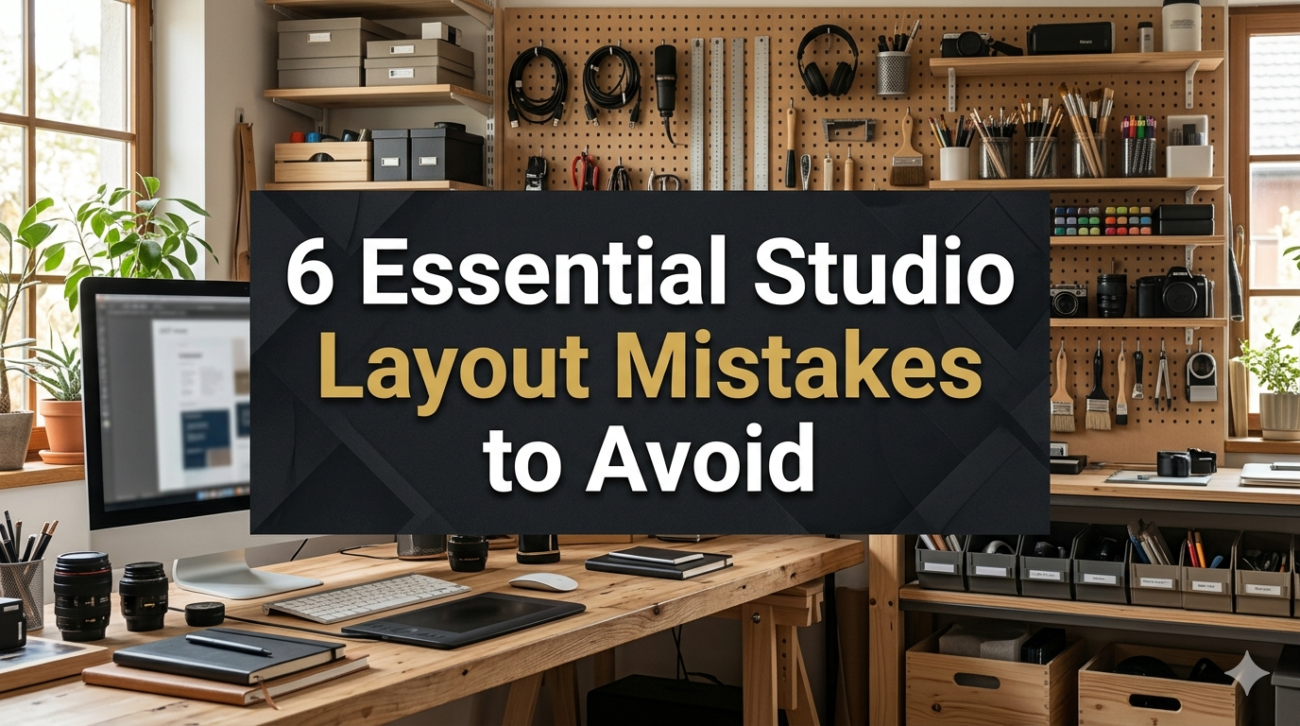
This guide breaks down six essential studio layout mistakes people repeatedly make, along with practical fixes, spatial strategies, and real-world planning tables to help you rethink your entire setup.
- ignoring functional zoning in a single open space
One of the biggest layout mistakes in studio apartments is treating the entire space as one undefined zone. When everything blends together—sleeping, working, cooking, relaxing—the result is visual confusion and mental fatigue.
Without zoning, your brain struggles to assign purpose to each area. That’s why even a clean studio can feel “messy.”
why this becomes a problem
- Bed, desk, and kitchen visually compete
- No mental separation between rest and work
- Activities bleed into each other (work on bed, eat near laptop, etc.)
- Constant feeling of being “always in the same place”
better approach: invisible zoning system
You don’t need walls. You need structure.
studio zoning breakdown
| Zone Type | Function | Suggested Elements |
|---|---|---|
| Sleep zone | Rest and recovery | Bed, soft lighting, minimal noise |
| Work zone | Focus and productivity | Desk, chair, task lighting |
| Living zone | Relaxation/social | Sofa, rug, TV or reading chair |
| Utility zone | Storage & chores | Kitchen, laundry, cleaning supplies |
layout tip
Use rugs, lighting, and furniture orientation to visually separate zones instead of physical barriers.
zoning comparison chart
| Layout Style | Visual Clarity | Comfort | Flexibility |
|---|---|---|---|
| No zoning | Low | Low | High |
| Partial zoning | Medium | Medium | Medium |
| Defined zoning | High | High | High |
A structured studio always feels larger because your brain understands the space faster.
- poor furniture placement against walls by default
Many people assume that pushing all furniture against the walls creates more space. In reality, it often produces awkward dead zones and poor flow.
This “perimeter-only” layout makes the center empty but not usable.
what goes wrong
- Center space becomes wasted
- Walking paths feel unnatural
- Furniture loses functional relationships
- Room feels like a waiting area instead of a home
better approach: floating furniture strategy
Instead of sticking everything to walls, float key furniture pieces to define zones.
examples of smart floating layouts
| Furniture Piece | Better Positioning Strategy |
|---|---|
| Sofa | Float to divide living/sleep zone |
| Desk | Place near light source, not always wall-bound |
| Bed | Use partial wall placement or corner anchoring |
| Shelving unit | Use as divider instead of backdrop only |
layout effectiveness comparison
| Layout Type | Space Efficiency | Comfort | Visual Balance |
|---|---|---|---|
| Wall-hugging | Medium | Low | Low |
| Floating layout | High | High | High |
floating furniture creates “rooms within a room,” which is essential in studio living.
- ignoring circulation pathways
A studio can look organized but still feel uncomfortable if movement pathways are not considered. Circulation is how you move through your space—literally the invisible traffic system of your home.
If pathways are blocked or inconsistent, the space feels smaller and more stressful.
common mistakes
- Walking around furniture unnecessarily
- Cluttered entry paths
- Bed or desk blocking natural movement flow
- No clear route from kitchen to other zones
ideal circulation planning
circulation map breakdown
| Path Type | Purpose | Minimum Clearance |
|---|---|---|
| Entry flow | Door to main area | 80–100 cm |
| Kitchen path | Cooking movement | 90 cm |
| Sleep access | Bed entry/exit | 60–75 cm |
| Work path | Chair movement | 75 cm |
flow quality comparison
| Layout Flow | Ease of Movement | Stress Level |
|---|---|---|
| Blocked flow | Low | High |
| Mixed flow | Medium | Medium |
| Clear flow | High | Low |
practical fix
Before placing furniture, imagine walking through your studio in a loop. If you bump into imaginary obstacles, the layout needs adjustment.
- poor lighting layering across zones
Lighting is often treated as decoration rather than structure. In a studio, lighting is actually part of the layout itself.
A single ceiling light flattens the space, erases zones, and creates harsh shadows.
what goes wrong
- One light source for everything
- No distinction between work and relaxation areas
- Dark corners make space feel smaller
- Overexposed or underexposed zones
better approach: layered lighting system
lighting structure
| Lighting Type | Purpose | Placement |
|---|---|---|
| Ambient | General illumination | Ceiling or wall wash |
| Task | Focus lighting | Desk, kitchen counter |
| Accent | Mood + depth | Shelves, corners |
| Natural | Spatial openness | Windows, mirrors nearby |
lighting effectiveness chart
| Lighting Setup | Mood Quality | Functional Clarity | Space Perception |
|---|---|---|---|
| Single light | Low | Low | Small |
| Dual lighting | Medium | Medium | Moderate |
| Layered lighting | High | High | Spacious |
layout insight
Lighting defines boundaries as much as furniture does. A well-lit corner automatically becomes a “zone.”
- ignoring vertical spatial hierarchy
Most studio layouts focus only on floor space, ignoring the vertical dimension. This creates underused air space and overcrowded ground areas.
Vertical planning is what separates functional studios from cluttered ones.
common issues
- Empty walls above furniture
- Overloaded floor storage
- No height variation in layout
- Everything at eye level or below
better approach: vertical zoning
vertical structure breakdown
| Height Level | Usage | Example Items |
|---|---|---|
| High (above 170 cm) | Storage | Seasonal items, boxes |
| Mid (80–170 cm) | Daily use | Shelves, decor, kitchen tools |
| Low (0–80 cm) | Heavy storage | Drawers, bins, seating |
vertical efficiency chart
| Layout Strategy | Storage Capacity | Floor Space Usage |
|---|---|---|
| Floor-based only | Low | High clutter |
| Mixed vertical | Medium | Balanced |
| Full vertical | High | Open floor |
practical tip
If your eyes can see empty wall space above furniture, that space is usually being wasted.
- designing without multi-function zones
In a studio, every area must work harder than in a larger home. A major mistake is assigning only one purpose per space, which leads to inefficiency.
For example, a desk that is only for work, or a corner that is only decorative, wastes valuable real estate.
what goes wrong
- Static furniture usage
- Underused corners
- Redundant spaces
- Lack of adaptability
better approach: layered functionality design
multi-function zone examples
| Zone | Primary Function | Secondary Function |
|---|---|---|
| Bed area | Sleeping | Reading, lounging |
| Desk area | Work | Dining, planning |
| Sofa area | Relaxing | Guest sleeping |
| Entry corner | Storage | Drop zone, mirror station |
function density chart
| Layout Type | Space Efficiency | Flexibility | Value |
|---|---|---|---|
| Single-use zones | Low | Low | Low |
| Dual-use zones | Medium | Medium | Medium |
| Multi-use zones | High | High | High |
layout principle
The fewer “dead zones” your studio has, the larger it feels—even without changing square footage.
summary table of all mistakes and fixes
| Mistake | Core Issue | Fix Strategy |
|---|---|---|
| No zoning | Everything blends together | Define functional areas |
| Wall-only furniture | Wasted center space | Float key furniture |
| Ignored circulation | Hard movement flow | Design walking paths |
| Poor lighting layers | Flat visual space | Use layered lighting |
| No vertical planning | Wasted wall space | Build upward storage |
| Single-purpose zones | Inefficient layout | Create multi-use areas |
final thoughts
A studio layout is less about decorating and more about spatial strategy. The goal is not to fit everything in—it’s to make everything work together.
When you fix zoning, circulation, lighting, vertical planning, and furniture logic, the same square footage can feel almost twice as functional.
Good layout design doesn’t add space. It reveals the space that was already there but not being used properly.
FAQs
- What is the most common studio layout mistake?
The most common mistake is not creating functional zones, which makes the entire space feel like one cluttered room. - How do I make a studio layout feel bigger?
Focus on circulation paths, vertical storage, and layered lighting. These elements expand perceived space. - Should all furniture be placed against walls in a studio?
No. Floating furniture helps define zones and improves flow, making the layout more functional. - How important is lighting in studio layout design?
Very important. Lighting defines zones, affects mood, and changes how large the space feels. - What is a multi-functional zone in a studio?
It’s an area that serves more than one purpose, such as a desk used for both work and dining. - How do I start fixing my studio layout?
Start by mapping zones, then adjust furniture placement, improve flow, and finally layer lighting and storage vertically.