Designing a studio apartment is less about decorating and more about solving a spatial puzzle. Every square foot has to work harder than it would in a larger home. The real challenge isn’t just fitting everything in—it’s making the space feel natural to move through.
Good “flow” means you can walk, sit, cook, sleep, and work without feeling blocked, cramped, or constantly shifting things around. A well-planned layout can make a small studio feel twice as large, even if nothing physically changes.
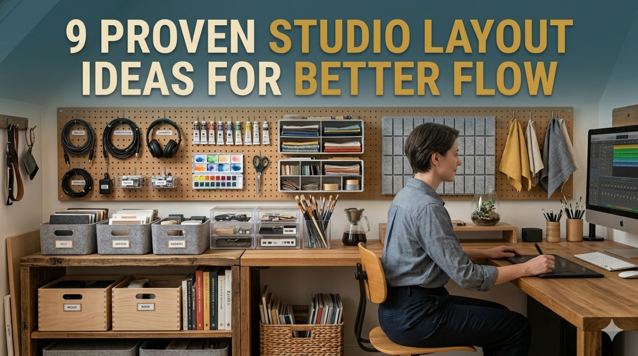
Below are 9 proven studio layout ideas that consistently improve movement, usability, and comfort in small spaces.
1. The Linear Flow Layout (Wall-to-Wall Organization)
This layout arranges everything along one or two main walls, leaving a clear walking path.
Typical setup:
- Bed against one wall
- Sofa or seating opposite
- Storage aligned along edges
This is ideal for long, narrow studios.
Layout breakdown:
| Zone | Placement | Purpose |
|---|---|---|
| Sleeping | Far end wall | Quiet zone |
| Living | Middle section | Relaxation |
| Storage | Along perimeter | Space-saving |
| Pathway | Center strip | Movement flow |
Why it works:
- Keeps the center open
- Reduces visual clutter
- Creates a natural “hallway” feel
Best for: rectangular studios or converted rooms
2. The Corner Anchor Layout
In this design, key furniture pieces are anchored in corners to open up central space.
Common anchors:
- Bed in one corner
- Sofa in opposite corner
- Desk near window corner
Flow concept: edges hold weight, center stays free.
Flow impact chart:
| Feature | Result |
|---|---|
| Open center | High |
| Visual clarity | High |
| Furniture density | Low |
| Movement ease | Very high |
Why it works:
Corners naturally contain furniture, making the room feel less crowded.
Best for: square studios
3. The Floating Zone Layout
Instead of pushing everything against walls, furniture floats in defined zones.
Example:
- Sofa floats in center to divide space
- Bed behind partial divider or shelving
- Desk positioned independently
Zone separation methods:
| Divider Type | Effectiveness | Cost |
|---|---|---|
| Bookshelf | High | Medium |
| Curtain | Medium | Low |
| Rug zones | Medium | Low |
| Sofa back | High | Free |
Why it works:
Creates natural “rooms” without walls.
Best for: open-plan studios
4. The Bed-Centric Layout
Here, the bed is the central anchor of the entire space, and everything orbits around it.
Typical arrangement:
- Bed placed against longest wall
- Storage beneath or above
- Desk nearby but not blocking flow
Flow diagram concept:
Bed → Living area → Work area → Storage loop
Space usage table:
| Element | Priority |
|---|---|
| Bed | Highest |
| Storage | High |
| Seating | Medium |
| Decor | Low |
Why it works:
The bed is the largest object, so controlling it improves overall layout efficiency.
Best for: micro-studios or single-room units
5. The Window-Focused Layout
This layout prioritizes natural light flow by placing key areas near windows.
Typical arrangement:
- Desk near window
- Sofa adjacent
- Bed positioned to avoid blocking light
Light optimization table:
| Placement | Light Benefit |
|---|---|
| Desk near window | Very high |
| Sofa side-light | Medium |
| Bed away from window | Medium |
| Storage near walls | Low impact |
Why it works:
Light improves perceived space size and reduces clutter feel.
Best for: dark or narrow studios
6. The Split-Zone Divider Layout
This layout uses furniture or partitions to split the studio into distinct functional halves.
Common split:
- Sleeping side
- Living/work side
Divider options:
| Divider Type | Flexibility | Privacy |
|---|---|---|
| Bookshelf | Medium | High |
| Curtain | High | Medium |
| Folding screen | High | High |
| Cabinet wall | Low | Very high |
Why it works:
Creates psychological separation, making the space feel like a small apartment instead of one room.
Best for: shared or multifunction studios
7. The Perimeter Loop Layout
Everything is placed around the edges, leaving the center completely open.
Flow pattern:
Circular or rectangular movement around room edges
Space analysis:
| Area | Usage |
|---|---|
| Center | Open movement |
| Walls | Storage & furniture |
| Corners | Anchors |
Why it works:
Maximizes walking space and reduces obstacles.
Best for: very small studios
8. The Dual Function Corridor Layout
This layout turns walking paths into usable space.
Example:
- Hallway doubles as workspace
- Entry area becomes storage zone
- Narrow desk fits along path
Efficiency chart:
| Space Type | Traditional Use | Dual Use |
|---|---|---|
| Corridor | Movement only | Storage/work |
| Entry | Empty zone | Drop zone |
| Wall strip | Visual space | Shelving |
Why it works:
Removes “dead zones” in the layout.
Best for: long, narrow layouts
9. The Modular Flexible Layout
This is the most adaptable layout, using movable furniture and flexible arrangements.
Key elements:
- Rolling tables
- Foldable chairs
- Lightweight shelving
- Modular sofas
Flexibility table:
| Element | Mobility | Adaptability |
|---|---|---|
| Rolling desk | High | High |
| Foldable table | High | Medium |
| Modular sofa | Medium | High |
| Stackable chairs | High | Medium |
Why it works:
Allows constant reshaping of space depending on activity.
Best for: multipurpose living (work + leisure + hosting)
Comparative Layout Efficiency Overview
| Layout Type | Space Efficiency | Flow Quality | Flexibility | Best Use Case |
|---|---|---|---|---|
| Linear Flow | High | High | Medium | Narrow rooms |
| Corner Anchor | High | Medium | Medium | Square rooms |
| Floating Zone | Medium | High | High | Open studios |
| Bed-Centric | High | Medium | Low | Small rooms |
| Window-Focused | Medium | High | Medium | Brightness issues |
| Split-Zone | Medium | High | Medium | Privacy needs |
| Perimeter Loop | Very high | Very high | Low | Tiny studios |
| Corridor Dual Use | High | Medium | High | Long rooms |
| Modular Layout | Medium | High | Very high | Flexible lifestyles |
Practical Flow Improvement Tips
Even with a good layout, small adjustments dramatically improve movement:
- Keep pathways at least 60–80 cm wide
- Avoid blocking natural light sources
- Use rugs to guide movement direction
- Group frequently used items near activity zones
- Reduce furniture with sharp or protruding edges
Small changes often have bigger impact than full redesigns.
Common Layout Mistakes to Avoid
| Mistake | Problem |
|---|---|
| Blocking walkways | Poor movement flow |
| Too many small furniture pieces | Visual clutter |
| Ignoring natural light | Space feels smaller |
| No defined zones | Disorganized layout |
| Overfilling corners | Tight, boxed feeling |
Final Thoughts
A studio apartment doesn’t become functional by accident—it becomes functional through intentional flow design. When movement feels natural, everything else improves: comfort, usability, and even how large the space feels.
The best layout isn’t the most complex one, but the one that matches your habits. A good studio layout supports your daily rhythm instead of fighting it.
FAQs
1. What is the best studio layout for small spaces?
Perimeter loop and linear flow layouts usually work best for very small studios because they maximize open space.
2. How do I make my studio feel less cramped?
Focus on clear pathways, reduce unnecessary furniture, and use vertical storage.
3. Should I place my bed in the center of the studio?
Only if you’re using a floating zone layout. Otherwise, placing it against a wall is more space-efficient.
4. How important is lighting in studio layout design?
Very important—natural light placement significantly affects how spacious a room feels.
5. What’s the biggest mistake in studio layout planning?
Blocking movement paths with oversized furniture or poor zoning.
6. Can one studio layout work for everything?
No. Most studios benefit from hybrid layouts that evolve with your lifestyle.