The first studio I ever laid out professionally was in a building on Adelaide Street in Toronto. My client was a graphic designer in her late twenties who’d been living there about seven months and couldn’t figure out why nothing felt right. She had decent furniture, no glaring aesthetic problems, nothing I’d call offensive. And still, the apartment felt like a storage unit that someone had loosely arranged.
I walked the space for maybe three minutes before I started moving things. Not for dramatic effect. The problem was immediately visible. She’d placed her sofa first because it was her most expensive piece and she’d moved it in on day one. Everything else had been arranged around that original decision. The bed was wedged into a corner with almost no clearance on one side, the light distribution was backwards, and two of the four walls were doing absolutely nothing with intention.
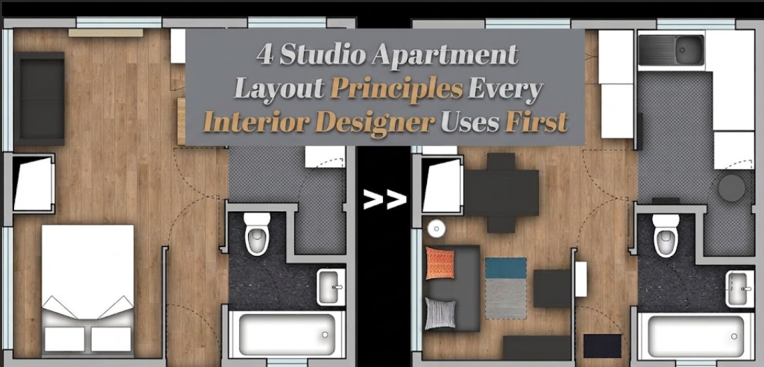
Forty minutes later, the layout worked. Same furniture. Different sequence.
That afternoon made explicit something I’d been applying instinctively for years. There are four things professional designers sort out before any furniture is placed, and they’re applied in a specific order because each one constrains the next. Most people skip all four, they buy pieces, push them toward the walls, and then struggle with the result for years without understanding why.
1. Anchor the Room With the Right Piece, Not the First Piece You Own
The anchor in any studio is the largest piece that has specific ergonomic requirements around it. Not the piece you love most, not the most expensive item in the room. The piece with the most constraints. In a studio apartment, that’s almost always the bed.
I say this because I watch people make the sofa their anchor constantly, and it creates a cascading problem. The sofa, in most studios, can live in multiple locations without serious consequence. The bed cannot. The bed needs clearance on at least two sides (a minimum of 24 inches, preferably 30, beside the side you primarily get out of). It benefits from proximity to natural light in the morning, separation from the kitchen and its smells, and reasonable access to an outlet for charging. Those are real constraints, not preferences, and they narrow the viable placement options considerably.
Once you’ve identified where the bed must go, everything else organizes around it. The sofa finds its position in relation to the bed’s established zone. The desk fits into what remains. The layout has a logic.
What I saw on Adelaide Street was the inverse: a sofa in the room’s prime real estate, a bed punished into a corner because it was placed second. Once I moved the sofa to a supporting role and returned the bed to the room’s most functional position, the entire layout aligned in under an hour.
This principle connects directly to the broader question of furniture selection. If you haven’t already read the piece on why matching furniture sets make a studio look smaller, the thinking there reinforces this exactly. Scale and placement are interdependent decisions, and the anchor principle is what gives scale decisions their context.
The anchor also sets the visual center of the room. In a space with no interior walls, there’s no architectural hierarchy to tell a visitor where to focus. The anchor piece does that job. It needs to be something that can hold that responsibility, not something that retreats to the periphery.
2. Map the Circulation Path Before a Single Piece Is Placed
Circulation is the design term for the route you walk through a space. In most studios there’s essentially one main path: entry to sleeping zone, sleeping zone to kitchen, kitchen to bathroom. That route needs to be clear, continuous, and wide enough to move through without turning sideways.
The practical standard is 30 inches of clear width at every point along the primary path. Thirty-six inches is comfortable. Twenty-four inches is technically passable but creates a compressed feeling that accumulates over months of daily use. Under twenty-four and you’re not living comfortably, you’re navigating an obstacle course you also happen to sleep in.
What I actually do, on any new project, is sketch this path first. Before furniture positions are even discussed. I trace the line from the front door to each destination and confirm that there’s unobstructed width at every point. Then every furniture placement decision is made with that path preserved.
Most people don’t do this. They place furniture and hope the path emerges naturally. Sometimes it does. Often it doesn’t, and the result is the apartment where you angle sideways past the foot of the bed every night to get to the bathroom. That’s not an inconvenience. Over time it’s a low-level stress that makes the whole space feel wrong without anyone being able to identify why. I covered this in more detail in the Studio Apartment Setup piece on layout signs that indicate real problems, and blocked circulation comes up every single time.
There’s also a secondary effect worth knowing: the circulation path, when clear, makes a studio feel bigger from the entry point. A visible line of open space drawing the eye from the door through the apartment creates depth. Block that line with furniture and the apartment reads as small the moment you walk in, regardless of what else you’ve done right.
3. Treat Natural Light as a Fixed Wall, Not a Bonus Feature
This is the principle that separates layouts that feel livable from layouts that only photograph well. Natural light in a studio is a fixed resource. It comes from specific windows at specific times of day at specific intensities depending on orientation. You cannot move it, you cannot manufacture it, and you cannot compensate for wasting it with artificial lighting solutions.
The most common misuse I see: the bed placed directly in front of or alongside the main window because it seemed like the natural spot. The result is that the room’s largest piece of furniture occupies its brightest zone, blocking that light from reaching the living and working areas where it’s actually needed during waking hours. The sleeping zone needs natural light least during the day. The work surface, the sofa, the kitchen counter where you eat breakfast, those are the zones that benefit from it.
I map light before I map furniture. That means understanding the apartment’s orientation. East-facing windows deliver sharp morning light that softens by midday. West-facing windows get intense afternoon and evening light. North-facing windows, which are common in older Toronto buildings, provide even, diffused light all day with no direct sun at all. That profile of each window tells me which zones should be positioned closest to it.
Mirror placement is a tool within this same principle. A properly placed mirror bounces natural light further into the space, effectively extending the reach of a single window by eight to ten feet in a well-proportioned room. Studio Apartment Setup’s piece on mirror placement in a studio covers the specifics of where this works and where it doesn’t, and I’d read that alongside whatever changes you’re making to your light distribution.
One important qualification: apartments with floor-to-ceiling windows or corner exposures operate differently. When light is coming from multiple directions at high intensity, distribution isn’t the constraint and zone placement shifts to other variables like noise, privacy, and temperature. But for the standard studio with one or two standard windows, light distribution is the primary zone-placement driver. Full stop.
4. Give Every Wall a Job Before You Give Any Wall a Piece of Furniture
This principle is probably the one I’ve never heard articulated outside of a design consultation, but it’s the one clients say changed their thinking most when I explain it. The idea is simple. Before you decide what goes where, decide what each wall is for.
Most studios have four walls. Some have more depending on the floor plan. Each wall should have a defined role. Not every wall needs furniture against it. But every wall needs an intention. Here’s the framework I use:
Anchor wall. This is where the primary piece lives. Usually the bed headboard or, in a living-room-forward studio, the main sofa. The anchor wall is the room’s dominant surface and sets the visual hierarchy for everything else.
Activity wall. This is where work happens. Desk, media setup, the television if you have one. It needs outlet access, ideally some physical or visual separation from the sleeping zone, and enough width to contain the activity zone without bleeding into adjacent areas.
Storage wall. Wardrobe, shelving, built-in or freestanding. This wall works hard but should not be visually dominant. A storage wall that visually overwhelms the room is a common mistake, especially when full-height wardrobes are placed on the anchor wall instead of their own designated surface.
Breathing wall. This one surprises people. One wall, preferably in the sightline from the main seating area, should be relatively open. A single piece of art, a textile, or nothing at all. This wall is visual relief. In a small space, a surface that doesn’t compete for attention is functional, not indulgent.
When these roles are assigned before any shopping happens, the furniture selection becomes almost systematic. The anchor wall dimensions tell me the maximum bed frame size. The activity wall tells me whether a full desk or a wall-mounted surface makes more sense. The storage wall tells me whether I need a wardrobe or whether open shelving serves the space better. And the breathing wall tells me what to leave alone.
The zone-creation thinking behind creating separate spaces without walls connects closely to this. Wall roles and zone definitions reinforce each other. Getting clear on one makes the other easier to execute.
At-a-Glance: The Four-Principle Sequence
Work through these in order before placing or purchasing anything:
PRINCIPLE 1: ANCHOR
[ ] Identified the piece with the most placement constraints (bed)
[ ] Confirmed clearance: 24"+ on primary exit side, 18"+ opposite
[ ] Checked outlet access, morning light proximity, kitchen separation

PRINCIPLE 2: CIRCULATION
[ ] Traced the main path: entry to sleeping zone to kitchen/bathroom
[ ] Confirmed 30"+ clear width at every point along the path
[ ] Verified no furniture placement interrupts this line

PRINCIPLE 3: LIGHT
[ ] Identified window orientation (east / west / north / south)
[ ] Assigned waking-hour zones (desk, sofa, dining) closest to light
[ ] Placed sleeping zone where daytime light is less critical

PRINCIPLE 4: WALL ROLES
[ ] Designated anchor wall (primary furniture)
[ ] Designated activity wall (work/media, outlet access)
[ ] Designated storage wall (wardrobe/shelving, not visually dominant)
[ ] Designated breathing wall (minimal, visual relief, in main sightline)
The Adelaide Street apartment took forty minutes to reorganize. My client had spent seven months uncomfortable in a space that was entirely workable, she just hadn’t had a sequence. The furniture was fine. The problem was the order in which decisions had been made and, more precisely, the absence of any framework guiding those decisions in the first place.
Studios aren’t hard spaces to live in well. They’re hard spaces to improvise in. The four principles above aren’t rules that constrain creativity. They’re the things that make creativity possible by removing the structural errors before they have a chance to compound.
Frequently Asked Questions
Do these principles change for a very small studio, under 350 square feet?
The sequence stays the same but the tolerances tighten. In a studio under 350 square feet, the circulation path minimum of 30 inches becomes non-negotiable rather than recommended, because there’s no slack elsewhere in the layout to compensate. The breathing wall also becomes more critical, not less, because the smaller the space, the more damaging visual overcrowding becomes. Every principle applies, applied with less margin for error.
My studio has an open kitchen that takes up a full wall. Does that affect wall role assignment?
Yes. A kitchen wall is already assigned its role by function, so it comes off the table for anchor, activity, storage, or breathing designation. You’re working with three walls instead of four, and the framework adjusts accordingly. The most common outcome is that the storage wall doubles with a secondary function (a wardrobe that also defines the sleeping zone, for instance) to free the other two walls for the anchor and breathing roles.
Is there a case where the sofa should be the anchor instead of the bed?
There is one scenario where this makes sense: a studio configured specifically as a living-first space, typically by someone who works from home full-time and uses the sofa as the primary daytime work surface, and uses the bed primarily for sleeping without needing morning clearance on both sides. In that case the sofa’s placement constraints become comparable to the bed’s. But this is genuinely uncommon. For most people, the bed has more specific positioning requirements than any other piece in the room.
How does the breathing wall principle work in a studio with gallery-style art collections?
The breathing wall and a curated art wall are not opposites. A breathing wall can hold a single large-format piece or even a gallery wall, provided the composition doesn’t visually compete with the other three walls simultaneously. The function of the breathing wall is to give the eye a place to rest, not to leave bare drywall. One well-composed art wall can absolutely serve that function. What defeats the purpose is four walls of equal visual density with no hierarchy.
I’m planning to move into a new studio. At what point should I apply these principles?
Before you sign the lease, ideally. The piece on Studio Apartment Setup about signs a layout will make you miserable is a good pre-move-in audit. Once you’re in, apply the four-principle sequence before you unpack. Lay out the circulation path, identify the anchor wall, assign roles to the remaining walls, then bring in furniture. Starting with an empty room and the framework takes about an hour. Fixing a layout that was assembled without one can take considerably longer.