The floor plan looked fine on paper. That’s the problem.
I’ve walked through enough studios, and I’ve consulted on enough setups where the client called me three weeks after moving in to say they hated the space, that I’ve started recognizing the warning signs before they unpack a single box. The layout that looked clean and efficient in a listing photo is now the reason they’re sleeping with the smell of last night’s pasta. The “open concept” they fell for is why they can’t mentally switch off at 9pm.
Most of those problems were visible before the lease was signed. You just need to know what you’re looking at.
There are three specific layout signals I watch for now. Any one of them is manageable. All three together, and you’re looking at a space that will quietly grind you down no matter how thoughtfully you furnish it.
1. The Sleeping Area Has No Clear Anchoring Wall
Most people touring a studio scan for square footage and natural light. What they don’t check is whether the sleeping zone has a wall it can commit to.
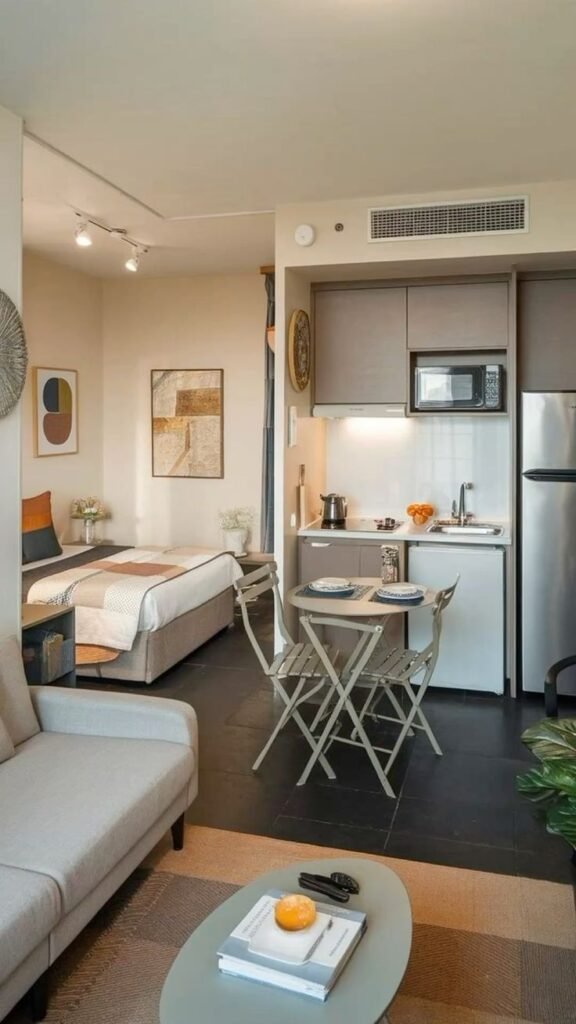
Every bed needs a wall. Not just to push against, which is the obvious thing, but a wall that logically separates the sleeping area from everything else. In a well-proportioned studio, that wall is usually the one farthest from the entrance, positioned opposite the kitchen, with enough clearance to fit a full or queen without blocking a window or a closet door.
When that wall doesn’t exist, or when it’s interrupted by a radiator, a poorly placed door, or a pass-through closet, you end up floating the bed in the middle of the room or wedging it at an awkward diagonal. And then nothing else can organize itself around it. Everything becomes a compromise.
I had a client in a downtown Toronto studio who put her bed diagonally in a corner because there was genuinely no clean wall for it. She told me it looked artistic. Six months later, she was sleeping poorly, couldn’t settle on where to put her dresser, and said the space made her feel restless all the time. The diagonal bed wasn’t the root cause of all that. But it was the symptom of a layout with no defined sleeping zone, and living without one steadily wears on you.
Before you sign, stand in the space and physically point to where the bed goes. If you can’t place it against a wall that reads as the “back” of the room, away from the main traffic path and not in direct sightline from the front door, that’s sign number one.
A lot of what Studio Apartment Setup covers on creating separate spaces without walls assumes the layout gives you something to build on. If the sleeping wall isn’t there, no amount of creative zoning will fully fix it. You’re decorating around a structural problem, and those never fully resolve.
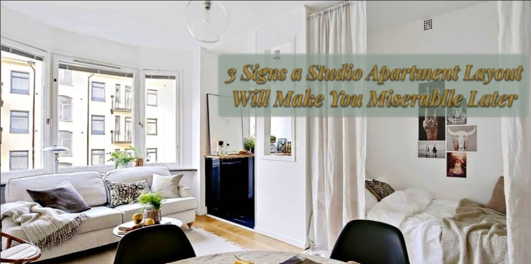
2. The Kitchen Directly Faces the Bed
This one catches people off guard because it doesn’t look like a problem during a fifteen-minute tour.
A studio where the kitchen sits directly across from the sleeping area, nothing between the stove and your pillow, no alcove, no furniture buffer, no change in plane, is a studio that smells like dinner at midnight, sounds like coffee grinding at 7am, and feels psychologically impossible to divide into any meaningful routine.
The counterargument I always hear: “You just put furniture between them.” But this is exactly where people go wrong. In a studio under 450 square feet, there is rarely enough depth to build a genuine physical and mental barrier between the kitchen counter and the bed. You can place a sofa. You can add a room divider. But if the sight line from where you sleep to the range hood is unbroken, your brain registers it as one continuous space, because it is one continuous space.
Sleep quality in a studio is directly tied to how well the brain separates the bedroom from everything else. It’s not about actual distance. It’s about whether the layout allows any visual or functional break at all.
A kitchen tucked along a side wall, or angled even slightly off-axis from the main sleeping wall, performs dramatically better in real daily life. The sounds don’t carry the same way. The smells don’t either. And the mental separation, which is the part nobody talks about, is real.
During a tour, stand at the foot of where the bed would go. Is the stove the first thing you see? If yes, that’s sign number two. Before you commit to anything, it’s worth reviewing what to ask your landlord before moving into a studio, because occasionally a unit on a different floor has a subtly different configuration, and those distinctions matter more than most people realize.
3. Every Functional Wall Is Already Spoken For
Windows are wonderful. I’d never argue against natural light. A studio with strong window placement feels significantly larger than its square footage, and that matters a great deal when you’re living in 400 square feet.
But there is a specific layout pattern where the light comes at a cost most people don’t see until they’re trying to furnish the space and nothing is working.
If the two long walls of a studio are both heavily windowed, and the remaining walls are carved up by the front entrance, the bathroom door, a closet, and a built-in radiator unit, you are left with almost no functional wall space at all. And in a studio, wall space is storage. Wall space is furniture anchoring. Wall space is what gives the room visual structure. Without it, everything floats.
What actually happens in these layouts: people end up centering furniture in the room because there’s nowhere to push it. Floating furniture in a small space reads as bigger than furniture against walls. Storage becomes nearly impossible because there’s no wall for shelving, no corner for a tall bookcase, no logical surface to mount anything. You start living around the furniture instead of with it.
Every vertical storage strategy worth attempting, and there are solid ones covered in Studio Apartment Setup’s guide to using vertical space the right way, requires a wall to anchor to. No wall, no strategy.
The test is simple. Walk the perimeter of any studio you’re seriously considering and count the uninterrupted wall runs. An uninterrupted run means at least five to six feet of clear wall with nothing blocking it from floor to ceiling. You need at least two. Ideally three. Count only one, or none, and that layout will fight you on every furniture decision you ever try to make.
4. What Happens When All Three Show Up at Once
Any one of these three layout problems is workable. I want to be specific about that. I’ve helped clients make a studio with no ideal sleeping wall genuinely livable. I’ve done room divider installations in apartments where the kitchen stared directly at the bed, and the result looked intentional. The solutions exist.
But when all three appear in the same space, the cumulative effect is a slow drain. A kind of ambient low-grade irritation that most people never connect back to the layout. They assume they’re just not good at decorating. They think they need more storage. They believe that if they found the right furniture piece, everything would finally click.
It rarely does, because the bones aren’t there.
Here’s a quick layout assessment you can run during any tour. It takes under two minutes:
| What to Check | Good Sign | Watch Out For |
|---|---|---|
| Sleeping wall | Clear, uninterrupted, away from entry | Broken by doors, radiators, or walkway |
| Kitchen position | Along a side wall or angled away from bed | Directly facing the sleeping zone |
| Wall availability | 2 to 3 clear wall runs of 5+ feet each | Mostly windows, doors, and built-ins |
| Traffic path | Runs along one edge of the space | Cuts through the center of the room |
| Light distribution | Concentrated on one or two walls | Spread across all walls, leaving none functional |
Screenshot it before your next viewing. The floor plan will tell you everything a listing photo deliberately avoids.
For a full pre-lease review, the 5 things to check before you sign a studio lease covers the broader list worth running through before you commit.
5. What “Open Concept” Is Actually Selling You
Open layouts are marketed as a feature. Airy. Flexible. Modern. And they can be all of those things. But in a studio, “open” can also mean “no definition,” and no definition means no psychological separation between sleeping, cooking, working, and trying to relax.
The people who genuinely love their studios almost always describe the space as feeling like theirs. A little world they built inside it. That sense of ownership almost always traces back to a layout that gave them something real to work with. A natural sleeping corner. A kitchen that stays in the kitchen. Walls that let them put things on them.
The ones who feel unsettled or restless, even after furnishing thoughtfully, are usually dealing with a layout that was “open” in all the wrong ways.
Before you fall in love with a studio because of the afternoon light or the freshly painted walls or the price point, spend five minutes on layout logic. The stuff you cannot change after you sign. Creative approaches like the room divider ideas for studios that don’t block natural light can take you quite far. But they can’t build a foundation that the layout never provided.
FAQs
Can furniture arrangement fix a bad studio layout? Partially, yes. A sofa or open shelving unit can create a visual zone break even when the layout doesn’t naturally support one. But furniture solutions work best when the layout gives them something to anchor to. If none of the three structural signals above are working in your favor, furniture becomes a patch rather than a fix, and patches require ongoing attention to maintain.
Does square footage matter more than layout? Not nearly as much as most people assume. A 375-square-foot studio with a clear sleeping wall, a tucked kitchen, and two usable wall runs will feel more livable day-to-day than a 520-square-foot studio with all three layout problems described here. When comparing units at similar price points, layout logic wins over raw size almost every time.
Is an alcove studio always better than an open studio? For daily livability, usually yes. An alcove provides partial physical separation between the sleeping zone and the main room, which resolves sign number one immediately and often improves the kitchen sight line as well. When prices are comparable, the alcove wins on long-term comfort. The one caveat: a poorly proportioned alcove can create its own set of furniture problems, so still run the wall check.
What if every affordable studio in my area has layout problems? Then go in knowing the specific challenges and plan for them before you move anything in. Room dividers, vertical storage, and deliberate lighting placement can all help. But go in clear-eyed. These workarounds take real effort to execute well, and they take maintenance to sustain. Knowing that upfront is far better than discovering it three months in when the excitement has worn off.
Should I ask the landlord where previous tenants put their bed? Yes, and ask whether the unit has ever been photographed furnished. If it has, request those photos. Ask specifically whether the previous tenant used a full-sized or queen bed and where they positioned it. That single piece of information will tell you more about whether the layout actually functions than any floor plan drawing will. Studio Apartment Setup has a full walkthrough on exactly what to ask your landlord before moving in that goes deeper into this.
There are good studios and there are studios that photograph well. The difference is almost never in the listing. Nobody describes their unit as “awkward” or admits the kitchen stares directly at your pillow. You have to see it in person, and you have to know what you’re looking at before the light and the fresh paint do their work on you.