Something I hear from clients every single time we start talking about studio layouts goes something like this: “I’d love to separate my sleeping area, but I don’t want it to feel like a cave.”
And that concern is completely fair. Most of the dividers people picture first when they think of this, the solid wood panels, the tall bookcases pushed awkwardly side to side, the full-length curtains in dark navy, they genuinely would absorb light and make the room feel compressed. The assumption that dividers and natural light are enemies has been quietly holding studio dwellers back from one of the most effective design moves available to them.
The thing is, it’s a solvable problem. And the solutions look genuinely beautiful.
1. The Open-Plan Assumption That’s Actually Costing You Something
Actually, let me address this before getting into specific products and options, because this is the part most people skip, and skipping it usually leads to the wrong choices.
The open-plan studio is widely treated as the light-maximizing ideal. No walls, no barriers, everything flows. And yes, natural light does travel freely through an unobstructed room. But there’s a catch that doesn’t get discussed enough: the human eye needs contrast, separation, and visual anchors to perceive a space as generous.
When everything blurs together in one undifferentiated room, the space doesn’t actually feel bigger. It feels like one crowded, purposeless thing. A sleeping area that dissolves visually into a kitchen corner and a work desk can make a studio feel far more chaotic and compressed than the square footage warrants, even when the light is flowing perfectly.
Over at Studio Apartment Setup, this tension between visual zoning and perceived spaciousness comes up constantly in the layout content, and for good reason. It’s one of the most counterintuitive things about small-space design: a well-placed division can actually make a studio feel more expansive, not less. Because suddenly each zone has an identity, and the brain reads two defined areas instead of one ambiguous one.
So the real question isn’t “should I divide this space?” The question is: what do I divide it with?
2. The Dividers That Actually Let Light Through
There is an entire category of dividers designed to create visual separation without meaningfully blocking daylight. These aren’t niche products or expensive custom installations. Most are widely available, and the majority work perfectly well in a rental.
Sheer curtain panels on a ceiling track. This is one of the most elegant solutions for a studio, full stop. A ceiling-mounted curtain track runs about $40 to $80 at most home stores. You hang lightweight linen or voile curtains from it and you have a full-height zone separator that light passes right through. The curtain softens the division rather than hard-stopping it. You can draw it closed for privacy at night or push it back entirely during the day. It takes up zero floor space. It’s renter-friendly. And when done in the right fabric, it genuinely looks like a design choice rather than a functional workaround.
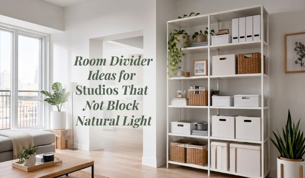
Open-frame shelving. A freestanding bookshelf at 5 to 6 feet that isn’t packed wall to wall still allows ambient light to pass through the gaps. The visual separation is created by the structure and height, not by solidity. Keep the top shelf open rather than loading it with opaque bins, and you preserve both the sense of light and the airiness above the divide.
Macramé and woven hanging panels. These have come back in a meaningful way, and not just as a trend. Hung from a ceiling hook or a tension rod near the ceiling, they define a zone without stopping any significant light. The texture adds visual interest, which is essentially design work being done for free.
Open-weave rattan and cane screens. Traditional folding screens in solid wood are often too heavy and light-blocking for a studio. But open-weave rattan or cane screens are a different story. The woven pattern creates its own dappled light effect on adjacent walls, which is actually an asset. The light that comes through becomes more interesting, not less.
A row of tall indoor plants. A grouping of fiddle leaf figs, tall snake plants, or Monstera at considered intervals creates a soft visual boundary that the eye reads as a “zone” without functioning as any kind of physical barrier. And plants engage with light in a way no solid surface does, absorbing it, reflecting it back. I recommended this approach in a client’s Toronto condo last year, a narrow live-work space where any furniture-based divider would have eaten too much floor area. Three large plants in white planters along a simple line was all it took. The sleeping zone read as completely separate. The light was untouched.
3. Where You Put It Matters More Than What It Is
The divider type matters, but the placement and orientation matter just as much. Sometimes more.
The most common mistake I see in studio apartments is placing a divider perpendicular to the main window wall, so the window is essentially on one side and the rest of the room is on the other. You’ve split the light in half, and the deeper zone becomes noticeably darker. This is the setup that earns the cave comparison, and it’s avoidable.
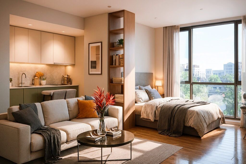
The more effective approach is to orient a divider parallel to the window wall, running in the same direction as incoming light rather than across its path. The light continues its full journey into the room and the divider acts as a lane marker rather than a barricade. It sounds like a small adjustment. It is a small adjustment. But the impact on how the room feels is real.
Height is the other frequently misread variable. Floor-to-ceiling dividers feel permanent and heavy, and in a studio with standard 8 or 9-foot ceilings, a 7-foot screen can read as oppressive. A divider that stops around 5 feet leaves the upper third of the room open, and light travels along upper walls and ceilings before diffusing downward into a space. Preserve that band above the divide and you preserve the sense of volume.
For those rethinking their studio layout more broadly, the 9 Studio Layout Tips for Small and Narrow Apartments post covers the zoning conversation in detail, particularly how furniture placement and zone definition interact in tighter footprints.
4. How Different Divider Types Actually Compare on Light
I found myself walking through this same comparison in client consultations often enough that I put together a reference breakdown. For anyone at the “choosing between options” stage, this should help.
| Divider Type | Light Blocking | Privacy Level | Takes Floor Space | Renter-Friendly |
|---|---|---|---|---|
| Sheer curtain on ceiling track | Very low | Medium | None | Yes |
| Open rattan / cane screen | Low | Low to Medium | Minimal | Yes |
| Macramé or woven hanging panel | Very low | Low | None (hung) | Yes |
| Tall plants arranged in a row | Very low | Low | Low to Medium | Yes |
| Open bookshelf (lightly filled) | Low to Medium | Low | Medium | Yes |
| Dense fabric curtain (blackout) | High | High | None | Yes |
| Solid wood folding screen | High | High | Minimal (folded) | Yes |
| Frosted glass panel | Medium | High | Minimal | Harder |
The practical takeaway here: privacy and light preservation are not always in direct conflict, but you do need to decide where on that dial you want to land. A sheer curtain panel gives you natural light at near-full strength with moderate privacy. Open rattan gives slightly more visual definition with slightly more light loss. Dense curtains give you a true room division but the light stops at the fabric.
What you’re choosing between is a dial, not an on/off switch.
5. Where People Usually Get This Wrong
Beyond the placement issue, there are two patterns that consistently undermine otherwise good divider decisions.
The first is scale. A short, narrow screen in a room with 9-foot ceilings looks like it arrived by accident. It doesn’t read as a zone marker because it doesn’t have the visual authority to claim any territory. A divider needs to reach at least 60 to 70 percent of the ceiling height to credibly divide a space. Anything below that just reads as stray furniture.
The second is material mismatch. When a divider material looks noticeably out of place next to everything else in the room, it telegraphs itself as a functional fix rather than a design decision. A natural linen curtain panel in a room with warm wood tones and earthy ceramics feels completely intentional. A quick-fix bamboo screen wedged between a white IKEA sofa and a chrome lamp stands out as exactly what it is: a problem being patched over.
The divider should feel like it belongs to the room. That requires looking at the existing palette, materials, and finishes before buying anything, rather than after. It’s a step that gets skipped constantly, and it’s why rooms that have all the right individual pieces still don’t feel resolved.
The 6 Studio Layout Mistakes Making Your Apartment Feel Smaller article covers this visual cohesion problem in a broader layout context, including how individual furniture and decor decisions interact with the overall reading of the space.
The dividers that actually work in light-sensitive studios are the ones that do their job without announcing it. A sheer linen panel that shifts slightly when someone walks past. A rattan screen casting its own patterned shadow on the floor by midmorning. A row of tall plants that makes the zone boundary feel almost organic.
None of these are expensive. Most are completely renter-friendly. And the design principle behind all of them is identical: visual definition doesn’t require physical solidity. The eye needs only enough information to understand that two distinct zones exist. It does not need a wall to reach that conclusion.
Frequently Asked Questions
Can I use a bookshelf as a room divider in a studio without making it too dark?
Yes, but how you fill it matters more than the bookshelf itself. Keep the top shelf open, use light-colored or clear containers where possible, and avoid packing it floor to ceiling with solid objects. A bookshelf used as a semi-open partition still allows ambient light to diffuse through the gaps and around the frame. Dark wood finishes in an already dim studio will amplify the problem, so lean toward white, natural wood, or light oak if light is a concern.
How tall should a room divider be in a studio apartment?
For zone definition without full privacy, 4.5 to 5.5 feet works well. It creates a readable visual boundary while keeping the upper portion of the room open. For a sleeping zone where actual privacy matters, a 6 to 7 foot option or a full-height curtain panel is more appropriate. In either case, aim to leave at least 18 to 24 inches of clearance between the top of the divider and the ceiling. That gap does real work in preserving the sense of volume.
Are ceiling curtain tracks hard to install in a rental?
Most ceiling track systems for residential use install with small screws into joists or with toggle anchors into drywall. The holes left behind are easy to patch when you move. Some track systems also mount onto tension poles that press between floor and ceiling without any ceiling contact at all, which is worth knowing if your lease is strict about walls and ceilings. The tension pole versions are generally rated for curtains up to a certain weight, so check the load specs before you buy.
What’s the most light-friendly room divider for a small studio?
Sheer curtain panels on a ceiling track, followed by open-weave rattan screens and hung macramé panels. All three transmit the highest proportion of daylight while still creating enough visual separation to function as zone markers. A thoughtfully arranged row of tall plants is a close fourth, with the added advantage of contributing to air quality and bringing a completely different texture into the space.
Does dividing a studio actually make it look smaller?
A poorly chosen divider in the wrong position can compress a space significantly. But a well-placed, light-transmitting divider often does the opposite by giving each zone its own identity and making the studio read as more considered. Studio Apartment Setup addresses this in several layout posts: defined zones consistently feel more spacious than the same square footage presented as a single undifferentiated room. The key is proportioning the divider correctly and, critically, running it parallel rather than perpendicular to the natural light source. That one positioning decision is responsible for more light-loss complaints than any particular divider type.