A client walked into my office a few years ago carrying a crumpled piece of paper with a name written on it in ink: Railings. It’s a near-black by Farrow and Ball, one of the more serious colors in that collection, and she wanted it on three walls of her 410-square-foot studio. Not as an accent. Not on a single feature wall. Three walls.
I remember setting down my coffee and asking her to walk me through the apartment: ceiling height, window orientation, how much light she got on a winter afternoon. Not because I was looking for reasons to talk her out of it, I want to be clear about that. I was looking for reasons to help her do it right. There’s a version of nearly-black walls in a studio that works, and there’s a version that makes a person feel like they’re eating breakfast inside a submarine. The difference comes down to a handful of specific conditions, and none of them are really about the darkness of the paint.
What I’ve found, across a lot of small-space projects over the years, is that the conventional advice about dark colors in small rooms is based on a real principle that gets applied too broadly. The result is that people who want dark color get talked into safe choices they resent, and the spaces they end up with look considered but feel anonymous. That’s its own kind of failure.
So: does dark paint work in a studio apartment? Yes. Not always, not without thinking it through, but the idea that small rooms require light color to feel livable is genuinely too simple.
1. What the “Keep It Light” Rule Is Actually Based On
The principle behind light walls in small spaces is physics before it’s aesthetics. Light colors reflect more of the light that enters a room, which creates a brighter interior, which reads to the eye as more spacious. That’s real. A room painted warm white will feel more open than the same room painted charcoal, assuming identical light conditions, identical furniture, identical everything else. The science holds up.
Where it breaks down is the assumption that “feeling more open” is the correct goal for every studio, and that dark paint’s only effect on a room is making it feel smaller. Both of those are wrong, and they’re wrong in interesting ways.
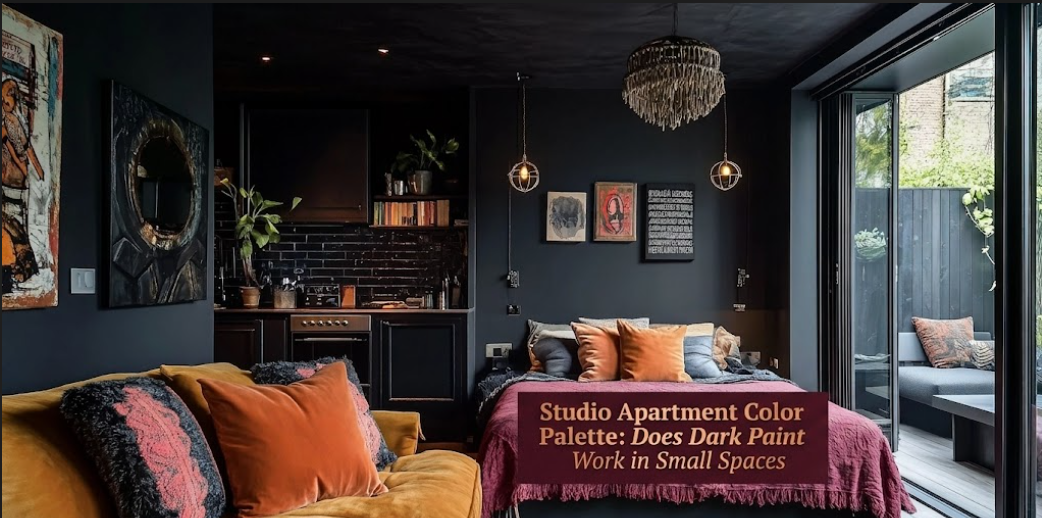
Dark color on a wall does something that light color can’t replicate: it creates visual weight. It makes the surface feel defined, intentional, anchored. In a studio where the challenge is almost always about creating the sense of distinct zones within one continuous room, that weight is actually useful. A deep color on the wall behind the bed doesn’t just darken that area. It separates it. The eye reads the sleeping zone as a specific, bounded space, which is exactly what you’re trying to achieve in a home where the bedroom and the living room are technically the same room.
There’s also the depth question. A dark wall at the far end of a long studio, particularly one opposite a window, recedes visually. The brain reads dark surfaces as further away than light ones. So painting the far wall dark in a narrow studio can make the room read as longer, not more compressed. This is counterintuitive enough that most people don’t believe it until they see it, but it’s consistent. Same principle as wearing dark colors to appear slimmer: the eye registers the darker area as more distant.
And then there’s intimacy, which is harder to quantify but shows up in how people actually feel about living in the space. Studio Apartment Setup has written about the phenomenon of studios that feel like hotel rooms even when they’re furnished well. One of the things that creates that effect is the absence of contrast, pale walls, pale furniture, pale flooring, everything sitting in the same general value range so that the room reads as a single undifferentiated surface. Dark paint breaks that. It introduces a plane that is definitively different from the others, and that difference is what makes a room feel like a place with a specific character rather than a temporary arrangement of objects.
2. The Conditions That Determine Whether It Works
I want to be direct here because this is where the practical answer actually lives. Dark paint in a studio is not universally viable, and the variables that make it succeed or fail are specific enough to be worth laying out plainly.
FACTOR                 | FAVORABLE FOR DARK PAINT            | PROCEED WITH CAUTION
-----------------------|-------------------------------------|-------------------------------
Ceiling height         | 9 ft or above                       | Standard 8 ft or lower
Natural light source   | South, east, or west-facing window  | Single north-facing window
Window size            | Large or multiple windows           | One small window
Room proportions       | Longer than wide                    | Square rooms under 320 sq ft
Furniture tone         | Light upholstery, light wood        | Dark upholstery, dark wood
Floor color            | Light hardwood, pale tile           | Dark flooring already present
Application goal       | Zone separation, drama, coziness    | Making the room feel larger
Ceiling height is the factor I’d weight most heavily. The visual relationship between dark walls and the ceiling above them is critical. At 8 feet, dark walls with a dark or even a standard white ceiling create a box effect that reads as compressive. At 9 feet or above, that relationship reverses. The height pulls upward, the dark walls add drama below, and the room ends up feeling like a chic version of itself rather than a constricted one. The same paint color can produce completely different results depending on whether the ceiling is giving it room to breathe.
The furniture tone point is where people most commonly make execution errors. Dark walls with dark furniture create a room that muddles, where surfaces bleed into each other and the eye has nothing to anchor on. Dark walls with light-toned furniture, cream linen, blonde or natural wood, white or off-white bedding, create real contrast. The furniture comes forward and the wall recedes, and that interplay is what gives the room visual life. The contrast is the point, not just the dark color alone.
3. Which Dark Colors Actually Hold Up in a Studio
This is the part of the conversation that gets most interesting to me as a designer, because “dark paint” covers a range so wide that treating it as a single category doesn’t make sense. Deep forest green behaves completely differently in a small room than cool charcoal, which behaves differently than warm navy, which is nothing like near-black. Undertone and temperature matter at least as much as darkness.
Deep greens are consistently the most forgiving dark option in small spaces. Forest green, dark sage, hunter, deep olive: all of these carry a warmth that reads as organic rather than absorbing. Green reflects light in a way that feels alive. It doesn’t close down a room the way a cool dark does. If someone tells me they want to go dark but they’re not sure, I usually start here because the risk is genuinely lower than with most other dark families.
Warm charcoals, colors that sit between dark grey and greige with a warm undertone, are the second most reliable option. They’re dark enough to create drama and anchor the room, but the warmth stops them from reading as cold or institutional. This is a good starting point for anyone who wants the effect without fully committing to a saturated color. And I should say this clearly: warm charcoal is not the same as grey. Flat grey in a small room almost always looks like an unfinished decision. Warm charcoal with a genuine brown or beige undertone reads as chosen.
Navy is the color I approach with the most deliberation in a studio context. In ideal conditions, with strong natural light and well-considered furnishings, it’s genuinely beautiful. But cool navy on multiple walls in a room with limited light reads as cold in a way that green and charcoal typically don’t. If navy is the goal, the single accent wall approach is the right place to start. Get one wall right before deciding whether the room wants more.
Near-black on all four walls is a commitment that very few studios are built to support. The rooms that carry it well tend to have 10-foot ceilings, generous natural light from multiple directions, and extremely deliberate furniture choices. The effect, when all of that is present, is stunning. The effect when any of those conditions is absent is suffocating. If you’re drawn to near-black, start with a single wall and sit with it for a month before deciding.
4. The Practical Details That Decide Whether It Looks Right
Assuming the conditions are favorable and the color is sound, there are three technical choices that make or break the execution.
Paint finish is the one most people don’t think about until they’ve already rolled the first coat. Dark paint in a flat or matte finish absorbs light and reads heavier than the same color in an eggshell. In a small room where you’re already asking the color to do something bold, that extra heaviness compounds. Eggshell bounces light slightly, which keeps the room from going dead in the corners. For dark walls in studios, eggshell is the finish I recommend almost universally. Satin can work on an accent wall where you want the surface to have a bit more presence, but it tends to highlight every imperfection in older plaster walls, so know what you’re getting into.
The ceiling treatment is the most underused tool in the dark paint conversation, and I’m genuinely surprised how rarely people think about it deliberately. A dark wall with a ceiling that’s two to three shades lighter pulls the eye upward and makes the walls feel taller. A dark wall with a ceiling in the same family (say, a slightly softer version of the wall color) creates the enveloping, room-within-a-room effect that works in a sleeping zone. And a dark wall with a stark bright white ceiling above it creates the strongest visual separation between the two surfaces, which maximizes the sense of height but can also feel harsh. Which version is right depends on what you’re trying to do with the zone, and the zone logic in a studio is worth thinking through before you commit to a ceiling treatment.
The application boundary is the third decision. A single feature wall behind the bed is the most controlled approach, lowest risk, clearly defined effect. Two adjacent walls (the wall behind the bed and one connecting wall) start to create an alcove effect that can feel genuinely designed, like the room grew a bedroom rather than just having a bed in it. Three walls or four is the full commitment. The question I always ask clients before recommending the full-room approach is: do you want this room to feel like a jewel box, or do you want it to feel as open as possible? Both are valid. They require different answers.
The one place people consistently go wrong on application: stopping the dark color at an arbitrary horizontal point partway up the wall, as if doing a color block. Chair rail height or a deliberate architectural line can make that work, but stopping dark paint midway up a wall with no logical break reads as incomplete rather than intentional. Go all the way up or use a real architectural element to define the boundary. Half measures in small spaces almost always register as indecision rather than design.
Studio Apartment Setup’s resources on maintaining natural light in a studio are worth reading alongside the dark paint question, because the two decisions are related. What dark paint takes away from the room in reflected light, good window treatment and mirror placement can partially restore. Plan both together rather than treating paint and light as separate conversations.
That client with the Railings chip: her studio had nine-foot ceilings, a large east-facing window, and a bone-white oak floor she’d refinished before moving in. We ended up doing two walls in the dark color, the sleeping zone wall and the wall that continued from it at a right angle, and left the remaining two walls in a warm off-white called String. The floor bounced light back up through the room. The dark section felt like a separate room had appeared inside the studio, which was exactly what it needed to feel like. She’s been in that apartment four years and has not once wanted to repaint it.
Dark paint in a studio isn’t a risk to manage. It’s a tool. Like any tool, it works beautifully when used for the right job under the right conditions, and badly when forced onto a situation it wasn’t meant for. The conditions are knowable. The rest is just making the call.
FAQs
My studio only has one small north-facing window. Can I still use dark paint anywhere?
You can, but the scope needs to match the light available. With one north-facing window, avoid dark color on all four walls. A single accent wall in a warm dark color (deep olive, warm charcoal with a brown undertone) on the wall farthest from the window is the most viable approach. Stay away from cool-toned darks like slate blue or steel grey in low natural light situations. Those colors need sun to look deliberate. In dim conditions they go flat and heavy.
How do I know if my ceilings are high enough for dark walls?
Standard ceiling height in most apartment buildings is 8 feet. At 8 feet, dark walls are manageable on a single accent wall but risky across the full room. At 9 feet, the room has enough vertical space that dark walls read as dramatic rather than compressive. At 10 feet or above, you have real latitude. If you’re not sure of your exact ceiling height, stand with your arm raised straight up: the average person with arm raised reaches about 7.5 feet. If there’s at least a foot of clearance above that, you’re at 8.5 feet minimum.
What is the single most common mistake people make when going dark in a small space?
Keeping dark furniture to match dark walls. The combination looks cohesive in a furniture catalog and muddy in an actual room, because the room loses its contrast and the eye has nowhere to focus. Dark walls work because of the relationship between the dark surface and the lighter elements in front of it. The lighter your furniture, your textiles, and your flooring, the more the dark wall does what it’s supposed to do.
Is dark paint on the ceiling ever a good idea in a studio?
In a studio with high ceilings, a ceiling in the same color family as a dark wall (slightly lighter, same undertone) creates an enveloping quality in the sleeping zone that can genuinely help the room feel more restful. At standard 8-foot height, a dark ceiling almost always reads as oppressively low. The ceiling play works as a deliberate design choice when height is on your side. It’s a problem when the room is already tight vertically.
I’m renting and can’t paint. Is there any way to get a similar effect?
Removable wallpaper in deep-toned designs has improved considerably in the last few years, and there are now options in dark botanicals, textured geometrics, and tonal stripe patterns that read as genuine wall treatments rather than temporary fixes. Large-scale art in deep, saturated colors on a single wall achieves some of the same zone-defining effect that dark paint creates, particularly when combined with furniture and textiles that echo those tones. It’s a lighter version of the same principle: introduce a dark, weighty surface in the sleeping zone and let everything in front of it stay relatively light.