

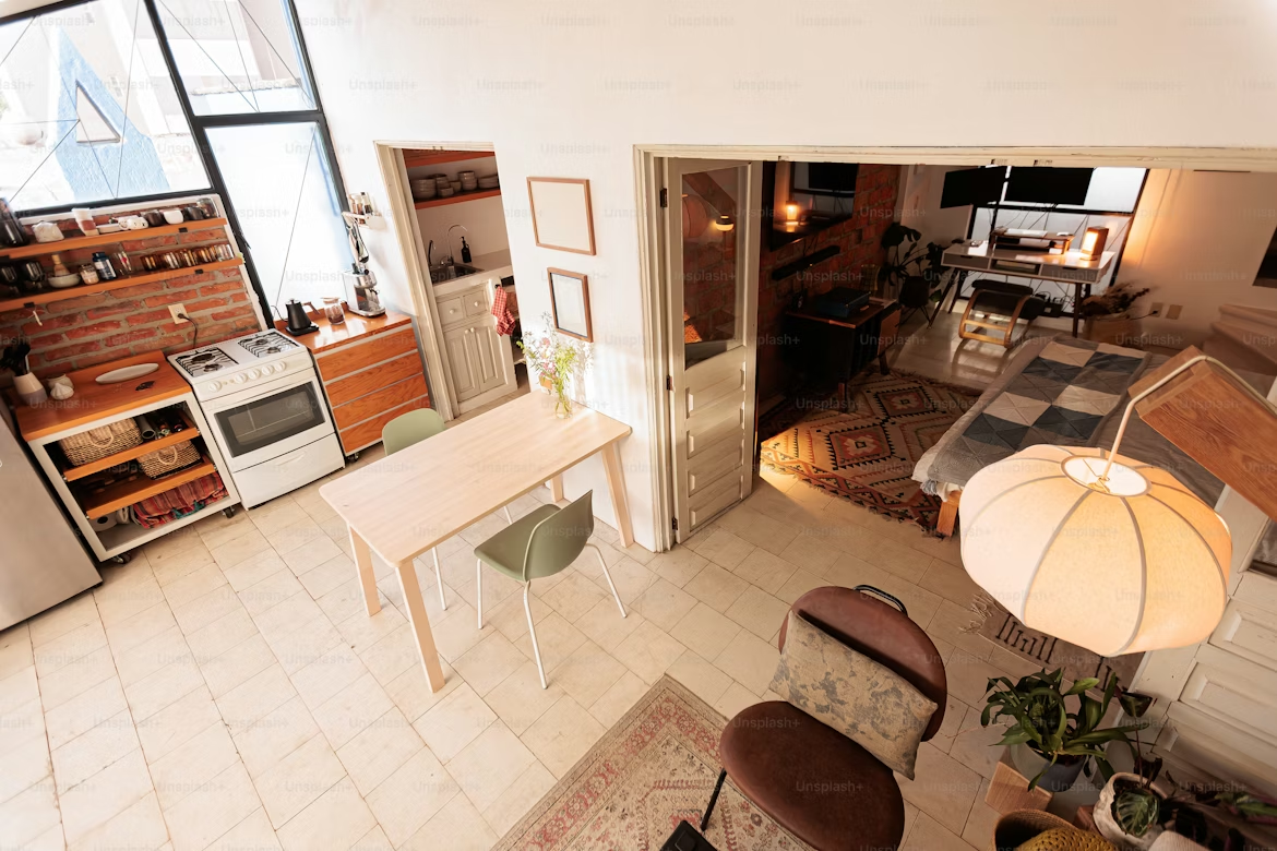
I still remember the day I stood in the middle of my studio apartment, coffee in hand, just staring at the mess of furniture crammed into every corner. My bed was too close to my “desk” (a tiny table shoved against the wall), my couch blocked the natural light, and my kitchen felt like an afterthought wedged between everything else. I wasn’t living in my space — I was surviving it.
It took me a few months of frustration, some embarrassing trial-and-error, and honestly a couple of Pinterest rabbit holes before I finally figured out what was actually wrong. Spoiler: it wasn’t the size of my apartment. It was the layout.
Here are the four layout changes that genuinely transformed how my studio felt — and more importantly, how I lived in it.
1. I Stopped Pushing Everything Against the Walls
This sounds counterintuitive, right? In a small space, your instinct screams: push everything to the edges, create as much open floor space in the middle as possible. I did this for nearly three months. My sofa was flush against one wall, my bed against another, my dresser against a third. The center of my studio was this big, empty, awkward void that I basically walked through to get from point A to point B.
The space didn’t feel open — it felt like a waiting room.
The fix came from something a friend of mine (who happens to be an interior designer) said during a visit: “Floating your furniture actually makes a room feel bigger, not smaller.”
I was skeptical. But I tried it.
I pulled my sofa about 18 inches away from the wall and angled it slightly toward the window. I moved my bed so the headboard was against the wall, but there was a small side table on each side with breathing room. The result? The room felt like it had zones. It had intention. It didn’t feel like furniture was hiding from each other around the perimeter.
Why this works: When furniture is pushed flat against walls, your eye scans the room in a single sweep. There’s nothing to break the visual journey, so everything feels flat and cramped. When pieces float slightly, they create visual depth — your eye stops, moves, explores. That exploration is what makes a room feel spacious.
One mistake I made here: I initially pulled things too far out and the walking paths became awkward. The sweet spot for a studio is usually 12–18 inches off the wall, not more.
2. I Created a “Zone” for Each Activity — Without Building a Single Wall
One of the biggest problems with studio living is that everything bleeds into everything else. I’d be working at my desk and feel like I was eating at the same time. I’d be lying in bed watching something and feel like I was also kind of in my living room. There were no mental boundaries, which meant I was never fully relaxed in any one area.
I’d read about using rugs, shelving, and curtains to divide a studio, but I always thought it would look forced or cramped. What I didn’t realize was that zoning isn’t about physical walls — it’s about visual cues.
Here’s what I actually did:
Step 1: Map out your activities first, not your furniture. I literally wrote down everything I do in my apartment: sleep, work, eat, relax, exercise (okay, occasionally). Then I drew a rough floor plan on paper and marked which area got the most natural light, which was closest to outlets, which had the best ventilation. Activities followed the map, not the other way around.
Step 2: Use a large area rug to anchor each zone. My “living area” got a warm-toned rug under the sofa and coffee table. My bed area stayed on bare floor with a small bedside rug. The contrast alone created a psychological separation between the two spaces. I picked up both rugs from IKEA — nothing fancy, nothing expensive.
Step 3: Use a bookshelf as a room divider. I placed a 5-shelf KALLAX unit (again, IKEA — no shame) perpendicular to the wall between my sleeping area and my workspace. It didn’t block light, it didn’t close in the ceiling, but it created a clear visual boundary. I used the shelves for books on one side and storage baskets on the other. Functional and structural at the same time.
You can find even more clever ideas in this guide on clever studio apartment hacks: how to separate rooms without losing style — there are some genuinely creative approaches there that I wish I’d tried earlier.
The unexpected result: Once I had defined zones, my productivity actually improved. Working in a “work zone” — even in the same room as my bed — felt different. My brain started associating spaces with activities. It sounds almost too simple, but it worked.
3. I Rethought My Bed’s Position Entirely

In my original layout, my bed was the first thing you saw when you walked in the door. Giant, dominant, unavoidable. It made the whole studio feel like one big bedroom — which, when you’re trying to have a friend over for dinner or get into work mode, is not exactly ideal.
Moving the bed was the most dramatic change I made, and also the most intimidating. It took two full hours, a furniture slider set I bought off Amazon for about $15, and one very sore back the next morning.
But it was absolutely worth it.
I rotated the bed 90 degrees and positioned it in the far corner of the room with the headboard on the side wall rather than the back wall. This did two things: it made the bed less visually dominant from the entrance, and it freed up a stretch of wall I’d never used before — which became my dedicated workspace.
The layout comparison before and after:
| Area | Before | After |
|---|---|---|
| Entrance view | Bed front and center | Open living area visible first |
| Natural light | Blocked by bed position | Flows through full room |
| Work zone | Cramped table near window | Full wall desk setup |
| Walking path | Narrow, around the bed | Open L-shaped path |
| Psychological feel | Bedroom vibe everywhere | Multi-room feel |
The entrance impression matters more than most people realize. When the first thing you (and guests) see is your bed, the entire apartment reads as one function: sleeping. When you walk into a defined living area first, the apartment reads as a home.
4. I Went Vertical — And Stopped Ignoring the Walls Above Eye Level
I used to think of my studio in two dimensions. Floor space in, floor space out. It never occurred to me that I had about four feet of completely unused real estate above my head — walls that went from roughly 5 feet up to the ceiling that were doing absolutely nothing.
This is one of those layout mistakes that seems obvious in hindsight but takes a while to see when you’re in the thick of it.
Once I started thinking vertically, everything changed.
What I actually installed:
- Floor-to-ceiling floating shelves on the wall above my desk. These hold books, small plants, a few decorative objects, and — most importantly — my printer and router, which used to sit on my desk and eat up half the surface area.
- A pegboard above my kitchen counter. I mounted a simple wooden pegboard and used hooks to hang pots, measuring cups, utensils. My cabinet space immediately doubled because I’d moved the stuff that was hanging around (literally) into actual storage.
- A tall, narrow wardrobe instead of a low wide dresser. Same footprint, triple the storage capacity. I replaced a 3-drawer dresser with a slim floor-to-ceiling wardrobe from a secondhand shop, and suddenly I had room for twice as many clothes plus a shelf at the top for luggage.
For anyone who’s already thinking about this, the article on 9 secret studio apartment space hacks for vertical storage goes into even more practical detail — especially if you’re renting and need wall-friendly options.
One thing I got wrong at first: I hung everything too high. Shelves at 7 feet look great but are functionally useless if you’re not 6’2″. I brought everything down to where I could actually reach it — between 5 and 6.5 feet — and used the very top shelf (6.5 to ceiling) for seasonal stuff I only need a few times a year.
The Mistake I Kept Making Before Any of This
Looking back, my biggest mistake wasn’t the furniture placement or the lack of vertical storage. It was that I kept reacting to problems instead of planning proactively.
I’d notice my desk felt cramped, so I’d get a new desk. The new desk would make something else feel off, so I’d move the bookshelf. The bookshelf would block light, so I’d rearrange the sofa. Three moves later, I’d be back to a version of what I started with — just exhausted.
The shift that actually helped was spending 20 minutes drawing my floor plan to scale (graph paper, pencil, nothing fancy) and thinking about flow before touching a single piece of furniture. Where do I walk the most? Where does light come in? Where do I spend the most time? What areas do I actively avoid?
That last question is surprisingly revealing. If there’s a corner of your studio you never use, it’s not because you don’t need it — it’s because the layout isn’t inviting you there.
For anyone dealing with an open-plan studio specifically, this roundup of 8 mighty studio apartment hacks for open floor plans is worth a read before you start moving things around.
Common Layout Mistakes That Are Easy to Avoid
Since I made most of these myself, I feel qualified to call them out:
Buying furniture before finalizing your layout. I did this twice. Bought a gorgeous L-shaped desk that physically could not fit once I had everything else in place. Measure twice, buy once.
Ignoring traffic flow. If you have to squeeze sideways past your sofa to get to the bathroom, your layout is fighting you. You want clear, natural pathways — ideally at least 30 inches wide.
Using too many small rugs. One large rug anchors a space. Four small rugs create visual noise. Less is more here.
Centering everything symmetrically. Studios aren’t living rooms. Strict symmetry can actually make a small space feel more rigid and cramped. A little asymmetry creates energy.
Neglecting the entryway. The first two feet inside your door set the tone for the whole apartment. A cluttered, dark entryway makes even a well-organized studio feel chaotic. I added a small entryway shelf with hooks and a mirror — took two hours to set up, changed the feel of the whole space.
You can find even more ideas in this detailed guide on 13 smart studio apartment space hacks for entryway storage — especially if your entry doubles as a dumping ground (mine certainly did).
A Simple Layout Planning Checklist Before You Move Anything
| Step | Action | Done? |
|---|---|---|
| 1 | Draw floor plan to scale (include windows, doors, outlets) | ☐ |
| 2 | List all activities that happen in your space | ☐ |
| 3 | Identify your primary light source | ☐ |
| 4 | Decide on zones (sleep, work, relax, eat) | ☐ |
| 5 | Ensure walking paths are at least 30 inches wide | ☐ |
| 6 | Plan vertical storage before buying new furniture | ☐ |
| 7 | Test new layout with furniture sliders before committing | ☐ |
Final Thoughts
None of these changes cost me a fortune. The furniture sliders were $15. The rugs were under $60 each. The pegboard was a Saturday afternoon project. The biggest investment was honestly just thinking differently about the space — stopping the habit of treating my studio like a smaller version of a one-bedroom and starting to treat it as its own kind of space with its own design logic.
If your studio feels frustrating right now, the answer probably isn’t more storage bins or a new piece of furniture. It’s most likely the layout. And the layout is always fixable — even in a rental, even on a budget, even this weekend.
Start with one change. Move your sofa off the wall. Rotate your bed. See what happens. You might be surprised how quickly everything else starts to make sense.