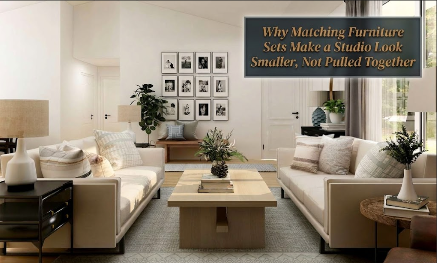
I’ve seen this pattern so many times I could describe it before I walk through the door. Someone moves into a studio, feels the pressure of having to make it look “done,” and heads straight to the furniture section of whatever big-box store is running a promotion. They come home with the full set. Sofa. Love seat. Matching coffee table. Matching side tables. All the same finish, all the same profile, all the same visual weight. Every single piece, perfectly coordinated, perfectly identical.
And every single time, the room looks smaller than it is.
Not disorganized. Not cluttered. Smaller. Like someone pressed everything flat. The kind of flat you’d only notice if you’d walked into enough rooms to know what flat feels like.
This isn’t about personal taste or budget. It’s a spatial problem created by a specific design choice, and understanding why it happens is the first step to fixing it.
1. The Myth the Furniture Industry Sold Us
Furniture retailers built a genuinely clever business model around the idea that a “complete set” equals a finished-looking room. And it works beautifully as a retail strategy. You walk in, you pick a finish, every decision is already made for you. Decision fatigue, solved. Interior design, apparently, solved too.
But matching sets were designed to move inventory, not to make small spaces feel larger. They solve a sales floor problem. When every piece in a one-room apartment shares the same profile, the same tone, the same visual weight, you don’t get a curated interior. You get a catalog spread. And catalog pages, by design, don’t look like anyone actually lives in them. They look like photographs taken before the tenant arrived.
In a larger home with multiple rooms, this is less damaging. A matching bedroom suite confined to one wing of a house doesn’t visually compress the entire property. But a studio has only one room. When every piece in that single room is identical, your eye has nowhere interesting to travel. It scans the space in two seconds and reads the whole thing as one flat, compact object.
The room isn’t smaller. It just reads smaller. And in real estate where every square foot costs what it does, that’s a problem worth solving.
2. What’s Actually Happening to Your Eye
There’s a principle I keep coming back to in my work, whether I’m designing a sprawling Toronto loft or a 400-square-foot condo: visual variety creates the perception of depth. When your eye has to move across different shapes, different heights, different materials and textures, it’s doing work. That work takes time. Time spent looking around a space makes the space register as larger.
When every piece is the same finish and the same scale, your eye completes the circuit almost instantly. One sweep, done. The room reads as a single uniform block. Compact, contained, finished in a way that feels more like a shoebox than a home.
Think about it from the other direction. Rooms that feel genuinely spacious, even when they’re not particularly big, almost always have contrast. A pale sofa against a dark wood floor. A sleek metal lamp beside a chunky linen cushion. A raw wood dining table paired with chairs upholstered in something completely different. Nothing matches outright, but everything works together. That’s the distinction most people miss.
Matching is not the same as cohesive. They’re not even related.
Cohesion in a well-designed space comes from a consistent color story, a material or texture that repeats as an accent without dominating, a visual rhythm that runs through the room without making everything identical. Two chairs that share a similar shape but have completely different upholstery can feel more intentional than two chairs that are perfectly matched, because they show a decision was made. Someone chose them together. That choice reads as personality, and personality makes a room feel alive rather than staged.
Height variation matters just as much. A full matching set tends to put everything at roughly the same level and the same visual weight. A thoughtfully mixed studio has tall pieces next to low ones, which creates layering that makes a room feel dimensional. If every item in your apartment tops out at the same 30-inch height, the room reads like a spreadsheet.
3. The Cohesion Confusion (Where Most People Go Wrong)
This is the error I see most consistently, and I don’t say that with any condescension because the furniture industry has done a very effective job of conflating “matching” with “designed.” They are not the same thing. They’re not even close to the same thing.
Cohesion is about intention. It’s about choosing a through-line, whether that’s a warm wood tone appearing in two or three pieces but not all of them, a color palette that runs through the soft goods without being repeated in every furniture finish, or a stylistic direction that holds the room together even when no two pieces share the same origin.
A walnut dining table paired with a white-painted bench and two rattan chairs? Cohesive. They’re all warm, light, organic in feeling. A matching dark espresso dining set with four identical chairs and the matching sideboard? Technically coordinated, but visually heavy and dimensionless.
If you’re starting from zero and feeling uncertain about where to begin without the safety net of a matched set, Studio Apartment Setup’s guide to setting up from nothing is a useful starting point. The instinct to buy sets when you’re overwhelmed with decisions is completely human, but the result will almost always work against you in a single-room space.
One rule I give clients when they’re building a mixed room: let your textiles do the matching work, not your furniture. If your area rug, your throw pillows, and your window treatments all share a color family, your furniture doesn’t need to coordinate with itself. The soft goods are doing the connective tissue work. Your furniture can vary in finish, material, and height. Actually, for a studio, it should.
4. What to Do Instead
This doesn’t require a design degree or a hefty budget. The principle is simple once it clicks.
Pick one material to anchor the room. A natural wood tone, a painted finish, a metal element, whatever suits your taste. Let that material appear in two or three pieces, but not every piece. It becomes the visual thread that reads as deliberate without making everything identical. A walnut credenza, a walnut picture frame above the sofa, a small side table in the same tone. Three points of reference. Enough to feel intentional, not enough to feel uniform.
Then vary the scale. One tall bookshelf, one low bench or coffee table, something at eye level. That vertical movement alone does a significant amount of work in a studio. It creates the kind of layering that makes a room read as dimensional, and it directly affects how large the space feels. Getting vertical space right applies equally to storage choices and decorative furniture decisions.
On the seating side, resist buying the sofa and love seat from the same set. A sofa paired with two accent chairs in a different material or a slightly different silhouette does far more spatial work than a perfectly matched set. And it often costs less overall, because the accent chairs can come from different sources at different price points.
Here’s a quick breakdown of how the two approaches compare in a real studio living area:
Matching Set vs. Curated Mix: A Side-by-Side
| What You’re Looking At | Full Matching Set | Curated Mix |
|---|---|---|
| Visual depth | Flat; eye finishes the room in one scan | Layered; eye moves through varied shapes |
| Perceived size | Room feels compressed | Room reads larger than it is |
| Personality | Showroom or hotel feel | Feels lived-in and chosen |
| Flexibility over time | Difficult to update one piece without disrupting everything | Easy to evolve by swapping one element |
| Entry cost | Front-loaded, higher upfront commitment | More adaptable, often lower starting point |
The zones point is worth spending a moment on. A studio only works spatially if it reads as distinct areas rather than one undifferentiated room, and a full matching set actively undermines that. When every piece is the same finish and visual weight, your eye can’t locate where the sleeping area ends and the living area begins. Creating separate zones without walls is partly a furniture question, and using varied pieces for each zone is a key part of making it work.
A different chair for the reading corner than the chairs around your small dining table. A bed frame that doesn’t share the exact finish as your desk. These aren’t just aesthetic choices. They’re spatial cues. A studio needs them.
And one final thing that I see consistently on the Studio Apartment Setup side of this conversation: people who build a curated mixed look almost always feel more confident in their space long-term. When you buy a matched set, the moment one piece gets damaged, outdated, or simply stops working for you, the whole room is affected because it’s all tied together. A curated approach lets you evolve. Replace one chair. Add a new lamp. The room adapts with you instead of holding you hostage to whatever style choices a furniture buyer locked in three years ago.
If you’ve ever moved into a studio and had that creeping sense that something’s off even though everything technically coordinates, this piece on why studios end up feeling like hotel rooms gets into exactly that feeling. Matching sets are a significant part of it.
The furniture industry will always try to sell you the complete package. And I understand the appeal, especially when you’re walking into an empty studio trying to make it feel like home as fast as possible. But a small space punishes visual repetition more harshly than any other environment. Give your room something to discover, and it starts to feel like twice the space.
FAQs
Q: I already bought a matching set. Is there anything I can do without replacing everything?
Yes, and it doesn’t require a major overhaul. Start by introducing contrast through textiles: a rug in a warm or unexpected color, throw pillows in different textures and scales, a throw blanket in a contrasting material. Then add one piece that deliberately breaks the set. A side table in rattan, a lamp base in a different metal finish, one accent chair in a contrasting fabric. That single disruption does a surprising amount of work. It tells the room that choices were made, and the whole thing stops reading as a catalog.
Q: Does avoiding matched sets mean everything needs to be from different brands or different styles?
Not at all. Two pieces from the same designer or collection can absolutely coexist, and there’s nothing wrong with that. The spatial problem arises specifically when every single piece in a one-room apartment, the sofa, the love seat, the side tables, the console, the matching mirror, all come from the same prescribed set with the same finish and the same visual weight. That specific combination is what creates the compression. Mixing a sofa and a coffee table from the same brand while choosing a different chair and a different lamp is completely fine.
Q: What’s the easiest first swap in a matching bedroom setup?
The bedside tables. Replace the matching ones with something in a contrasting material: a rattan piece, a painted wood table in a different tone, even a simple stool or a small upholstered ottoman. It’s low commitment, low cost, and it immediately breaks the monotony. The bed frame itself doesn’t need to change. One different element is often enough to shift the whole room from “prescribed” to “considered.”
Q: Aren’t matching sets generally better value for money?
Retail value, sometimes yes. Spatial value, almost never. What you’re paying for, largely, is the convenience of not having to make decisions. And in a studio, that convenience costs you the perception of space. The better investment is almost always a well-made anchor piece, a quality sofa, a solid bed frame, a good dining table, and then building around it with varied elements at a range of price points rather than committing to a rigid coordinated package.
Q: How do I know if my mix reads as cohesive or just random?
Look at the three most dominant pieces in your space and ask whether they share at least one quality: a color family, a material, a general aesthetic direction (warm and organic, clean and minimal, etc.). If they do, the room will almost certainly read as intentional. If all three are completely different in finish, scale, and style with no common thread, that’s when it tips from curated into chaotic. The goal is variety within a framework, not variety for its own sake.