

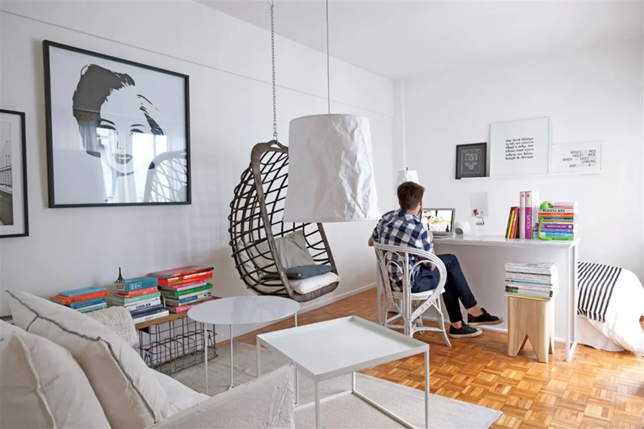
I’ll be honest — I used to think minimalism meant bare white walls and one sad succulent on a windowsill. That was my entire vision of it. So when I moved into my studio apartment and people kept saying “go minimal,” I basically ignored them and proceeded to fill every shelf, wall, and corner with things I thought looked cool.
Six months later, my studio felt like a thrift store that had given up.
Not cluttered in a charming way. Just… noisy. Visually exhausting. I’d walk in after work and feel more stressed than when I left.
That’s when I actually started researching what minimal decor really means — and more importantly, what it looks like when it’s done well in a small space. Turns out, it’s not about owning less stuff. It’s about making deliberate choices with what stays.
And right now, there are four specific minimal looks that are everywhere — on Pinterest, in real apartments, in design blogs — because they actually work in studios. Not just aesthetically, but functionally. They make small spaces feel calm, intentional, and honestly kind of impressive.
Here’s what they are, how they work, and what I actually learned trying to pull them off.
1. Warm Japandi — The Look That Makes Everyone Relax the Second They Walk In
Japandi is the blend of Japanese minimalism and Scandinavian design that the internet has been obsessed with for a couple of years now — and for good reason. It’s not going anywhere, because it solves a problem most people have in small spaces: how do you make something look minimal without it feeling cold or sterile?
The answer Japandi gives is: warmth. Natural materials. Quiet color palettes. Things that look handmade rather than mass-produced.
In practice, this means:
- Furniture in light wood tones (oak, ash, pine)
- Neutral colors — warm whites, sand, taupe, terracotta
- Textures that feel organic: linen, rattan, ceramic, jute
- Very little visual “noise” — no busy patterns, no competing colors
When I tried this in my studio, I started with what I already had and just edited. I covered my too-bright ikea sofa with a warm oatmeal linen throw. I swapped the plastic vase on my shelf for a matte ceramic one I found at TJ Maxx for $7. I bought a small rattan side table from Amazon ($28) and it instantly made the corner feel like a moment rather than a leftover space.
The step-by-step for getting the Japandi look without buying everything new:
Step 1 — Audit what you already own by color. Pull out anything that’s a bright, saturated tone (red, electric blue, neon anything) and box it temporarily. See what’s left.
Step 2 — Look for wood. Even one piece of real or wood-look furniture anchors the aesthetic. IKEA’s LISABO or HEMNES ranges work perfectly.
Step 3 — Add one natural texture layer. A jute rug. A linen pillowcase. A rattan basket. You only need one to shift the whole vibe.
Step 4 — Reduce what’s on display. Japandi is not about bare surfaces — it’s about considered surfaces. Three objects you love, deliberately placed, beats fifteen objects crammed together.
The mistake I made: I went too beige too fast. My whole space became a bowl of oatmeal — everything the same tone, no contrast, no depth. The fix was adding one darker element (I chose a matte black candle holder and a dark-stained wooden tray) to give the eye somewhere to rest.
2. Modern Monochrome — One Color, Done Beautifully
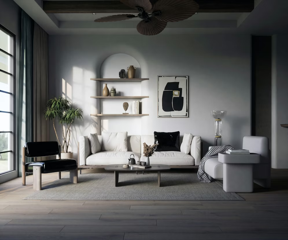
This one intimidated me at first because I thought “monochrome” meant black and white, full stop. But modern monochrome decor is really about building a room around one base color — and then playing within that color’s range.
Think: an all-grey studio where you’ve got charcoal, silver, warm grey, and off-white all working together. Or an all-cream space with ivory, linen, eggshell, and sand. Or even a deep green approach with sage, forest, and emerald accents.
The reason this works so well in studios is that it creates visual unity across the whole space. When everything reads as one color family, the eye doesn’t get “caught” on contrasting zones — which makes a small room feel more expansive and intentional.
For layout ideas that complement this kind of visual cohesion, these 9 proven studio layout ideas for better flow pair really well with a monochrome approach because the furniture placement logic is the same: reduce visual interruption, keep sightlines clean.
How to build a monochrome studio look without it becoming boring:
The key is variation in texture, not color. If everything in your all-white room is smooth and flat, it looks clinical. But if you’ve got:
- A fluffy white throw
- A matte white ceramic vase
- A glossy white lamp base
- A woven white or off-white rug
…suddenly there’s visual interest everywhere without a single color change.
| Monochrome Base | Works Best With | One Accent to Add |
|---|---|---|
| Warm White / Cream | Linen, wood, natural fiber | Black or dark walnut |
| Soft Grey | Velvet, glass, brushed metal | Dusty blush or sage |
| Sage Green | Rattan, terracotta, linen | Warm white or cream |
| Warm Tan / Camel | Leather, jute, ceramic | Rust or forest green |
Real example: My friend redid her studio in all warm whites. She painted one wall (with landlord permission) in Benjamin Moore “White Dove,” covered her grey couch in cream slipcovers, got a cream textured rug, and used white linen curtains. The only non-white things are her dark wood floors and one black-framed art print. It looks like a magazine. Her total spend on new items was around $180.
Mistake to avoid: Buying the same shade of white from different stores and ending up with clashing undertones. Warm white and cool white in the same room fight each other visually. Stick to one brand or test swatches before committing.
3. Earthy Organic — The Look That Feels Like a Boutique Hotel
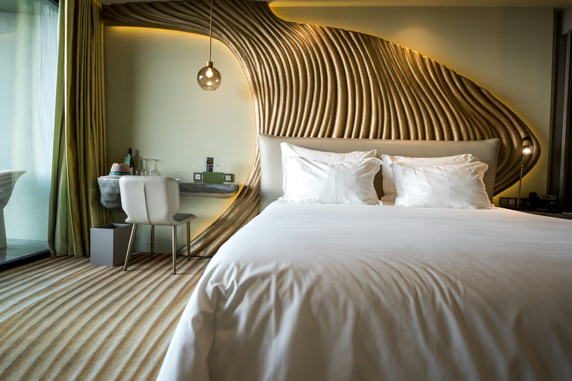
This is the one that’s absolutely everywhere on Instagram right now, and once you see it, you can’t unsee it. Earthy organic decor is minimal in the number of items but rich in texture and color — think desert tones, lots of natural materials, and that feeling like everything was sourced from a small artisan market.
The palette: burnt orange, terracotta, rust, warm brown, olive, dusty pink, cream. Not all together — pick two or three and let them play.
The materials: raw linen, unglazed ceramic, chunky knit, woven wall hangings, dried botanicals, wood with visible grain, stone accents.
What makes this minimal rather than maximalist is the restraint. You’re not covering every surface. You’re choosing a few high-impact items and letting them breathe.
Here’s what I actually put in my studio to test this look:
- A terracotta-colored linen duvet cover (Amazon, $42) on my bed — instant anchor
- Two dried pampas grass stems in a tall, narrow vase on the floor — zero maintenance, high visual impact
- A chunky hand-knit throw I found at a local market for $18
- Two unglazed ceramic pots from IKEA’s plant section (used for decor, not actual plants)
The result looked effortless. People kept asking if I’d hired someone to style it. I hadn’t. I’d just spent about $75 and taken two hours on a Saturday.
One thing nobody tells you about the earthy organic look: It photographs unbelievably well. If you document your space on Instagram or use it as a backdrop for videos (content creators — this is for you), this palette is warm and flattering in almost any light.
If you’re also thinking about what to put on your walls in this style, these 5 wall shelving space hacks for studio apartments give good guidance on how to create gallery-style displays without it looking cluttered — which is crucial for keeping the organic look minimal rather than messy.
The mistake most people make: Going too heavy on terracotta. It’s a beautiful color but it can overwhelm fast. Use it as an accent — a pillow, a pot, a throw — rather than the base. Let neutrals carry the room.
4. Clean Scandinavian — Functional, Quiet, and Completely Timeless
Unlike the other three looks, Scandinavian minimalism isn’t trendy — it’s been quietly working for decades. And it keeps showing up in studio apartments because it solves the exact problem studios have: too much going on in too little space.
The Scandi approach strips everything back to function. If something doesn’t have a purpose, it doesn’t have a place. But it doesn’t feel cold because the warmth comes from a very specific set of choices: light wood, white walls, soft textiles, and a few carefully chosen pieces of simple, beautiful design.
Think IKEA at its best — not IKEA thrown together in a hurry, but IKEA selected with intention.
The core principles of Scandi minimal decor:
Principle 1: White or very light walls. This is non-negotiable. The light walls create the sense of spaciousness that makes the whole look work.
Principle 2: One hero furniture piece. In Scandinavian design, there’s usually one item that has genuine design quality — a well-made sofa, a beautiful light fixture, a solid wood dining table — and everything else is kept simple around it.
Principle 3: Soft layers for warmth. Sheepskin throws, chunky knit blankets, thick cotton rugs. These add warmth and humanity to an otherwise pared-back space.
Principle 4: Functional storage that disappears. Baskets, boxes, and storage that looks intentional. Nothing left out that doesn’t need to be.
Principle 5: Plants. Always a few plants. They’re the life in a Scandi room. A pothos, a snake plant, or even a simple branch in a vase.
| Scandi Decor Must-Haves | Approximate Cost | Where to Find |
|---|---|---|
| White/off-white curtains | $20–$45/pair | IKEA, Amazon |
| Light wood side table | $25–$60 | IKEA, Wayfair |
| Sheepskin or faux fur throw | $15–$40 | H&M Home, TJ Maxx |
| Simple white pendant light | $20–$50 | IKEA, Amazon |
| Large white-walled art print | $10–$30 | Society6, Desenio |
| Woven cotton rug (natural) | $40–$80 | IKEA, Amazon |
If you find yourself overwhelmed with organizing the functional side of this look — particularly in a studio where storage is always a challenge — these 7 smart studio organizing hacks that save space work perfectly alongside Scandi principles because they emphasize hidden, intentional storage over visible clutter.
Lesson I learned the hard way: Scandi design is easy to get right in pictures and easy to get slightly wrong in real life. The gap between “beautiful Scandi studio” and “empty apartment that hasn’t been moved into yet” is actually pretty narrow. The difference is the soft layers and the plants. Don’t skip those. They’re what make the space feel lived-in rather than vacant.
How to Choose Which Look Is Actually Right for Your Studio
Because you probably can’t (and shouldn’t) try to do all four at once, here’s a quick way to figure out which direction fits you:
You’re drawn to Japandi if: You love calm, you hate visual noise, you feel good around natural materials, and you want your space to feel like it’s breathing.
You’re drawn to Modern Monochrome if: You’re a “one palette, nail it” kind of person. You like things to feel cohesive and seamless. You probably also like a fairly clean desk.
You’re drawn to Earthy Organic if: You want your studio to feel warm, creative, and a bit collected — but still minimal. You’re drawn to texture over color. You might make content or just love a space that photographs beautifully.
You’re drawn to Clean Scandinavian if: You want function first, beauty second, and you’d rather have one really good thing than five okay things. You appreciate understated quality.
The Common Thread Between All Four Looks
Here’s what I’ve noticed after genuinely trying versions of all four of these in my own studio over the past couple of years: they all share the same underlying logic.
Less visual competition. More intentional placement. Materials that feel real.
It doesn’t matter which look you choose — if you follow those three principles, your studio will feel minimal in the best way: calm, considered, and completely livable.
The mistake most people make is thinking they need to overhaul everything at once. You don’t. Pick one look, change three things this weekend, and see how it shifts. You’ll be surprised how much a rug, a throw, and two deliberate decor choices can move the needle.