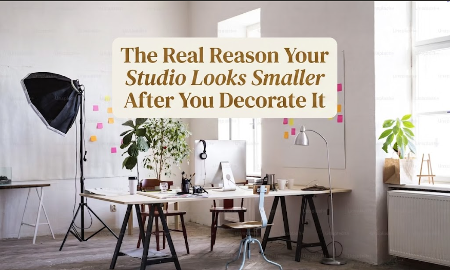
One of the most consistent misconceptions I run into with studio clients is this: they believe that decorating will make their space feel more expansive. More intentional. More livable. They’ve read the guides, chosen a rug in the “right” size, hung a few pieces of art, layered some throw pillows. And then they call me, genuinely confused, because the apartment feels noticeably smaller than it did when they moved in with nothing.
I’ve seen this happen dozens of times, across studios ranging from 350 square feet to 600. Same square footage before and after. Completely different energy.
The decor did it. And not in the obvious ways everyone assumes.
1. The Problem Isn’t the Furniture. It’s the Contrast.
The first thing most clients do when a room feels tight is start questioning the furniture size. They assume the sofa is too big, or maybe the coffee table is claiming too much floor space. So they swap things out. They buy smaller pieces. They clear more visible floor. The room still feels cramped.
Because the furniture was never the issue.
What’s actually happening is a visual contrast problem. Every time you introduce an object into a room, your eye has to stop, register it, and move on. A single well-chosen piece in an empty room feels intentional and clean. Introduce six objects across the same wall, each in a slightly different tone or finish, and suddenly your eye has nowhere to settle. That visual restlessness reads as “crowded” in the brain, regardless of what the square footage actually is.
Studios punish this more than any other floor plan. In a large apartment, you have open transitions between spaces, room for the eye to breathe between moments of interest. In a studio, there’s no buffer. When contrast is everywhere, the room feels congested even before the furniture is too close together.
This is the part of small-space design that decorating guides almost never address.
2. Scale Is the Thing Most People Get Wrong
Scale isn’t only about whether a piece of furniture fits through the door or clears the walls. It’s about the relationship between all the objects in the room, how much visual weight each one carries, and whether anything gets to be the hero.
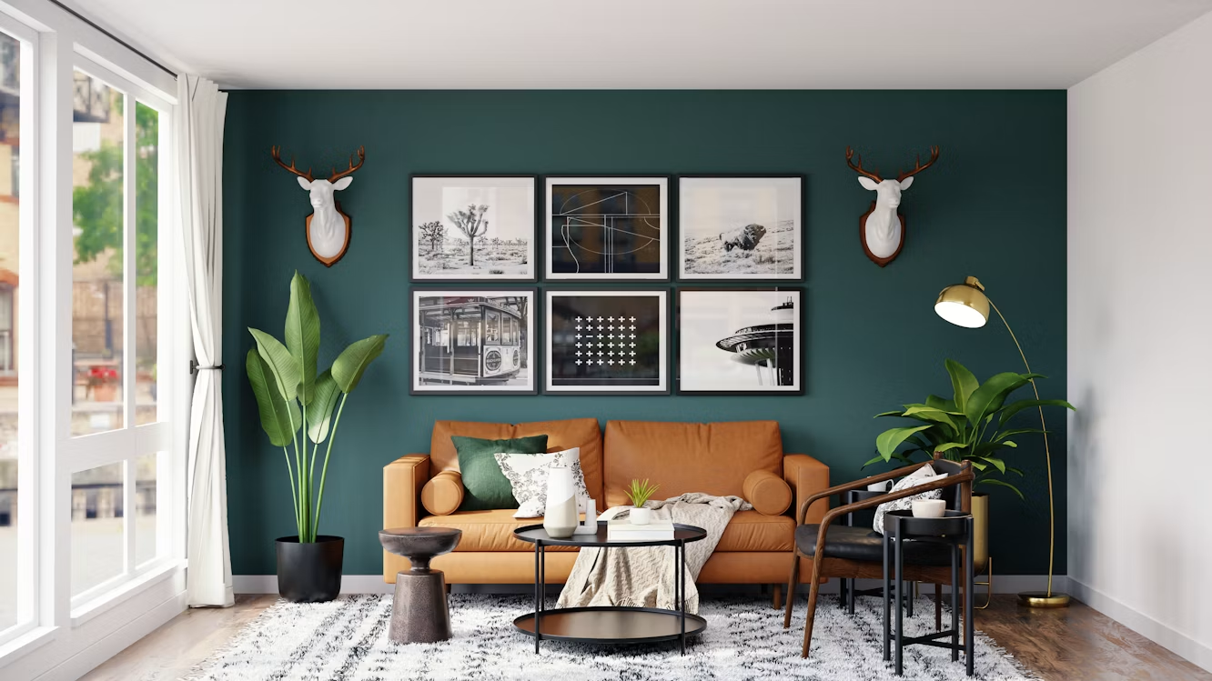
And this is exactly where matching furniture sets make a studio look smaller, not more pulled-together. The logic seems reasonable when you’re shopping: a coordinated collection means everything fits. But matching sets in studios create a flat, uniform visual field. There’s no hierarchy. Your eye doesn’t know where to land first, so it tries to take everything in at once, and in a small room, that’s exhausting. One dominant piece, two or three supporting it, and some deliberate negative space. That’s the formula that actually works.
The other thing people consistently miss is vertical scale. Studios tend to be under-decorated in their upper half. Art is hung at eye level even when the ceiling is nine feet high. Curtains are mounted at the window frame. Nothing draws the eye upward. This is a missed opportunity every single time.
Hang your artwork higher than feels natural. Mount curtain rods close to the ceiling and let them fall to the floor. Use a tall, narrow floor lamp rather than a squat table lamp. The vertical plane is the most underused design tool in a studio, and it costs almost nothing to use.
3. The Three Invisible Culprits
Once scale is sorted, the remaining issues tend to be quieter and harder to spot. These are the things that register as a vague “something’s off” feeling without an obvious cause.
Pattern on large surfaces. A patterned area rug covering most of the floor creates, visually, a second floor. The eye has to process the floor twice. Busy patterns demand attention and they get it, which means there’s less visual bandwidth left for everything else in the room. The same logic applies to heavily patterned throw cushions on a textured sofa. Keep bold patterns limited to one element and make sure that element is earning its place.
Ceiling colour. A stark white ceiling against mid-tone walls creates a hard contrast line at the top of the room that visually lowers it. This is one of the most counterintuitive corrections in small-space design, but it’s consistent: paint the ceiling the same colour as the walls, or just slightly lighter, and the room height reads taller because the eye doesn’t get stopped at that seam.
Single-source lighting. A single overhead fixture casts shadows in every corner, and shadowed corners compress the perceived size of a room. This is one worth taking seriously. One overhead light is often the thing that quietly ruins a studio’s atmosphere more than any furniture decision does. Wall sconces, a floor lamp in a dark corner, under-cabinet lighting in the kitchen zone, a table lamp on the desk. Layers of light push illumination into the edges of the room and the space reads as larger because the eye can follow that light all the way around.
And then there are mirrors. They work, but only in specific conditions. A mirror placed directly across from a window doubles the window and doubles the incoming light. That’s the right move. A mirror in a dark corner just reflects more darkness, which makes the dark corner feel more present, not less. Mirror placement in a studio matters far more than mirror size.
Quick Reference: What Shrinks the Room vs. What Opens It
| Design Element | What Shrinks the Room | What Opens the Room |
|---|---|---|
| Rug sizing | Too small (furniture floats) or too large (no floor border) | Front furniture legs anchored, visible floor border remaining |
| Wall art | Small prints scattered at varied heights | One larger piece at consistent height |
| Colour palette | High contrast between walls and furniture | Tonal family, low contrast overall |
| Curtain rod height | Mounted at window frame | Mounted near ceiling, floor-length drape |
| Lighting setup | Single overhead fixture | Multiple sources at different heights |
| Furniture base | Solid-base sofas and chairs to the floor | Visible legs, light passing underneath |
| Ceiling colour | Bright white against mid-tone walls | Same as walls or one shade lighter |
| Pattern use | Bold pattern on multiple surfaces | Bold pattern on one element only |
4. The Decor Moves That Make the Problem Worse
There’s a specific category of decor item that gets promoted constantly in small-space content, yet it reliably creates the opposite effect of what’s promised.
Accent walls, done wrong, are a good example. And in my experience, they’re done wrong more often than they’re done right. An accent wall in a studio creates a visual stop sign: the eye hits that saturated colour and stops moving. If that wall is behind your bed, the whole sleeping zone feels like it’s been pushed forward into the room. Accent walls in studios can absolutely work, but they require the colour differential to be subtle, the wall to be one the eye would naturally read as a focal point anyway, and the rest of the palette to reference it consistently.
Too many textiles are another one. Throws draped over every surface, cushions stacked three-deep, a second rug layered over the first. Textiles absorb light. An over-upholstered studio has a heavy, dense quality that reads as closed-in, even if nothing is technically blocking any sightlines. One quality throw, one well-placed rug, and cushions that serve the furniture rather than overwhelm it.
And collections. I’ve watched clients bring in beautiful objects, things they’ve gathered over years of travel or simply pieces they genuinely love, and arrange all of them on one shelf. The result, inevitably, reads as visual noise. Every individual piece is interesting. Fifteen of them grouped together cancel each other out. Edit down. Show five things beautifully rather than twenty things casually, and rotate the ones in storage every few months.
The guides on Studio Apartment Setup are consistently honest about this: density is not the same as warmth. A studio can feel genuinely personal and even glamorous without being visually dense. The goal is a high quality-to-quantity ratio at every level, which requires a willingness to take things out as much as you put things in. That’s the harder edit, and it’s the one most people don’t want to make.
There’s always at least one moment in a studio project where something has to come out. Not because it’s wrong, not because it’s a bad piece, but because the room can only carry so much before the whole thing starts to compress. The spaces that end up working are never the ones with the most interesting objects. They’re the ones where every object has room to be seen.
That’s the real reason your studio looks smaller after you decorate it. You didn’t make bad choices, most likely. Nobody told you that small spaces have a visual load limit, and most decorating advice is written for rooms with enough buffer to absorb the extras.
Now you know where to start.
FAQs
I hung some art last week and the room suddenly feels more cramped. What’s happening?
Most likely it’s a scale issue. A small piece of art in the centre of a large wall creates an awkward visual imbalance, and the wall behind it starts to feel more present, not less. Try going larger with the piece, or grouping it with one or two others to create a collected moment. Also check the hanging height: art positioned at eye level in a room with high ceilings loses the vertical draw that helps rooms feel taller than they are.
Does an area rug make a studio look bigger or smaller?
Both, depending entirely on sizing and placement. A rug that’s too small becomes a floating island in the centre of the room, which visually breaks the floor into fragments and makes it read smaller. The front legs of your seating should rest on the rug. If the rug doesn’t reach far enough to anchor the furniture properly, it’s too small for what you’re asking it to do.
My studio has white walls and it still feels tight. Why isn’t it working?
White doesn’t automatically equal spacious. If your furniture is dark and your floors are dark, the white walls are creating high contrast throughout the room, which the eye reads as busy. The room feels visually loud even if it’s not cluttered. Try pulling the furniture tones warmer or lighter so there’s more cohesion across the space. And check your lighting. White walls only work as an expanding element when they’re actually lit well enough to read as light, which one overhead fixture usually can’t achieve on its own.
Are room dividers worth using in a studio, or will they make it feel smaller?
They can be worth it, but only if they allow light to pass through and don’t create fully enclosed sub-rooms. A heavy bookshelf running across the middle of a studio cuts the visual length in half. Open shelving, curtain dividers on ceiling tracks, or low furniture used to define a zone without blocking sightlines are all more effective. Studio Apartment Setup has a useful breakdown of room divider ideas that preserve natural light if you’re working through the zoning question.
Every guide I’ve read says floor-to-ceiling curtains make a room look taller. I tried it and it made no difference. What am I missing?
The curtain rod placement matters more than the curtain length. If the rod is mounted at the window frame, even perfectly floor-length curtains read as window-sized, because that’s where they start. Mount the rod as close to the ceiling as the architecture allows, and hang curtains that just graze the floor. The continuous vertical line from ceiling to floor is what creates the height illusion. And keep the curtain colour very close to your wall colour so the whole plane reads as one uninterrupted surface, not as a curtain hanging in front of a wall.