A gallery wall is one of the easiest ways to make a 350 square foot room feel like a stockroom instead of a home. That’s the blunt version. The longer version takes a bit more explaining, because gallery walls aren’t a bad idea in general, they’re a bad idea applied to the wrong size of room without adjusting for it.
1. The Belief: Gallery Walls Mean Personality and Free Coverage
The pitch is everywhere. Hang a cluster of frames, mix in some art and photos and maybe a small shelf, and suddenly a blank wall has personality instead of looking unfinished. It’s cheap too, since most of what goes up is stuff people already own. In a bigger home with multiple rooms, this works almost every time, because each room only has to carry its own visual weight.
A studio doesn’t get that luxury. Every wall in a one-room layout is visible from almost every other point in the apartment, all at once, with no door to close on it when you want a visual break.
2. Why It Backfires in a One-Room Layout
Here’s the actual mechanism, not just the vibe. In a house, a busy gallery wall in the hallway doesn’t compete with the calm of the living room next to it, because you can’t see both at the same time. In a studio, your eye takes in the gallery wall, the bed, the kitchen counter, and whatever’s on the floor in front of the closet, in a single glance, from a single seat on the couch.
That means every visually loud surface is competing with every other surface for attention, all the time, with nowhere for the eye to land and rest. A gallery wall with twelve frames in mismatched sizes isn’t just twelve frames anymore. It’s twelve visual interruptions stacked into a room that probably only had two or three calm spots to begin with. Lose one of those calm spots to clutter and the whole room reads as smaller, even if the square footage hasn’t changed at all.
This is the same underlying issue behind a pattern Studio Apartment Setup has written about separately, where decorating a studio with good intentions still manages to shrink it. Wall displays are one of the most common contributors, and usually the last thing people think to blame.
3. The Mistake People Make Almost Every Time
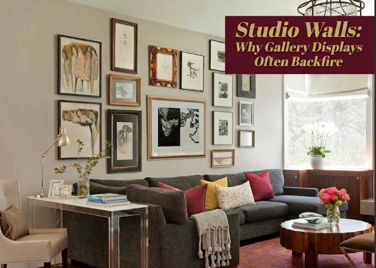
Here’s where it goes wrong, consistently, across nearly every gallery wall I’ve seen go bad in a small space. People treat the wall as available real estate instead of treating it as a limited resource the rest of the room depends on. Three things show up over and over.
First, too many frames for the wall size, often crammed in because “it filled up nicely.” Second, no anchor piece of furniture underneath, so the cluster floats with no visual relationship to anything else in the room. Third, mismatched frame colors and styles that would blend into a busier house but stick out hard against the limited backdrop of a studio.
And there’s a fourth one that’s sneakier. Hanging the whole arrangement too high, usually because the instinct is to “fill the wall” vertically instead of keeping it anchored to eye level. A studio with low average sightlines, since most of your time is spent sitting or lying down, makes a too-high gallery wall feel even more disconnected from the room than it would in a house with taller ceilings and more standing-height activity.
4. What Actually Works Instead
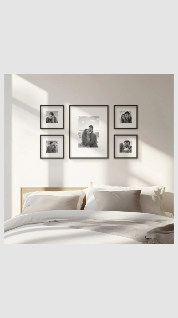
The fix isn’t “no art.” It’s fewer, bigger, more intentional pieces, anchored to something solid underneath. A couch, a console table, a headboard. Anything that gives the eye a stopping point before it travels up the wall.
For spacing and placement, here’s the rough guide most designers actually use, scaled down for studio-sized walls:
Center of arrangement      57 to 60 inches from the floor
Gap between frames          2 to 3 inches, consistent throughout
Frame count for a studio    3 to 5 pieces max on any single wall
Anchor furniture below      Yes, almost always
Frame finish                One consistent color or finish family
Three to five pieces sounds restrictive compared to the Pinterest version of a gallery wall, but in a room this size it’s the difference between a wall that adds character and a wall that adds noise. If mirror placement is part of your wall strategy too, it’s worth checking Studio Apartment Setup’s guide on where mirrors actually help versus where they just look strange, since mirrors and art are usually competing for the same handful of decent walls in a one-room layout.
5. When a Gallery Wall Can Actually Work
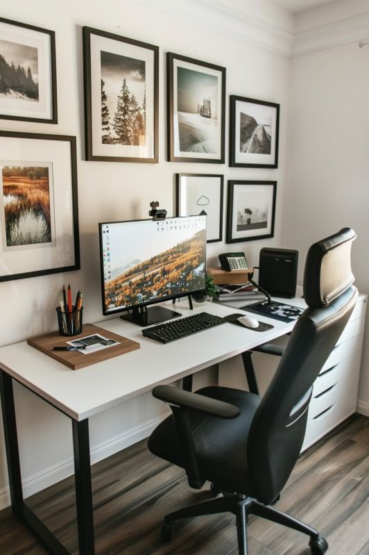
It’s not a permanent ban. A gallery wall works fine in a studio when it’s confined to one wall only, ideally a wall that isn’t also doing double duty as a sightline toward your kitchen or your bed. It works when every frame shares a finish or a color story instead of looking like five separate purchases from five different years. And it works best when it’s treated as the one loud moment in the room, not one of several.
That last part is the real adjustment people miss. A house can have three or four loud decor moments spread across different rooms. A studio gets one, maybe two, before the whole space starts to feel like it’s shouting. If your studio already feels cluttered even after a cleanup, a busy wall is frequently part of the reason, and Studio Apartment Setup covers that specific frustration in more detail here.
I’ve pulled gallery walls down for clients more often than I’ve installed them in small spaces, and almost every time, the room looked calmer and somehow bigger within a day of taking the extra frames off. Not because the wall itself was wrong, but because it had been asked to do more work than a small room could support.
6. A Few Common Questions
Is a gallery wall ever genuinely fine in a tiny apartment? Yes, as long as it’s limited to one wall, kept to a handful of pieces, and anchored above a piece of furniture rather than floating in open space.
How many frames is actually too many for a studio wall? Past five or six, most studio walls start to look crowded rather than curated. The exact number depends on wall size, but more than that usually means thinning it out, not adding a shelf to make room.
Does the center of the arrangement need to sit at a specific height? Roughly 57 to 60 inches from the floor to the center of the cluster is the standard reference point, which keeps it at a comfortable eye level for most people standing in the room.
Do all the frames need to match exactly? Not exactly, but they should share something, a finish, a color, a material, so the eye reads them as one decision instead of several unrelated ones competing for attention.
What’s a better alternative to a full gallery wall in a small space? One or two larger pieces, or a single shelf with a small rotating display, usually does more for a studio than a dense cluster of small frames, and it leaves the wall feeling intentional instead of full.
If wall space keeps feeling like the hardest part of furnishing a studio, it’s worth reading Studio Apartment Setup’s piece on why matching furniture sets often backfire too, since the underlying issue, too many competing decisions in one small room, shows up in furniture choices just as often as it does on the wall.