A client called me last spring, right after getting back from a ten-day Mediterranean cruise. She’d been living in a 400-square-foot studio in Toronto’s Liberty Village for about two years, and we’d worked together on the setup. Good bones, smart storage, decent layout for the square footage.
But she had that slightly deflated voice.
“Nicholas, my cabin on that ship was maybe 180 square feet. And I felt comfortable in it. More comfortable than I do at home sometimes. How is that even possible?”
She wasn’t wrong to be puzzled. But I wasn’t surprised, either. I’ve thought about cruise ship cabin design more than most interior decorators will openly admit, because those spaces are doing something that residential design frequently gets backwards: they treat every inch as a decision, not an afterthought. The ship doesn’t give you the option of fixing it later. You make the space work, or you fail completely.
That pressure produces brilliance. And a lot of it applies directly to studio living.
1. What Cruise Ship Designers Know That the Rest of Us Are Still Learning
The philosophy behind cruise cabin design isn’t complicated, but it is relentless. Every surface, every wall void, every transition between one area and another has been considered. There’s no such thing as a decorative-only choice in 180 square feet. Even the artwork is sometimes framed to conceal panels.
In a studio apartment, the same discipline is available to you. Most people just don’t apply it.
The mistake I see over and over again, both in client consultations and in questions that come through Studio Apartment Setup, is what I’d call the furniture store approach. Someone picks a sofa they love, then a bed they love, then a dresser they love, and tries to make three pieces designed for generously sized rooms work in a space that was meant to function as one tight, efficient whole. It doesn’t work. Not because the apartment is the problem, but because the furniture was never designed with it in mind.
Cruise ship designers start from the opposite direction. They begin with the space and build outward. What does this person actually need to do in here? Sleep, dress, sit, work a little, store things. Then they figure out how to accomplish all of that without any element getting in the way of another. That inversion, starting from need rather than aesthetics, is exactly where most studio setups fall apart.
The good news is that the inversion is learnable.
2. The Zone Principle: Separation Without a Single Wall
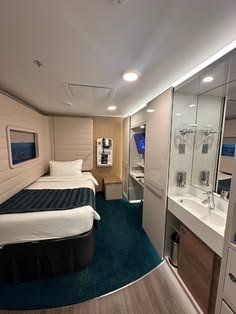
One of the things that makes a cruise cabin feel more generous than its square footage suggests is that it functions like two or three rooms while being one. You don’t feel like you’re sleeping in the same space where you relax, even when the bed is literally four steps from the reading chair.
That effect is built from zones. Not physical zones with dividers or curtains, but perceptual zones, constructed from lighting shifts, furniture angles, flooring cues, and line of sight.
A cabin bed is typically angled or recessed against a wall with a padded headboard panel that reads clearly as “bedroom.” The sitting chair has its own lamp, positioned on a slightly different axis. The desk is placed so that when you’re seated at it, you aren’t looking directly at the pillow. These are deliberate orientations, not accidents. And the result is a room that feels mentally segmented even when it’s physically one open box.
At Studio Apartment Setup, I keep returning to the same principle: a studio doesn’t need walls to feel divided. It needs signals. The piece on how to create separate spaces without walls goes deeper on this, but the cruise ship version of it is worth understanding on its own.
Three tools translate almost directly:
Line of sight management. When you walk into a well-designed cabin, the bed isn’t the first thing you see. There’s a short entry moment, a closet on one side, and then the room opens up to a window or seating area. Your eye lands somewhere other than the sleeping surface. In a studio, you can create this by placing something visually interesting across from your entrance door. A bookshelf, a console, a piece of art. The bed becomes background, not the focal point of the whole space.
Layered lighting. One overhead fixture does nothing except expose every imperfection and make the room feel like a waiting room. Cruise cabins almost always have reading lights at the bed, a warm indirect ceiling light, and a task lamp at the desk. Three circuits. Three moods. I’ve written about why one overhead light ruins everything in a studio and the logic holds here: if your only light source is above your head, your space will always feel like it’s being interrogated.
Rug and material transitions. Even carpeted cabins use rugs and material changes to signal shifts from one zone to another. A small rug under a side chair, a contrasting floor mat in the entry. These transitions say “you’re in a different part of the space now” without requiring anything structural.
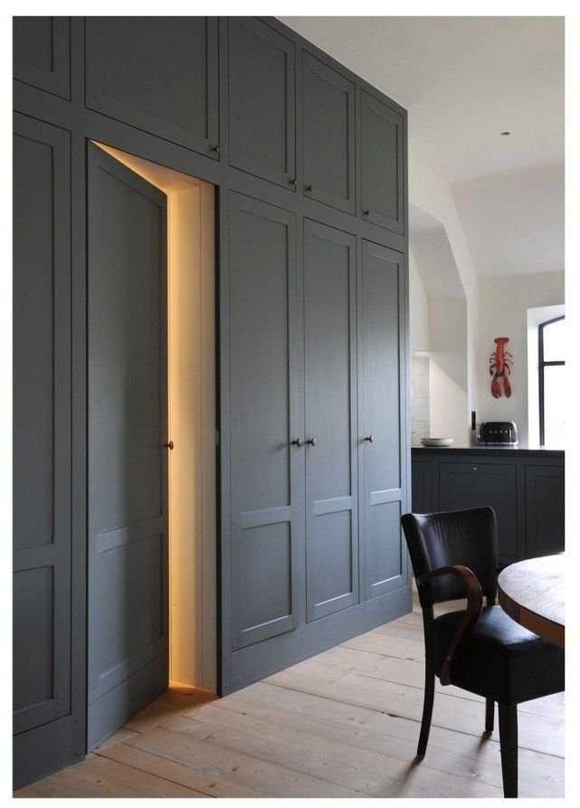
3. Built-In Storage Is the Real Secret
This is where cruise ship design earns its reputation.
The storage in a well-designed cabin isn’t impressive because there’s a lot of it. It’s impressive because most of it is invisible. Drawers integrated into the bed frame, recessed shelving built flush into the wall, mirror-fronted cabinets above the sink, hooks on the back of every single door. The impression isn’t “organized storage.” The impression is just that the room is tidy.
The most common studio mistake I see is what I’d describe as visible clutter management: buying bins and baskets and stacking them on shelves in ways that are technically organized but visually exhausting. You walk in and immediately register all the organizing. That’s the opposite of what you want. The ship approach hides the architecture.
Cabins also use the bed as a whole furniture system, not just a sleeping surface. Murphy beds in studios operate on this same logic: the sleeping surface folds away and the floor comes back. Most cruise ships take a different approach, a permanently placed but low-profile bed with a full storage system built underneath, but the underlying idea is identical. The bed is doing more than one job or it’s wasting its footprint.
And the vertical dimension. Cruise cabins go high in a way that residential design often doesn’t. The shelving above the closet isn’t dead space, it’s luggage and out-of-season storage. The wall above the desk runs a shelf its full width. The cabinet beside the bed reaches shoulder height and then some. Using vertical space in a studio the right way is genuinely the most underused tool available, and ship designers have understood this since ocean crossings meant fitting everything you owned into a room the size of a generous bathroom.
| Cruise Ship Cabin Approach | Typical Studio Setup |
|---|---|
| Drawers built directly into bed frame | Separate dresser placed wherever floor space allows |
| Recessed wall shelving, flush with surface | Freestanding shelves projecting into the room |
| Mirror-fronted cabinets that double as space expanders | Open shelving or plain cabinet doors |
| Hooks on the back of every door, by design | Hooks added as an afterthought |
| Luggage and seasonal items stored above head height | Floor-level bins as default |
| Closet engineered for a complete wardrobe, folded and hung | Single hanging rod with one shelf above |
The difference between these two columns is integration. One approach places furniture into a room. The other makes storage part of the room itself.
4. Light, Colour, and the Illusion of More Room
Cruise cabins are almost universally done in warm neutrals. Cream, warm white, pale taupe. Not because ship designers lack imagination, but because they understand what colour does in a confined space under artificial light.
Here’s where most people get this wrong: they test paint samples in daylight. On a Saturday afternoon with the windows open, cool grey looks crisp and spacious. Under artificial light on a Wednesday evening, it goes flat and slightly grim. Cruise designers solve for artificial light conditions first, because that’s when passengers are actually in the cabin. Studio dwellers should do the same.
Test your paint samples under the lighting conditions you actually live in. Not the flattering afternoon shot. The late-evening scenario with your current bulbs running. This one adjustment changes everything about how a colour reads in daily life.
Mirrors are the other thing cruise cabins do consistently well, and they do it with intention. Not one large mirror on a door, but mirrors positioned to reflect available light sources and multiply perceived depth. A mirror facing a window. A mirror beside the bed that catches the lamp. The positioning matters far more than the size, a point worth keeping in mind before anything gets hung.
Fabric restraint is the last thing worth borrowing. Cabins typically use one, maybe two textures across the whole room. They don’t layer a linen headboard against a velvet bench against a jute rug against a cotton duvet. The visual discipline is intentional. In a small space, too many textures register as clutter even when nothing is technically out of place. One palette, two textures maximum, is a principle that translates directly to the studio.
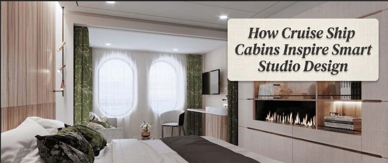
What I find genuinely inspiring about ship design is that it came from a non-negotiable constraint. The cabin doesn’t get bigger. There’s no phase two where you add more room. Every decision gets made under that pressure, and it produces a standard of intentionality that most residential projects never bother reaching for.
The studio apartment is the same constraint. And it deserves the same approach.
FAQs
What’s the single most impactful change I can make to make my studio feel more like a well-designed cabin?
Fix the lighting first. Most studios run on one or two overhead fixtures that flatten the space and make everything feel clinical. Add a floor or table lamp at bed level and a second lamp near your seating area. Three light sources at different heights changes how the room reads entirely, and it’s something you can do this weekend without touching a single piece of furniture.
Is built-in storage realistic in a rented apartment where I can’t touch the walls?
Completely realistic, with the right furniture choices. You don’t need to build into walls to apply the built-in principle. Platform beds with integrated drawers, wardrobes with internal shelving systems, ottomans with storage inside, all of these accomplish the same outcome as built-ins without requiring any permanent changes. The principle is about concealment and integration, not construction.
Cruise ship cabins benefit from porthole windows. What if my studio has minimal or no natural light?
This is where layered artificial lighting really earns its place. Use warm bulbs in the 2700K to 3000K range and position lamps to mimic where natural light would naturally come from, typically the side of a room, not the ceiling. A mirror positioned to catch and reflect whatever light does enter, even a small window across the hall, can make a noticeable difference. A dim studio can feel warm and intentional rather than just dark if the light sources are layered thoughtfully.
How do cruise designers keep a single colour palette from feeling monotonous?
Texture does the work that colour usually handles in a larger room. One warm neutral expressed in three different textures, a woven throw, a smooth ceramic lamp base, a matte wall finish, a glossy tile, gives the eye things to land on without introducing visual noise. You get visual richness without the chaos of multiple competing palettes. It’s a principle worth taking directly from ship design into any studio space.
Can I realistically zone a studio under 350 square feet?
Yes, and it doesn’t require anything structural. A rug defines a sitting area without a single wall. A pendant light centered over a small table establishes a dining zone clearly and without bulk. A bed positioned with its headboard deliberately against a wall, with lamps flanking it symmetrically, reads as a proper bedroom zone even when the sofa is three steps away. The signal doesn’t need the square footage. You’re creating perception, not architecture.