
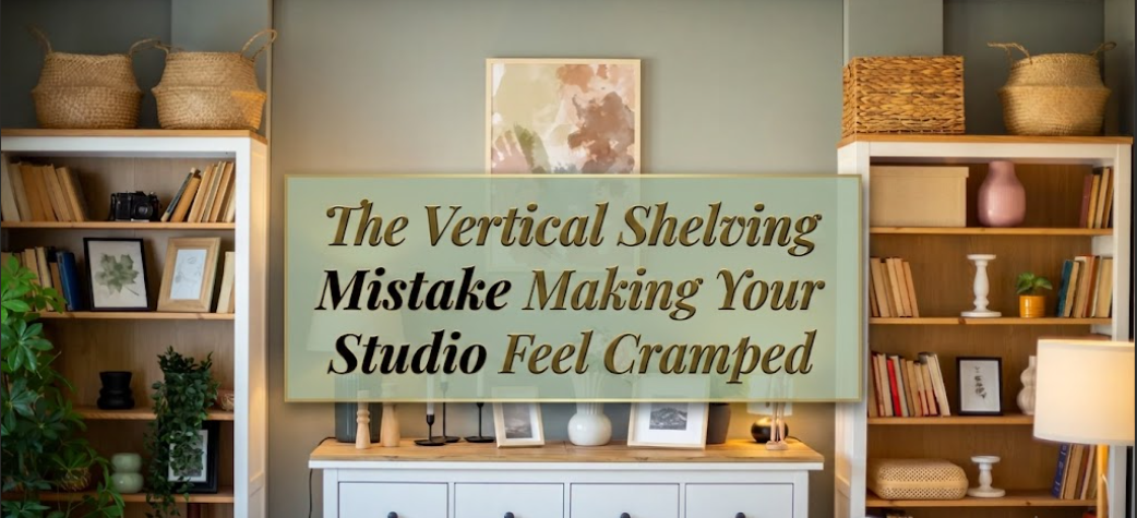
I did this to my own place before I ever did it to a client’s, so I can’t act like this mistake only happens to people who don’t know better. Years ago, when I was still building out my portfolio, I lined an entire wall of my first small apartment with open shelving, floor to ceiling, and stood back expecting it to look like something out of a design magazine. It looked like a supply closet. Every inch of vertical space was technically “used,” and the room felt smaller than it had with a bare wall.
That’s the trap with vertical storage in a studio. Going up is the right instinct. Most studios genuinely are underusing their walls. But there’s a very specific way this goes wrong, and it’s the same mistake I see over and over when people email me photos asking why their new shelving unit made the room feel worse instead of better.
1. What Actually Happens When You Go Vertical Wrong
The mistake isn’t using vertical space. It’s filling vertical space evenly, top to bottom, with objects of similar visual weight. When every shelf has roughly the same amount of stuff on it, at roughly the same density, your eye reads the entire wall as one solid block. There’s no resting point. No breathing room. The wall becomes visual noise, and in a studio, visual noise reads as clutter even when the actual square footage of “stuff” hasn’t increased.
Here’s where people usually go wrong, and I mean this specifically: they treat the top three feet of a shelving unit the same way they treat the bottom three feet. Books, baskets, folded clothes, decor, all crammed in at eye level and above, because that’s the space that got added when they went vertical in the first place. It feels productive. It is the opposite of productive.
Studio Apartment Setup readers ask me some version of this question constantly. And it’s rarely a shelving problem. It’s a density and hierarchy problem that shelving happens to expose.
2. The Height Zone Most People Get Backwards
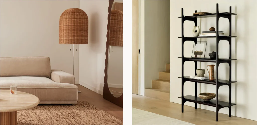
Think of a vertical wall in three zones. Low zone, roughly floor to waist height, is your working storage, things you touch daily. Mid zone, waist to about eye level, is your visual zone, the part a guest actually looks at when they walk in. High zone, everything above eye level, is your archive, things you touch maybe once a season.
The mistake I made, and the one I still see constantly, is putting the same density of items in all three zones. If you read the full guide on how to use vertical space the right way, you’ll notice the pattern that works best is almost the reverse of what feels intuitive. Keep the high zone sparse and closed off, baskets or bins rather than open display. Let the mid zone be curated, maybe a third of what you’d instinctively put there. Save the density for the low zone, where it belongs and where it’s actually useful day to day.
And no, this doesn’t mean buying more bins. It means being more honest about what deserves eye-level real estate in a room where every wall is doing double duty.
One thing worth mentioning here, because I get asked constantly: over-door space gets ignored by almost everyone, and it’s one of the few spots where you genuinely can add density without it registering visually, since it sits behind a door swing and out of the main sightline. If you haven’t looked at the spots most people completely miss with over-door storage, it’s worth a few extra minutes before you buy another shelving unit.
3. Open Shelving vs Closed Storage, Going Vertical
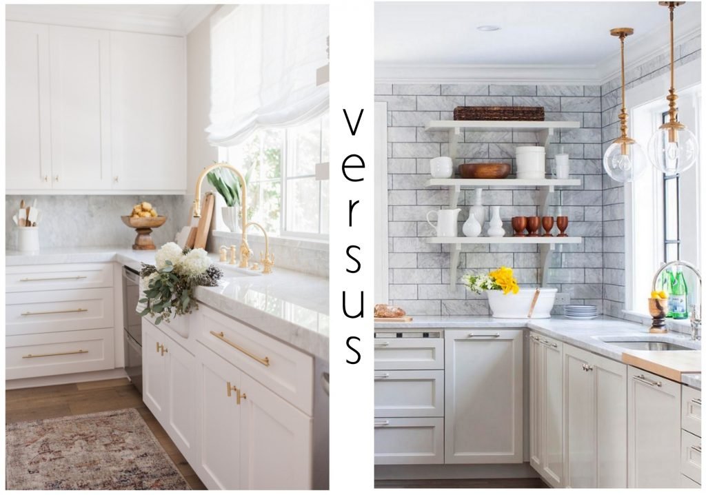
Clients ask me constantly which direction to go once they’ve decided to build up rather than out. Here’s the honest breakdown.
| Factor | Open Shelving (Vertical) | Closed Cabinets (Vertical) |
|---|---|---|
| Visual weight | Feels lighter if curated, heavier if crammed | Feels heavier upfront, calmer long term |
| Maintenance | Requires constant tidying, dust shows | Low maintenance, hides mess |
| Best zone | Mid zone only, sparingly | High and low zones |
| Cost | Usually cheaper | Usually more expensive |
| Studio-specific risk | Easy to overfill and create clutter noise | Can feel like a closet wall if not broken up |
Neither one is objectively correct. But for a studio specifically, I lean closed for anything above eye level and open only for the mid zone, and only when you can commit to keeping it edited.
4. How I Actually Fix This When A Client Calls Me In
The fix is almost never buying different furniture. It’s editing what’s already up there. I’ve walked into units where the shelving itself was fine, genuinely well built, well proportioned for the wall, and the room still felt like a storage unit because every surface was full.
So the first thing I do is empty the mid zone completely. Not the whole wall. Just the section at eye level. Then I put back roughly a third of what came off, chosen for variation in height and shape rather than category. A tall item next to a low one next to negative space. That’s it. That’s most of the fix, and it usually takes twenty minutes.
This connects to something I’ve written about before on why more storage does not fix a badly laid out studio. Adding shelving without editing what goes on it just moves the clutter vertically instead of solving it.
There’s a pegboard trick I picked up from a client’s kitchen wall a few years back that I still recommend, honestly more than most premade shelving systems, for exactly this reason: it forces you to hang things with visible gaps between them because pegboard holes only work at fixed spacing. If you’re curious, the wall storage and pegboard tricks that work piece goes into this in more detail than I have room for here.
Where This Actually Leaves You
A studio can absolutely handle floor to ceiling storage. I’ve built plenty that do. But the room only feels bigger if the wall has a rhythm to it, dense at the bottom, curated in the middle, quiet at the top. Get that backwards, or worse, flatten it into one uniform density, and you’ve built a very tall, very expensive way to make three hundred square feet feel like two hundred.
If you’re staring at a wall right now trying to decide whether to add another shelf, my honest advice is to edit what’s already there before you buy anything new.
FAQs
Does taller shelving always make a small room look bigger? Not automatically. It only reads as bigger when the density decreases as your eye moves up the wall. Uniform density at any height cancels out the benefit of going vertical in the first place.
Should I mix open and closed storage on the same wall? Generally yes, in a studio. Closed storage at the top and bottom, with a smaller open section at eye level, tends to look more intentional than an entire wall of one or the other.
What’s the single biggest mistake people make with tall shelving units? Filling every shelf to the same level of fullness. It’s the fastest way to turn a well built shelving unit into something that reads as cluttered from across the room.
Is it worth building custom shelving for a studio, or should I buy something premade? Premade works fine for most people. Where custom earns its cost is when your ceiling height is unusual or your wall has an obstruction, like a radiator or an outlet, that a standard unit can’t work around cleanly.
How much of a tall shelf should actually stay empty? As a rough guide, aim for a third of the mid zone left visually open. It’ll feel underused for the first week and then it won’t.
For more on getting a studio’s storage right from the ground up, the full breakdown on studio apartment storage mistakes that waste the most space is worth a read before your next shelving purchase.