There was a studio on Bloor Street, a client I took on about eight years ago, who had genuinely given up on the space before we even started. The ceilings were eight feet, which is not technically low by any standard residential measure, but the way the room was dressed made them feel closer to six and a half. Curtains hung at window height. Furniture spread low and flat across the floor. A tidy row of prints arranged at eye level, perfectly even, creating a solid horizontal band across the wall that might as well have been a false ceiling of its own.
By the time we were done, same square footage, same ceiling height, the room felt like it breathed. Multiple people who visited afterward asked if she’d had the ceilings raised. She hadn’t. We’d just stopped working against the verticality of the room and started working with it.
There is one core principle behind all of it, and variations that support it. The principle is this: the eye follows lines. In a room that feels compressed, you need more of those lines pointing upward.
1. Why Low Ceilings Feel Low Even When They’re Not
The ceiling itself is rarely the problem. What makes a ceiling feel low is what’s happening on the walls and in the furniture arrangement directly below it.
The human eye is constantly scanning for horizontal reference points. The top edge of a sofa. The bottom hem of a curtain. A row of framed prints at chest height. A shelf mounted mid-wall with empty space above it. Each of those horizontal lines tells the brain: here is where this room stops. When those reference points cluster in the lower half of the wall, everything above them reads as disconnected dead space, and the ceiling above that reads as an afterthought plastered on too close.
Eight feet becomes six when everything in the room stops at five.
Lighting compounds this. A single ceiling fixture pushes visual focus downward, pooling brightness at furniture level and leaving the upper walls in shadow. The ceiling disappears into that shadow rather than reading as part of the room. Studio Apartment Setup covers exactly this in their piece on why one overhead light ruins everything in a small apartment. The core issue is the same: when light comes only from above and lands only below, the ceiling stops participating in the room and height impression collapses.
Fixing perceived ceiling height means reintroducing vertical reference points throughout the space, from the floor to as close to the ceiling as possible, so the eye has a continuous journey to take. When it takes that journey, the room feels tall. When the journey stops at five feet, the room feels small regardless of what the measuring tape says.
2. The One Trick, Executed Properly
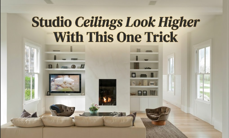
Hang the curtains at ceiling height. Not at the window frame. Not halfway up the wall. At the ceiling.
Mount the rod within two to four inches of the ceiling itself, or just below the crown molding if there is one. Then let the panels fall all the way to the floor, with enough length that the fabric just grazes or very slightly breaks at the bottom. That continuous vertical line, running from just below the ceiling all the way down to the floor, is what the eye follows. And when the eye follows it, the room reads as tall.
And the rod should extend beyond the window frame on both sides, typically eight to twelve inches past each edge. This matters for two reasons. It lets you draw the curtains fully open without blocking any glass, and it makes the window read as wider than it is. Wider windows make ceilings feel proportionally higher, the same way a wider collar on a coat elongates the neck.
Fabric choice is not trivial. Heavy, dark, patterned drapes absorb light and add visual weight to the lower wall, which pushes the ceiling perception back down even if the rod is mounted correctly. Light to medium weight panels, solid or very subtle texture, in a tone close to the wall colour or slightly lighter, are the move. Linen works beautifully in a studio. A flat-weave cotton does too. Velvet is gorgeous in a large room and wrong in a studio trying to lift its ceiling, it makes every surface feel heavier.
I’ve installed this setup in dozens of client apartments. The reaction when the panels are finally hung is almost always the same: the room looks taller, the client says it “just feels lighter,” and neither of us mentions that we haven’t changed a single structural thing. The eye has a vertical reference to follow, and it follows it all the way up.
3. Everything Else That Reinforces the Principle
Curtains are the highest-impact single move. But the same logic, vertical lines drawing the eye upward, applies in several other places throughout a studio, and stacking two or three of them is where the real transformation happens.
Tall storage to the ceiling. A bookshelf or set of open shelving that reaches all the way up, or within a few inches of it, does the same visual work as a well-hung curtain. It fills the vertical plane rather than leaving a large expanse of empty wall between the top of the furniture and the ceiling. That empty space above mid-height furniture doesn’t read as openness. It reads as a gap, a place where the design ran out of energy. Shelves carried all the way up read as intention, and intention reads as height.
The Studio Apartment Setup guide on using vertical space the right way goes into useful detail about what actually fits in those upper zones without looking precarious or hard to reach. Upper shelves should get lighter, more decorative, or simply more open as they climb. Dense objects crammed near the ceiling look heavy; the shelves should feel like they’re ascending.
Art placement. The gallery standard places the center of a frame at 57 to 60 inches from the floor. That’s correct for a museum. In a studio where ceiling height is a goal, hanging art a few inches higher than feels natural shifts the visual center of gravity just enough to draw the eye further up the wall. I’m not suggesting prints mounted near the ceiling. Just a slight upward adjustment, enough to break the pattern of everything stopping at chest height.
Floor lamps with upward-facing shades. A floor lamp that washes light up a wall toward the ceiling does two jobs simultaneously: it adds a tall vertical element and it illuminates the upper portion of the wall, which keeps the ceiling in the visual field. Table lamps pool light downward. They’re useful for task and zone definition, but for ceiling height purposes, a floor lamp aimed into a corner is the more effective choice, it draws both light and the eye upward.
Vertical texture or pattern. Vertical stripes, even very subtle tone-on-tone ones, guide the eye in a specific direction. Horizontal stripes make rooms feel wider. Vertical stripes make them feel taller. In a studio where you’re working to recover every inch of perceived height, the orientation of any pattern is not a neutral decision. Even a limewash technique applied with vertical brush strokes creates a soft upward directional quality that reads subconsciously.
4. What Pulls the Ceiling Back Down
There’s a short and consistent list of choices that undo vertical work, and some of them are extremely common in studio decorating. I’d rather name them directly than let someone do everything right and then undermine it with one of these.
Curtains hung at window height. I know I’ve already covered this, but I see it so frequently in client spaces before we start working together that it warrants saying twice. Window-height curtains draw a hard horizontal line at mid-wall, and everything above them reads as an afterthought. The room looks designed to stop at five feet. The empty wall between the curtain tops and the ceiling is the most visually damaging thing in most small apartments.
Furniture that’s uniformly low. A platform bed, a low sofa, a flush-mount ceiling fixture, and a console table at counter height create a completely flat visual horizon. There’s no vertical accent, no tall element to bridge the distance between the furniture level and the ceiling. Even one tall piece, a floor lamp, a narrow bookshelf, a tall plant, is enough to interrupt that flatness and create a vertical punctuation point that re-links the room to its ceiling.
Horizontal gallery walls at the same height. A row of prints hung perfectly even across a wall creates its own false ceiling, a visual line that the brain registers as “here is where things stop.” If you’re doing a gallery wall, arrange it to run tall and vertical rather than wide and horizontal, or keep individual pieces but hang them slightly higher than feels instinctively right.
Downward-only light sources. A ceiling fixture that directs all its brightness downward actively removes the ceiling from the visual composition. Combine it with low-profile wall art and low furniture and the ceiling becomes unreachable, it floats above a room that’s apparently designed to ignore it.
At a Glance: What Helps and What Hurts
Helps Ceiling Feel Higher             Hurts Ceiling Height Perception
-----------------------------------   -----------------------------------
Curtains mounted near the ceiling     Curtains hung at window-frame level
Floor-length panels                   Sill-length or below-sill curtains
Rod extending past window frame       Rod set exactly to window width
Tall shelving reaching toward ceiling Mid-height shelves with empty wall above
Art hung slightly higher than usual   Art at standard chest-height
Floor lamp aimed at upper wall        Table lamps as only light source
Wall colour continuing onto ceiling   Strong contrast between wall and ceiling
Vertical stripe or texture            Horizontal banding or pattern
Tall, upright plants                  Low spreading plants at floor level
Light or neutral upper walls          Dark paint concentrated on upper walls
5. One Studio, Walked Through
This isn’t hypothetical. Here’s a specific configuration I’ve implemented probably a dozen times in Toronto studio apartments over the years.
Single window on one wall, eight-foot ceilings, white drywall. Medium-tone hardwood on the floor. The previous tenant’s curtain setup: a rod mounted at window-frame height, panels falling to just past the sill, rod barely wider than the glass itself.
What we changed, in order of visual impact:
The rod went up to within two inches of the ceiling. The panels were replaced with pale linen in a tone close to the wall, long enough to break slightly on the floor. The rod was extended fourteen inches past the window frame on each side. This single change made the room look different before we touched anything else.
Open metal shelving on the adjacent wall went floor to ceiling at eight feet. Lower shelves held books, objects, a trailing plant. The upper third was lighter: a few baskets, some empty space left deliberately, one piece of art propped rather than hung. The shelf reached up, and the room followed.
A floor lamp went into the corner opposite the window, shade angled to wash light up the wall. Not a reading lamp. A lamp doing architectural work.
Three prints, which had been hung in a horizontal line at eye level, were rearranged into a loose vertical grouping with the highest piece at about seven feet off the ground.
Nothing changed structurally. But those same ceilings looked taller in photographs taken the same day.
If accent walls are part of the plan, it’s worth knowing which treatments open a space up and which close it down. The studio accent wall guide on Studio Apartment Setup covers this directly, and it matters here because the wrong accent choice can unravel every vertical gain from the curtains and shelving.
And if you’re reassessing paint colours alongside all of this, the relationship between wall colour, ceiling colour, and the contrast between them plays into ceiling perception more than most people expect. The colour palette piece deals with this question head-on and is worth reading before you commit to anything.
Frequently Asked Questions
My ceilings are only 7.5 feet. Does any of this still apply? Yes, and in lower-ceiling studios the curtain placement matters even more because there’s less room for error. Mount the rod as close to the ceiling as possible, go floor-length with the panels, and push at least one tall vertical element into the room. The gain is visible even at 7.5 feet.
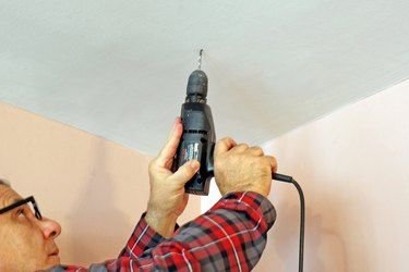
How exactly do I mount the rod so close to the ceiling without it looking wrong? Use a standard ceiling or wall bracket set to the height you need. If you’re within two to three inches of the ceiling, the gap reads as deliberate trim space rather than poor planning. The mistake to avoid is stopping at the window frame height or anywhere mid-wall; any bracket position near the ceiling reads correctly.
Does painting the ceiling the same colour as the walls actually help? It does, more than most people expect. High contrast between wall colour and ceiling colour draws attention to where the wall ends and the ceiling begins, which emphasises the horizontal line at that junction and can make the room feel capped. Painting the ceiling the same colour as the walls, or slightly lighter, removes that dividing line and the space reads as more continuous vertically. It’s a surprisingly low-effort change with noticeable impact.
What if I have a radiator under the window and curtains can’t reach the floor there? Use a roman shade or roller blind as the functional window covering, and then hang side panels at ceiling height framing the window on each side. The side panels deliver the vertical line; the shade handles the glass. The reading isn’t identical to full floor-length panels, but it gets most of the visual result.
Can tall plants actually help with ceiling height perception? A tall, upright plant, a fiddle-leaf fig, a snake plant that reaches four or five feet, a monstera on a tall stand, adds a vertical organic element that draws the eye upward without the formality of a shelf or a lamp. It also softens the space in a way that a bookshelf doesn’t. One tall plant in the right corner can do meaningful work for perceived height. A collection of small, low plants arranged on the floor does nothing for it.