Minimalism has become a word that’s used to describe so many different things it has nearly stopped meaning anything.
In interior design circles it usually refers to a specific aesthetic: clean lines, neutral palettes, surfaces cleared of everything except one artfully placed object. In the productivity world it means owning fewer possessions. In wellness content it means something closer to mental decluttering. And in studio apartment guides, including plenty I’ve read, it gets used as a synonym for “we don’t have room for much so here’s how to cope.”
None of those definitions are quite right for studios. And the gap between the popular version of minimalism and what actually works in a small space is worth thinking through, because people who accept the wrong definition end up with either an apartment that looks like a hospital waiting room or a studio so densely packed with “functional” storage pieces that the supposed minimalism just looks like organized chaos.
So what is the actual argument for studio minimalism? And why does StudioApartmentSetup make a consistent case for it? Let me think through this properly.
1. The Myth That Minimalism Means Sparse
The visual shorthand for minimalism in design media is a white room with almost nothing in it. One low platform bed, a single plant, bare walls except for one large-format print. Very aspirational. Very photographable. Genuinely miserable to live in for most people.
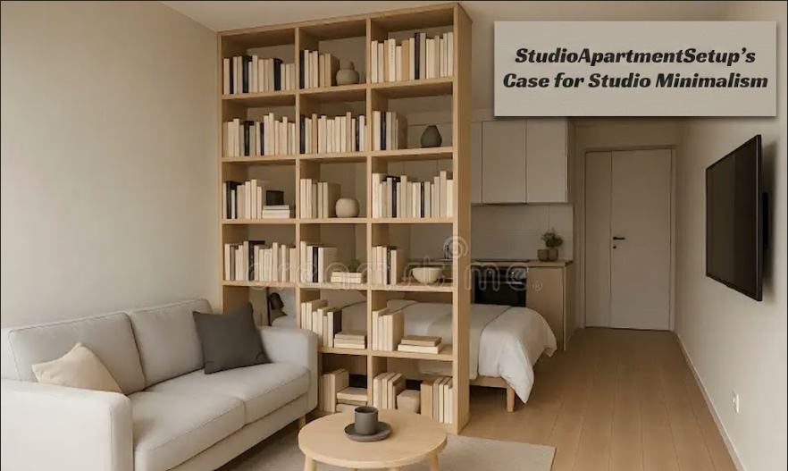
Real minimalism, as a design principle, is not about reducing the quantity of things to near zero. It’s about removing things that aren’t doing meaningful work and keeping the things that are. That’s a different idea. A studio can have warm textiles, a gallery wall, a bookshelf stacked with actual books, a comfortable chair with a throw over it, and still be minimalist in the meaningful sense. What it can’t have, if it’s going to function well, is four pieces of furniture all doing approximately the same job, or a collection of decorative objects that add visual noise without adding anything the person who lives there actually cares about.
The distinction matters practically. Someone who hears “studio minimalism” and thinks “I have to get rid of everything that makes me feel at home” is going to resist the whole framework. And they should, because that version of it is not what makes studios work.
What makes studios work is curation. Every piece in the room earning its presence, not just occupying space.
2. Why Studios Expose Bad Choices Faster Than Larger Homes
There’s something instructive about working in small spaces that took me a while to fully articulate. Mistakes in a large room can be absorbed by the room. An awkward piece of furniture in a spacious living room gets lost in the visual field, surrounded by other things, not doing much harm. In a studio, that same piece of furniture is somewhere between 10 and 30 percent of the total visual experience of the apartment. There’s nowhere for it to hide.
This isn’t a limitation of studios, actually. It’s a clarifying condition.
A studio that works well has been through an editing process that most larger homes never require. Every piece was chosen because it earns its footprint, both functionally and visually. The result, when it’s done right, is a room where everything has a reason to be there. That’s not austerity. It’s coherence.
I find myself more interested in designing small spaces for this reason, honestly. The constraints are more honest. A client with a 2000 square foot home can make a lot of choices I’d question and the space will absorb them. A client with 450 square feet has to commit to a point of view, and when they do, the apartment reflects something specific about how they actually live.
The piece on what minimalism actually looks like in 350 square feet on Studio Apartment Setup gets at this from a lived perspective, and it’s worth reading alongside this because the practical experience backs up the design principle. The constraint isn’t the enemy of a good-looking space. It’s often the condition that produces one.
3. The Myth That Personality Has to Go

Here’s where I see people lose confidence in the minimalist approach for studios. They start editing, which is the right instinct, and then they edit out everything that has warmth or personal meaning because those things look “cluttered” in the before photos they’re comparing against.
A studio stripped of personality doesn’t look minimal. It looks like a furnished rental that nobody’s made their own yet.
Personality in a small space isn’t the problem. Unfocused accumulation is the problem. There’s a real difference between a shelf with twelve objects that all arrived by accident and a shelf with four objects that were each chosen deliberately. Both have things on them. One reads as considered, one reads as a collection of things that haven’t been put away yet.
The edit I’d apply to a studio isn’t “get rid of the things you love.” It’s “identify the two or three things you love most and let those lead.” One strong piece of art, placed intentionally, does more for a studio than twelve smaller pieces that compete with each other. A rug in a specific color that you actually chose, rather than one that came with the apartment or arrived because it was on sale, anchors the whole room. The personality isn’t subtracted by minimalism. It’s concentrated.
And this is, I’d argue, exactly the design logic behind Studio Apartment Setup’s broader philosophy on layout. The four layout principles every interior designer uses first aren’t about emptying a room. They’re about understanding what the room needs to do and removing everything that interferes with that function. Same instinct, different vocabulary.
4. What Studio Minimalism Actually Looks Like in Practice
Let me try to make this concrete, because “curated” and “intentional” are words that sound good and mean very little without examples.
A studio practicing genuine minimalism has:
A bed that is the visual anchor of the room, chosen with care for height, frame style, and how it reads from the front door. Not the cheapest option that fits, not a hand-me-down surrounded by apologies.
One or two pieces of furniture that do more than one job, chosen specifically for that quality. A storage ottoman that works as a coffee table. A bench at the foot of the bed that holds blankets. Not five separate pieces that each do one thing.
Surfaces that are mostly clear, with the things that are on them there because they’re used or because they’re genuinely something the person who lives there cares about looking at. Not because things accumulated over time and clearing them felt like too much work.
A color palette that was chosen, not defaulted to. Even a studio painted entirely in the landlord’s off-white can have a chosen palette through textiles and wood tones and the one or two things on the walls.
What Studio Minimalism Is and Isn’t
STUDIO MINIMALISM: A CHECKLIST

It IS:
[ ] Every piece of furniture earning its visual and functional footprint
[ ] A clear sense of what the room's two or three most important elements are
[ ] Surfaces that are maintained, not just occasionally cleared
[ ] Color and material choices that were made deliberately, even if simply
[ ] Storage that is built into or concealed within furniture rather than added on top
[ ] Objects on display because they're loved, not because they haven't been moved

It is NOT:
[ ] No art, no color, no warmth
[ ] A space that looks like nobody lives there
[ ] Getting rid of books, plants, textiles, or anything that makes a room feel inhabited
[ ] Matching everything to one brand's aesthetic
[ ] Owning as few things as possible as a goal in itself
[ ] White walls and bare floors as a default
The confusion between these two lists is where most studio minimalism advice goes wrong. People read “edit ruthlessly” and interpret it as “remove personality.” The actual edit is subtler: remove what doesn’t serve you, and be honest about what that actually means.
For a studio, understanding why clutter persists even after organizing is usually a more useful exercise than trying to own less for its own sake. The cluttered feeling in a studio is almost never caused by too many meaningful possessions. It’s caused by too many things that are neutral, that arrived without intention, and that the person has never made a positive decision to keep.
That’s the case for studio minimalism as I’d make it. Not as a visual style. Not as a lifestyle ideology. As a design standard that small spaces require in order to function, and that, when applied with the right intentions, produces spaces that feel more like the people who live in them than most larger homes do.
Frequently Asked Questions
I’ve been told minimalism doesn’t work if you have a lot of hobbies or collections. Is that true in a studio?
Not exactly. The issue isn’t hobbies or collections, it’s whether they have a designated place and a defined boundary. A record collection on a dedicated shelf is a design element. The same records stacked on the floor, the counter, and half the windowsill is a clutter problem. Decide where the collection lives and hold that boundary. A studio can accommodate a lot of genuine interests if each one has a considered home.
I have furniture from a previous apartment that I want to keep. How do I know what to edit out?
Stand at the front door of the studio and look at the room. The pieces that feel like they’re taking up visual space without giving anything back are usually the ones to reconsider. Scale is often the issue: furniture sized for a larger room brings proportions that crowd a studio. Pieces that sit low, have open legs (so the floor continues underneath them), or have a clear visual purpose tend to earn their place. Pieces that just fill a corner because there was room tend not to.
What’s the difference between “minimalist” and just “cheap”? I feel like studio minimalism often looks the same as a space where someone couldn’t afford anything.
The difference is care, not cost. A studio with a $200 platform bed, $40 of warm-toned smart bulbs, a secondhand rug in a color that was actually chosen, and art made from prints in frames that were selected thoughtfully looks minimalist. A studio with five mismatched pieces of furniture that were all free or heavily discounted, with no through-line of color or style, looks like a lack of resources regardless of how little stuff is in it. Minimalism is a editing decision. It doesn’t require expensive things. It requires decided things. There’s a good overview of what the first week’s essentials actually are on Studio Apartment Setup that approaches this from a practical move-in angle rather than a style angle, and the logic there is compatible.
Is Japandi the right style for studio minimalism, or is warm minimalism better?
Neither is prescriptive. Japandi tends to favor lower furniture profiles, natural wood and linen tones, and a quieter palette that suits studios with good natural light. Warm minimalism is more forgiving of contrast, slightly more decorative, and works well in studios that need the space to feel activated rather than calm. Which is right depends on who’s living there and what the light in the apartment is actually like. The comparison of Japandi and warm minimalism on Studio Apartment Setup goes into this specifically for studio contexts and is the most useful starting point for that decision.
I want a more minimal studio but I live with a partner who isn’t interested in minimalism. How do you work around different aesthetics?
You design to shared priorities rather than shared aesthetics. Almost everyone, regardless of style preference, wants their home to feel calm, functional, and like themselves. That’s achievable from very different visual starting points. The edit isn’t “remove your partner’s things.” It’s identifying which of their things make the space feel like theirs versus which ones are just present by default. Most people are more flexible about the default items than the meaningful ones. Start there.